Table of Contents
When you think of modern interior design, it’s not unusual for several phrases to come to mind (think: contemporary, mid-century modern furniture, organic modern, and minimalist style). And while it might seem like modern design is the umbrella term for these styles, they’re actually all different but nod to each other, according to this comprehensive guide to interior design.
“When speaking of modern design, three things come to mind: clean lines, meaningful pieces, and an edited approach,” says designer Mikel Welch in an article about modern design. “It’s all about minimalism and refinement — it sticks to the basics, yet nothing is basic about it!” Other elements that can hint that a space is modernly designed are neutral colors found in nature and/or primary colors and the use of black accents. You can also find an open-plan layout. And there’s usually a lot of warm wood used.
And if you’re wondering what this style actually looks like in play, you’re in the right place. Below are 13 homes that, while all unique, best showcase modern interior design by highlighting the less-is-more approach.
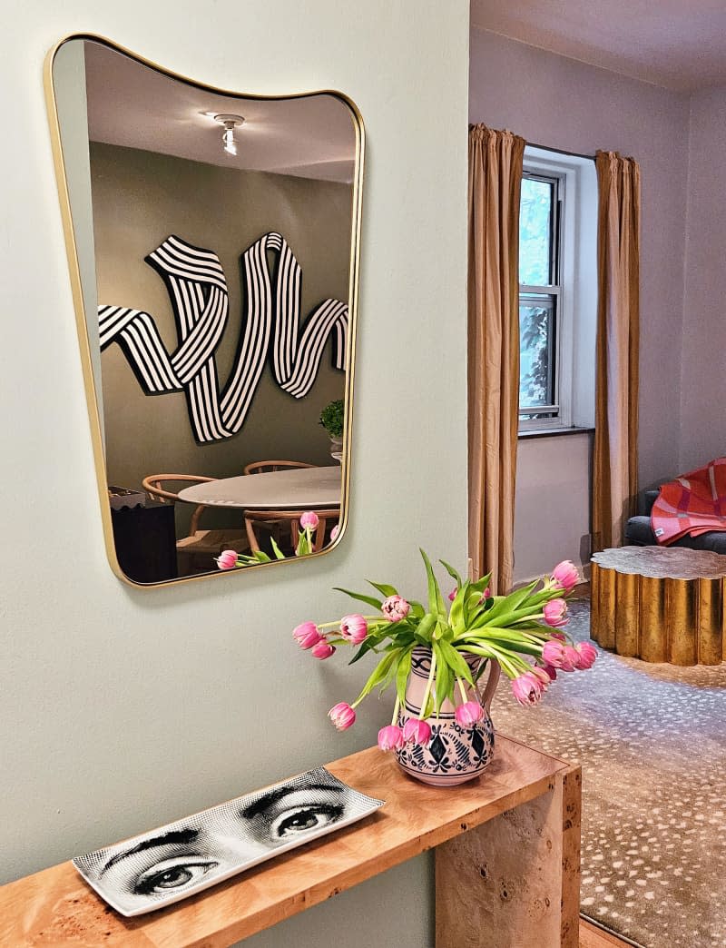
1. This New York City Apartment Is So Good, It Was Rented Sight Unseen
When beauty editor Dianna Mazzone Singh was designing the New York City apartment she shares with her husband, Herman, and pup, Sushi; she had her own take on the modern look: minimal maximalism. “To me, minimal maximalism means incorporating bold patterns, bright colors, and statement art pieces in a very deliberate, light-handed way,” Singh said at the time of the home tour.
Visit the full home tour to see more of this stunning apartment.
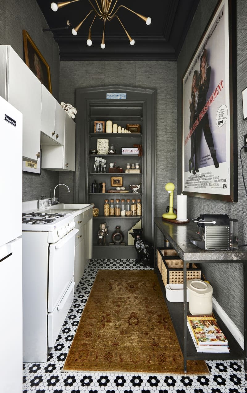
2. Professional Stager Jason Saft Transformed His 475-Square-Foot Studio
With over 20 years of real estate experience and owning a professional staging company, Jason Saft knows a thing or two about modern design. And living in a studio apartment, which is the definition of open-concept living (aka a tenet of this design style), he likely wanted his home to be clutter-free. He furnished the space with minimal furniture like CB2’s Babylon Dining Table.
Explore how modern furnishings made his studio apartment feel larger in the full home tour.
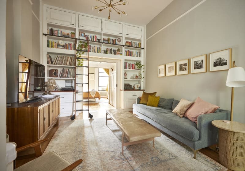
3. A Small One-Bedroom Apartment’s Clever Reno Fits This Family of 3 Perfectly
One key feature of modern design is using natural materials. Those organic elements are emphasized in Beach and Michael Silver’s modern apartment that’s home to them and their daughter. “We focus on varied, complementary textures with plenty of organics (hardwood, leather, cane, linen, plants), rich colors, comfortable furniture, and natural flow,” they shared at the time of the home tour.
Check out the full home tour to see how they transformed a storage loft into a nursery.
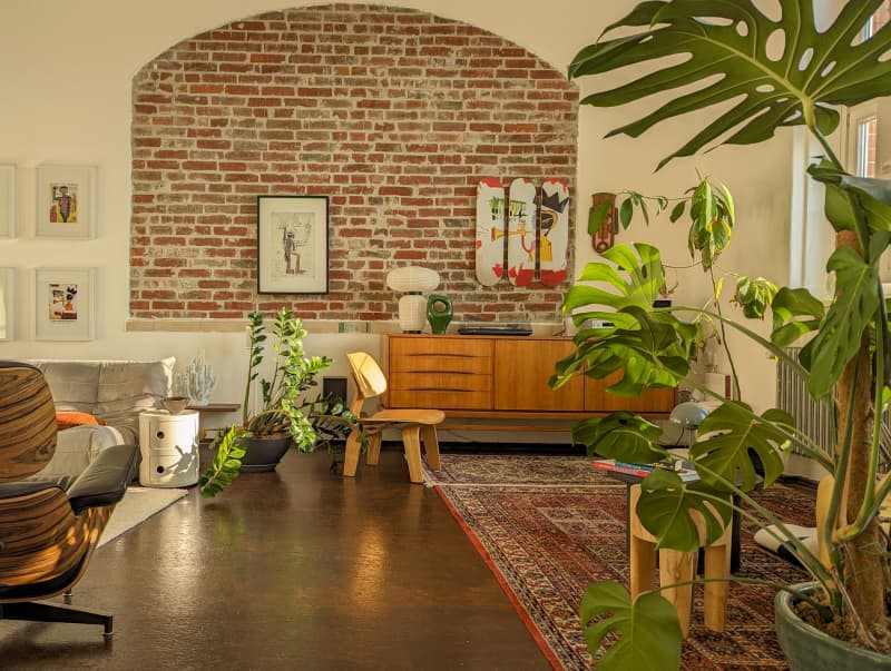
4. A “Repurposed Classroom” in Germany Became a Stunning Home for This Renter
Modern style is known for its pared-down, streamlined look with a less-is-more approach. Andreas Meinke, who lives in what once was a classroom in Germany, decorated his space with timeless furniture that complements the building’s history. “My goal is to curate spaces that evoke a sense of natural serenity, providing me with an environment that both stimulates my creativity and offers a tranquil escape when needed,” he said at the time of the tour.
See how Meinke updated the historic apartment in the full home tour.
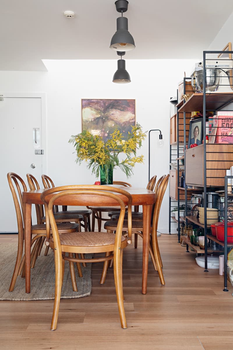
5. A Private Rooftop Helps a 344-Square-Foot Apartment Feel Much Larger
When Charlotte Ree moved into her 344-square-foot apartment in Sydney, the limited space likely dictated the modern design style throughout the home. “Living in such a small place means that hoarding is unforgivable, and so purging was the only thing to do,” she said at the time of the home tour.
Visit the full home tour to see more of Ree’s sunny space.
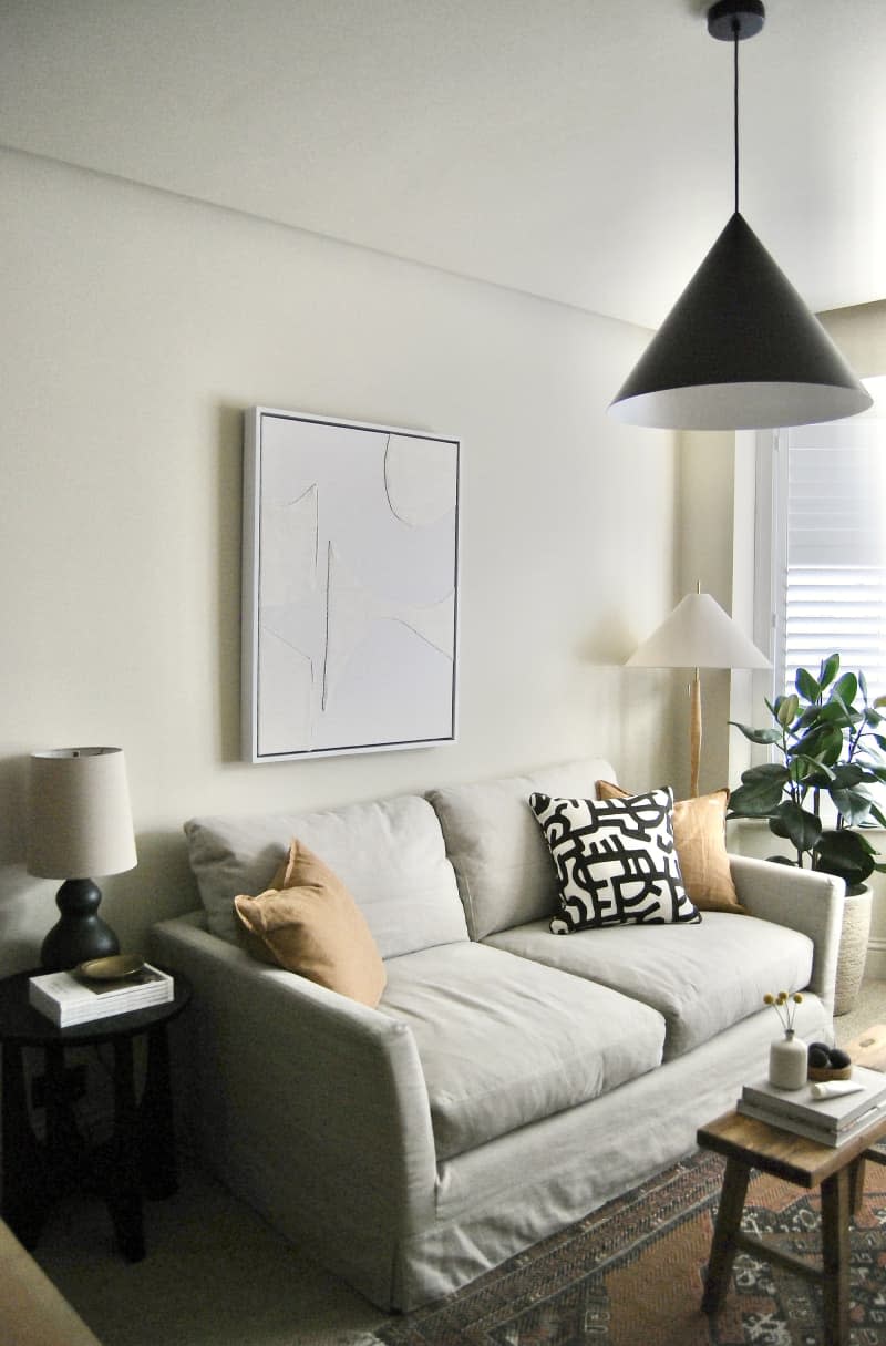
6. A Renovated London Home Has the Dreamiest Bedroom Loft and Walk-in Closet
After Justin Coakley finished renovating the 1930s home in London that he shares with his partner, Zunaid, it was time to decorate — but Coakley didn’t want to limit the furnishings to just one style. Instead, he seamlessly combined Scandinavian and mid-century modern influences to create a space that’s a tangible example of him and his partner. “I believe that our spaces should reflect our interests and personalities, and for me, that means my space has to have depth and layers in it,” Coakley said at the time of the tour.
Explore more of their beautiful rooms in the full home tour.

7. A Renovated Portland House Is the Literal Embodiment of “Easy Like Sunday Morning”
It’s no surprise that when Casey Keasler, who founded the award-winning design studio Casework, toured this “tired and musty” home built in 1966, she could see the potential in the bones. She believed it so much that she even wrote a letter to the sellers explaining how much she appreciated the home. When she inevitably moved in, she furnished the space with natural materials, a soft color palette, and minimalist furniture.
Visit the full home tour to see how Keasler reimagined the house.
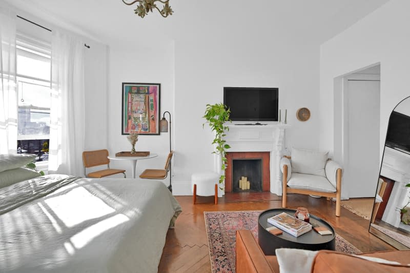
8. This 400-Square-Foot Boston Studio Apartment Uses Every Inch Wisely
One of the most exciting parts for Jacqueline Cipolla about living alone in this sunny studio apartment was the chance to decorate the space all by herself. Because she had limited square footage, she had an exciting challenge to maximize every inch without cluttering it. “I opted for a bed with hidden drawers underneath to keep clothes and shoes instead of a large dresser that would take up a lot of space,” she explained during the home tour.
Check out the full home tour to see how Cipolla made her space feel spacious.
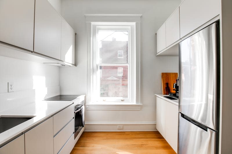
9. See Inside a Philosopher’s 112-Year-Old “Modern Minimalist” Apartment
Charles Repp has lived in this 112-year-old apartment in Richmond, Virginia, for five years and has decorated the space beautifully. It has modern influences with the sparse furnishings and clean lines, and he describes his decorating style as “modern minimalist.” That is until you consider his vast book collection. “I’m definitely not a minimalist (nor much of a modernist) when it comes to those,” he shared at the time of the tour.
Explore more of this minimalist apartment in the full home tour.
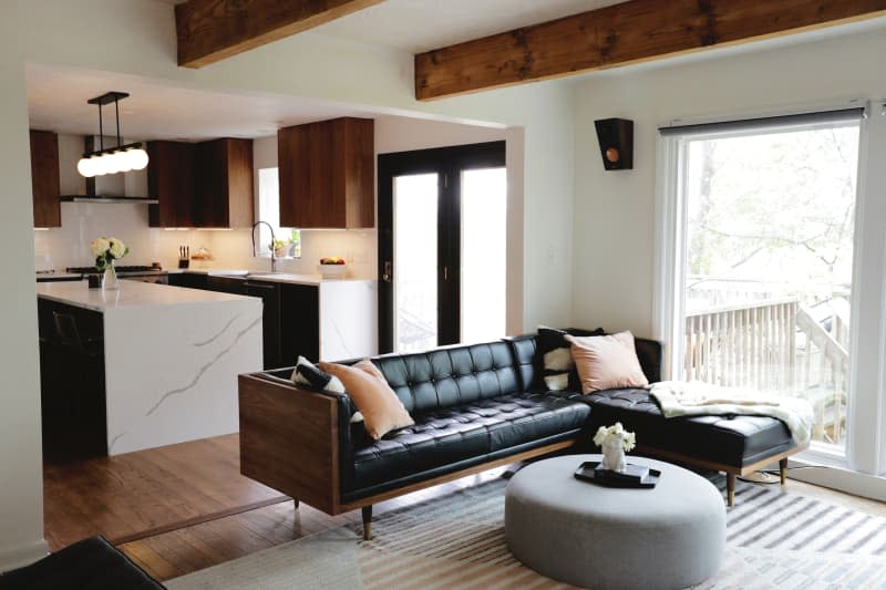
10. This Mid-Century Modern Home Needed an “Excessive Amount of Cosmetic Work”
When envisioning a modern home, you’ll likely find cream-colored walls, furniture that mixes leather and wood, and sparse furnishings. Well, that’s precisely what the living room looks like in Joel and Sarah Blumer’s home in Pittsburgh. When the couple first toured the home, they and their family confirmed it needed an “excessive amount of cosmetic work.” However, they’ve completely restored it to a gorgeous home with modern details.
See more of the Blumer’s space in the full home tour.
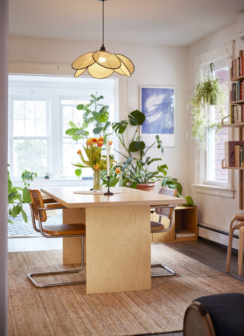
11. A Brooklyn Home’s Sunroom Sports “Floridian Mid-Century Modern” Style
The vibe of Justine Requa and Alex Moy’s Brooklyn apartment is a happy mix of aesthetics. There are notes of Requa’s Florida childhood in the rattan and plants and mid-century modern furniture shapes and natural color scheme. Her design background came in handy when designing her space, where she seamlessly pulls together curves with straight lines and overlaps plants and artwork without making it feel cluttered or chaotic.
Visit the full home tour to see the gorgeous sunroom in their Brooklyn apartment.
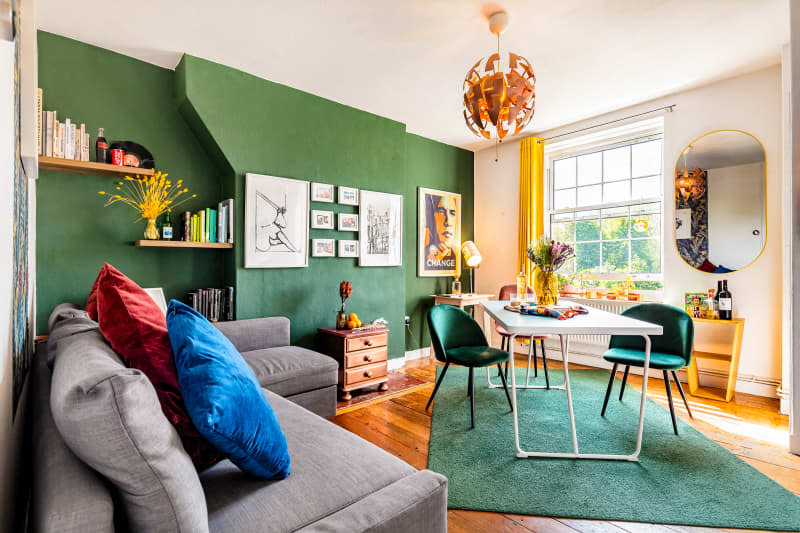
12. This Gorgeous London Apartment Has Discovered the Perfect Green Paint Color
Not only does Lusanda Kula-Szilagyi and Victor Kula-Szilagyi’s London apartment have modern furnishings (think: thin, curved furniture), but it’s also clad in an array of vibrant colors that make the home feel alive. One such color that’s throughout their home is green. “We spent all afternoon and evening painting that wall,” they shared at the time of the tour. “The next morning felt like Christmas morning, staring at and putting together our masterpiece with all the frames, images, and shelves.”
Step inside their colorful space in the full home tour.
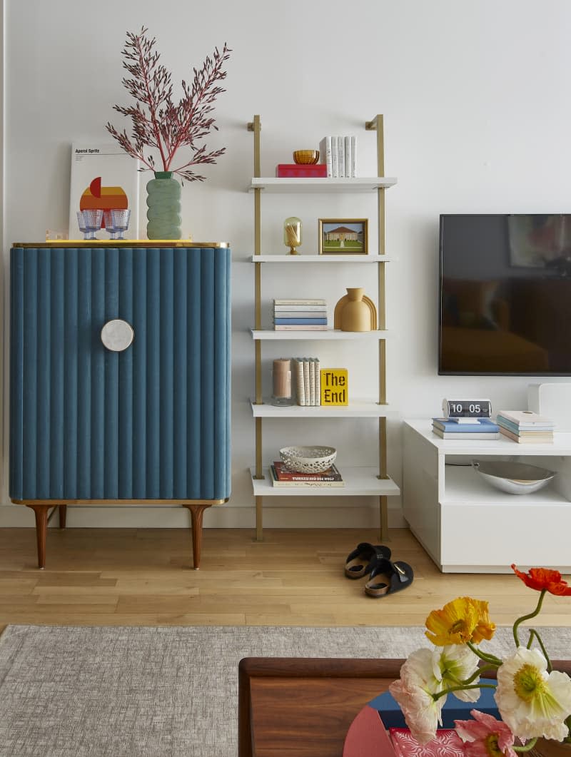
13. This New York Times Bestselling Author’s Brooklyn Condo Is “Funky Mid-Century Modern”
When Sarah Knight and Judd Harris moved into a gorgeous Brooklyn apartment, they had to come to a design compromise. Luckily, their interior designer, Sarah Harris, was there to be a mediator. Knight wanted to live in an opium den, and Harris wanted to live in a spaceship. “Eventually, we settled on what we call “funky mid-century modern,” which gives him a lot of clean lines and me the ability to accessorize with color and texture,” Knight shared at the time of the tour.
Visit the full home tour to see how their beautiful compromise came to life.
