Table of Contents
Hi Everyone,
If you missed my note last night, the post is late because I’m under the weather, with a fever a body aches. Covid is negative.
I am doing two follow-up posts to Wednesday’s post, focusing on Benjamin Moore’s and Sherwin Williams’ Color of the Year. (COTY 2023).
Why two more posts?
I’ll be getting to that in a sec, but the over-riding reason is:
It has to do with color psychology. While the majority agreed with me that Benjamin Moore’s COTY 2023 was the more desirable color. A few people felt the extreme opposite. And, I think a couple of you hated both colors. I don’t recall anyone liking both colors.
It is okay not to like what I like and vice versa.
However, some were questioning my judgment. Let’s not do that here. It’s fine to say, “I don’t like such and such.” It’s not okay to say, “Laurel, Red?” as if I’ve lost my marbles. That’s not nice. Please stand by what you like and don’t like; you don’t need to make someone else “wrong” to make yourself “right.” There is no right or wrong in this case.
Also, please understand that when I say a color is a “good color,” it doesn’t mean I would paint any part of my home that color. It means I appreciate its beauty. I appreciate golden blond hair. But, I’m not running out and having it dyed yellow. Well, that is, not this week. I can see from my roots that I have gone quite gray since moving to Boston.
In addition, note I am critical of “things,” not people.
The reason for two post is that I’m going to do a deeper look into both colors. Today, I’m going to tackle Raspberry Blush, and for Wednesday, Redend Point.
I am not attempting to do this in one post because I realize it will take a while to research and do two mood boards.
However, you might wonder why I want to work with a color I don’t like.
That’s a very good question. Thank you.
It’s a matter of fairness. I want to see if maybe I can turn both colors into a color we at least can say, “Okay, I concede, it does look good in that situation, and I can see why it turned me off completely before.”
It’s only fair if I attempt to make Raspberry Blush dislikers sway their opinion that I do the same with us Redend Point dislikers.
But, Laurel. Won’t you intentionally make Redend Point look bad so that you can say, “Seeeeee? I told you so!”
Well, I could, hehe. But, you guys would see right through that and decide I’m FOS. And two, No way would I do that. If I have to look at sewer sludge mixed with beet juice all day long, you better be sure I’m going to pull out the stops to make it look as palatable as possible.
In addition, we will look at the reasons why some of us can’t stand red and coral paint colors.
In fact, one commenter shared the home of someone I admire very much. AND her dining room is painted a shade very similar to Raspberry Blush. In this case, I, too, can’t stand it.
So, after we go over a few things, I’m going to focus on this dining room and attempt to fix it. I am not presuming that this is what Ina will like.
But, WHY do some of us sit in judgment of specific paint colors straight out of the gate?
I believe it often has to do with color psychology and association with certain colors.
If it’s a negative association, it could be for many reasons.
In the case of red, it is often associated with anger, aggression, embarrassment, hyperactivity, intense emotion, and love. It is the color of our life force, blood. It is the color inside our bodies. Red is HOT. It spells danger. It’s the color of fire trucks and STOP signs. Red says, “pay attention to me.”
All of that intensity can be very fearful for some people.
However, maybe something bad DID happen in a room painted red. Maybe your first love was wearing a bright red shirt when he broke your heart.
It’s even possible that some shades of red actually hurt your eyes. I have read that some shades of yellow hurt some people’s eyes.
If a paint color that’s in your face is causing any discomfort, be it physical, psychological, or emotional, we’re probably going to avoid it. Or, at least avoid a big drink of it.
Sometimes, we haven’t actually experienced anything terrible; we just haven’t experienced it– period. In that case, we may be relying on our preconceived notions of what certain colors can do to our brains.
Does anyone think of “red” when thinking of calm and peace?
How many times have I heard? “Well, my son’s already plenty hyperactive, so there’s no way I’m going to make that any worse by painting his room red.”
I bet the majority of you out there believe this to be true.
Would you believe me if I told you that the opposite is true?
Now, to be clear, I am not suggesting that anyone paint their entire home red or that you paint your kids’ room red.
And, I can’t say for sure, but my experience leads me to believe that red does not make people more hyper. I’ve been in at least 20 different rooms painted some shade between coral and red and have found myself feeling a strange calm but happy, too. I also painted a little boy’s room red in the mid-90s. As far as I know, it did not make him hyper and he’s quite a successful adult, now.
Red most likely stimulates parts of the brain that produce all of the “feel good” hormones.
However, for some, it might not work that way. My point is that sometimes widely held beliefs are not necessarily true.
This is the thing. If you’ve never spent time in several red rooms, how do you know?
Are you only supposing this based on what you read or heard, not your actual experience?
For me, I could visit a home, and six months later not remember what color the walls were. However, with a beautifully lit red room, the color is unforgettable and magical.
Please remember that I am not interested in painting my own home any shade of red, but my experience in red rooms has been extraordinary, even magical at times.
One of them happened in January 2017.
I went to the “Young Collector’s Night Antiques Show at the Armory in New York City.”
There was the most stunning red dining room I’ve ever seen. Well, a booth set up as a dining room.
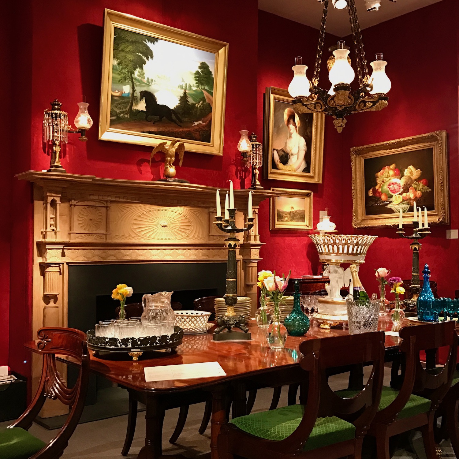
It’s a little difficult to tell, but the walls are a damask wall covering. This room features classic Federal-style furnishings, beautiful art, and jewel-tone accents in cool colors. There is also plenty of gold and sparkle. The room was dazzling and I had to visit it multiple times that evening. There was little else in the show that I remember this well.
Another time, I don’t have an image, but it was in a cosmetics store in Bronxville, NY.
The red, a Ralph Lauren color, was stunning!
The third example is an image many of you have seen many times.
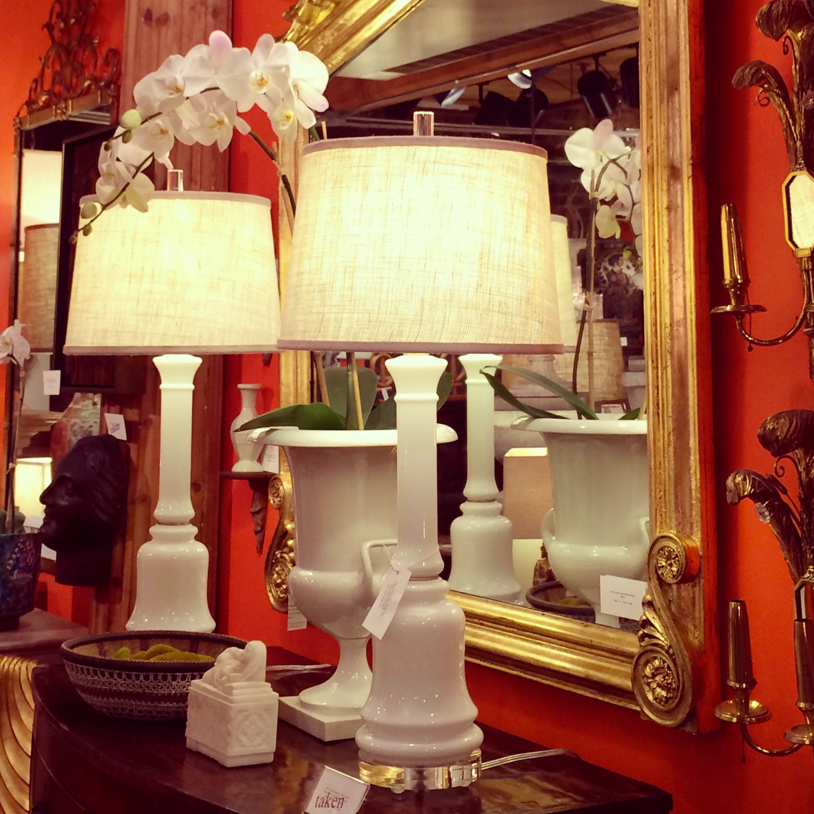
This is a booth at the High Point Market that inspired my curated collection of 144 beautiful Benjamin Moore paint colors. The one I ended up selecting is Racing Orange Red.
This post features the color red and some gorgeous red rooms. Here.
Red is a beautiful color for dining rooms, especially in the winter.
I made this mood board below, to help a reader whose dining room wasn’t coming together.
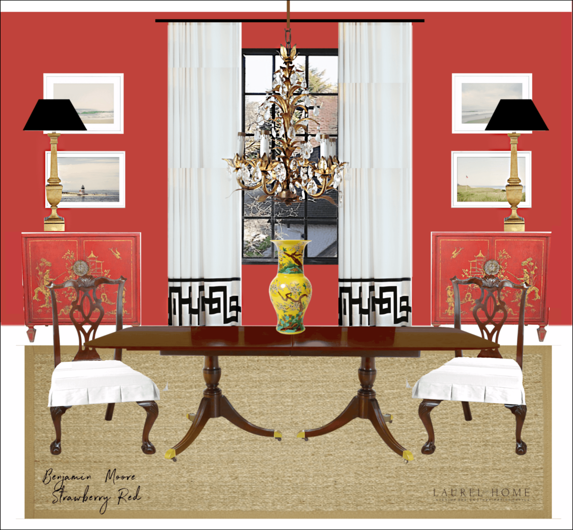
Frankly, I think you could put almost any color on the wall and, in some cases, change the chests, and this room would look good: at least to my eye.
Now, we’re coming to the aforementioned dining room of someone I admire a lot.
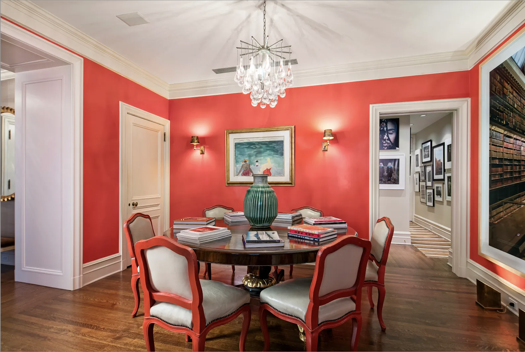
I tried to find other images of this apartment belonging to Ina Garten. (You can see more images here)
There aren’t any. Maybe it’s being renovated?
I hope so. It’s not that it’s bad, it’s just that it’s completely lackluster.
Although I think Ina Garten’s Manhattan apartment has a lot of potential, there is no evidence of an interior designer. Maybe much of the furniture was brought in for the shoot.
However, is it worthy of Architectural Digest?
No, not as it is. None of it is.
That football field-sized living room is bland and forgetful, except for the bizarre seating arrangement by the fireplace.
Facing the fireplace with nothing around it is a daybed.
Well, yes, of course. That is because this room is one giant snooze-fest. Again, it too, is not finished.
Why do they do this to us and pretend that it’s incredible? They do it because they can. People will believe anything they are told. Not us, of course. We know better.
Considering Ina’s past homes, I find this banal decor perplexing. My favorite home is her Hamptons home, from the mid-90s pictured here. It inspired my living room decor immensely. That, and Victoria Hagan’s Hamptons home, as well.
Before I begin examining Ina’s dining room coral paint color, I want to reiterate that I adore Ina Garten.
I love her show, darling personality, and her cooking. And oh man, have you seen her Insta account? Of course, you have. She has millions of followers. But, if you haven’t seen it and you’re on a diet before the holiday food frenzy, I caution you to stay away.
The reason is that you will soon be ravenous, and it won’t be for a spinach salad. If we eat with our eyes, well, Ina has done it to us repeatedly.
But, what happened here? Yes, I know. Ina is not an interior designer. No, and she’s not a chef either. What I mean is she’s not a trained chef. She taught herself. And, at this point in her life, having lived and furnished several homes, some of it must’ve rubbed off.
So let’s dish. (no pun intended)
What is wrong with this room, aside from the fact that the vivid coral paint color is like somebody just flung an ice-cold pitcher of watermelon-flavored Kool-aid in your face?
Melissa, I believe you had your hand up first.
The lighting seems a little bright and white, which isn’t complementary to the paint color.
Ya think? Yes, you are right. The light sucks to high holy heaven. Yes, it’s too bright and waaaay too white. And the chandelier is horrible and cheap looking.
Anyone else?
Yes, Maggie.
Well, the room doesn’t seem finished.
Bingo. It’s not. It’s not even close to being finished.
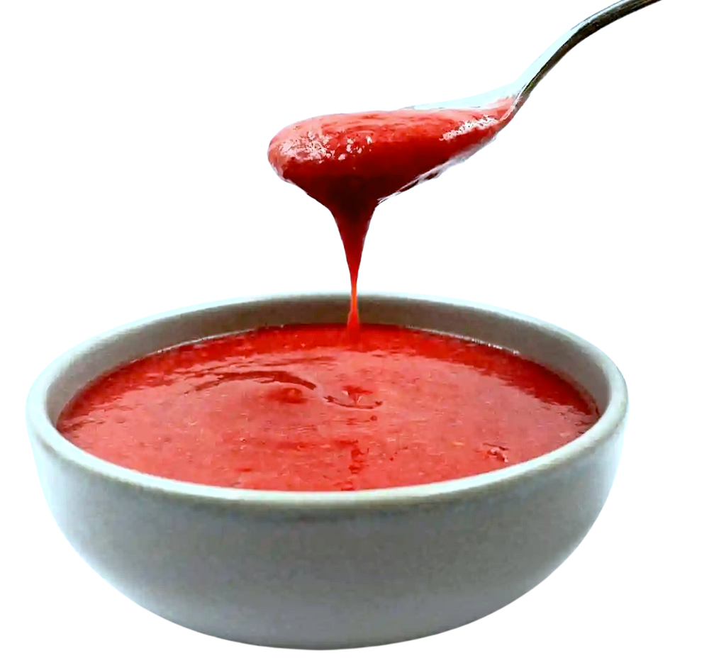
This dining room as it is right now is like Ina serving her guests a huge bowl of raspberry coulis, but she forgot to bring out the mascarpone cheesecake with a butter cookie crust and shaved bittersweet chocolate.
Now, we know that Ina would rather walk on shards of broken crystal before she would ever do such a thing.
But, there’s more. There is no connection to the other rooms. Where is this color coming from?
Aside from the assault of this one intense color, hideous lighting, and fuddy-duddy furniture, there’s an acute balance issue.
We don’t know if this room is trad or contemporary. It should be 80/20 or 90/10 and right now it’s about 60/40.
That’s it. The architecture says trad. Then, we have a vast contemporary painting and a smaller one, and a contemporary, cheap-looking chandelier. And, no other furniture. The dining room is 11 x 14, which is a nice-sized dining room.

Never mind some other things wrong with this place from a design standpoint. That is another post.
Okay, now I’m going to post some inspiration images. These are rooms and vignettes I believe might win some of you over.
If not, that’s okay too. Please let us know. Hang on while I gather them all up. Once I’ve done that, I’m also going to share a mood board I made for Ina’s new dining room. (Laurel-style)
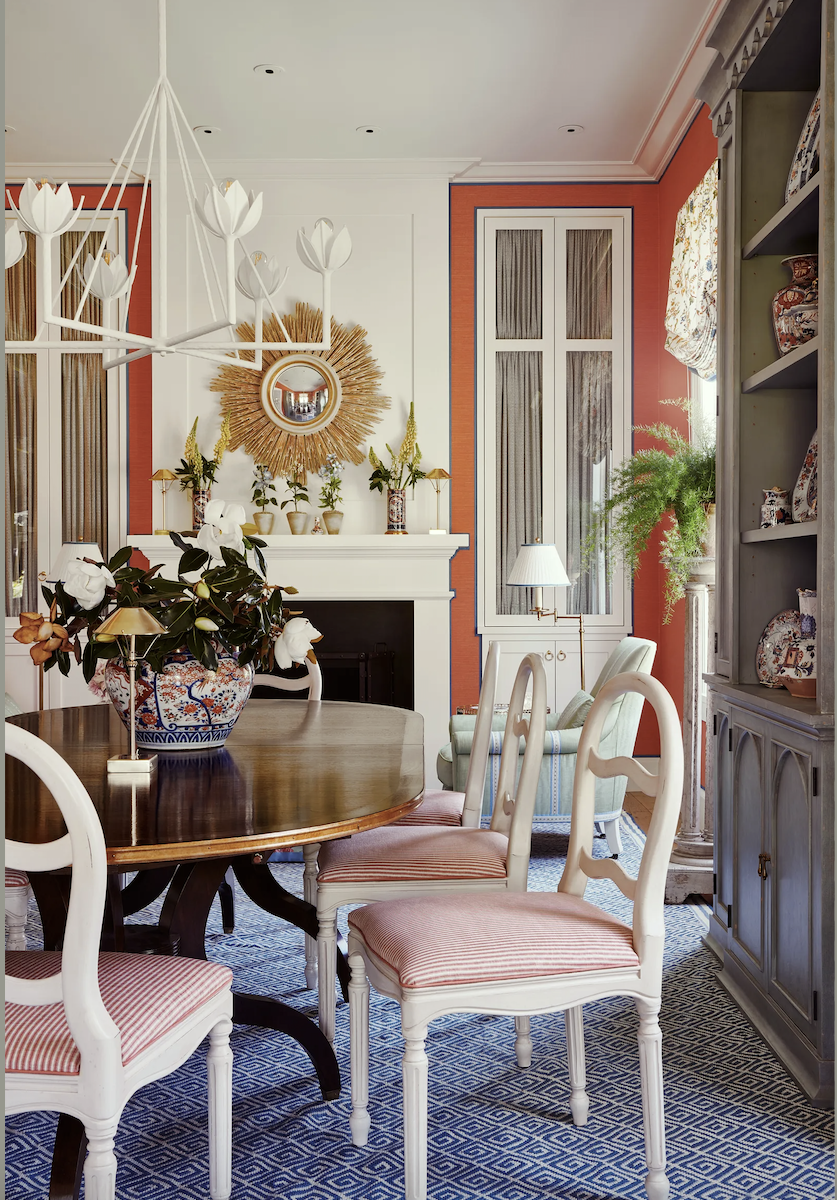
photo: Amy Neunsinger
Mark D Sikes always gets it right. This is a beautifully executed dining room, even if you don’t like coral paint colors or blue or coral and blue together. You can see more of this lovely home, here.
The secret? Mark cooled things down by adding a bit of dirty in that gorgeous breakfront. In addition, there’s a terrific balance of warm and cool. Warm colors like coral paint need cool tones.
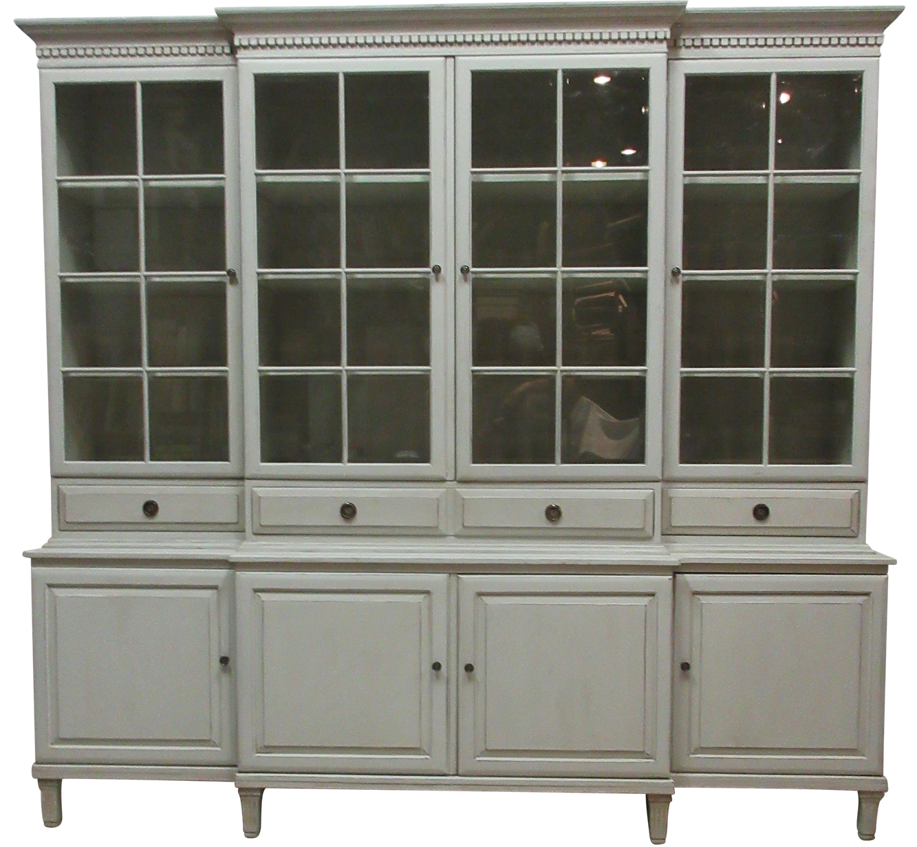
Above is a gorgeous Gustavian-style breakfront I found on Chairish.
Please remember the most crucial word in the design of any kind.
BALANCE.
If something doesn’t look right, it’s most likely because the balance is off.
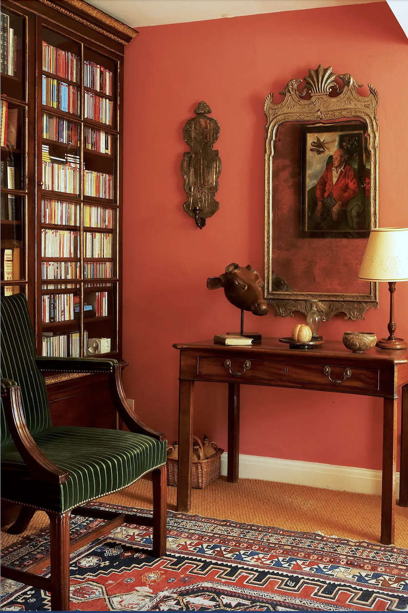
Photo: Jan Baldwin – I don’t know who the designer is. The English often love saturated hues and learn how to work with them. This is perfect and timeless.

Awww, the late, great Mario Buatta in the 1970s. Yes, like 50 years ago. I am not one to argue with the greatness of his work. This room is timeless.
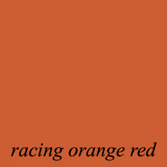
This is looking more like my Racing Orange Red. ROR is just a shade more orange.
If you want to see how to work with coral, please go to the Colefax & Fowler Instagram page.
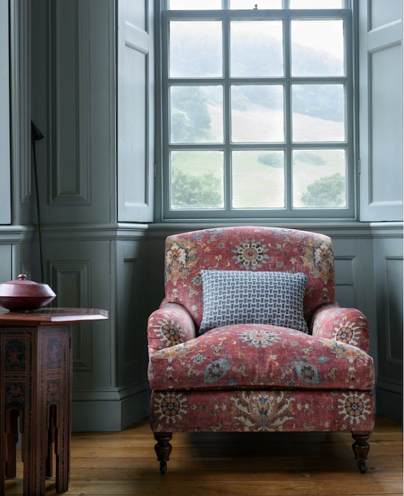
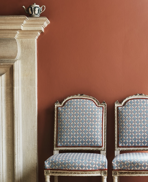
For the woman who said if the room had a coral paint color, she’d walk right out. Do you still feel that way looking at this? I think this image is breathtaking.
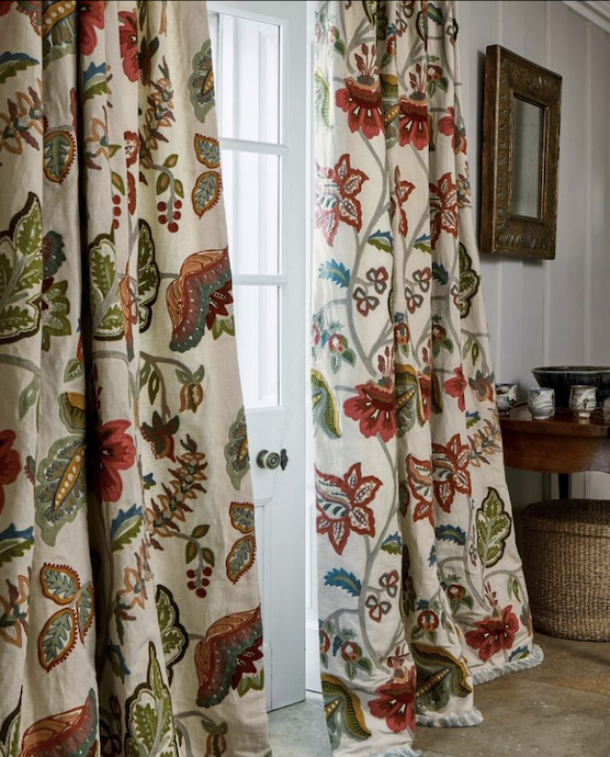
Hey, if you want to come up with a whole house color palette, use one of their exquisite fabrics. Please remember there should be one primary color, which could be white. And, I also feel a thread of one color going through all of the rooms. However, some rooms can have a lot more than a thread.
One more image. Gil Schafer, my love, who got married without asking me if it was okay, ;] first keeps adding more gorgeousness to his portfolio. I love his work so much that I can actually feel my heart pounding in my chest. I believe he often collabs with Miles Redd. Gil does architecture and interior design. Miles does interior design, fabrics, and furniture.
Now, this room doesn’t have a coral paint color; however, it does have coral in the room.
But, it’s the combination of colors that is so incredibly masterful.

Please study this and then go to Gil’s website, and under the dining rooms, you’ll see the other side with the gorgeous white bookcases. This room is so perfect; I don’t even mind that they didn’t use rings for the silk draperies. Please understand, however, that those are not from Pottery Barn.
Okay, as promised, I made a board. Well, actually, two boards.
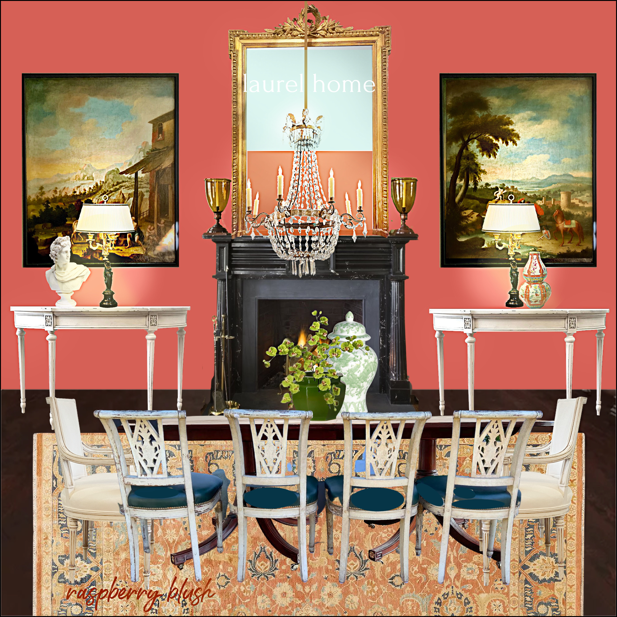
This is Raspberry Blush. You know, it doesn’t look that bright here. In fact, it looks a bit pink. That doesn’t mean it will look pink in your room. BTW, if that fireplace looks familiar, it’s because it is. :]
I wish I could form a decent sentence right now, but I can’t. This is not trying to be what I think would work for Ina Garten’s dining room. But, if we put a gas fireplace on the wall, one sees how lovely it would be when walking in the front door.
For funsies, I also did another board with Racing Orange Red, one of the Laurel Home Benjamin Moore Curated Paint and Palette Collection colors.
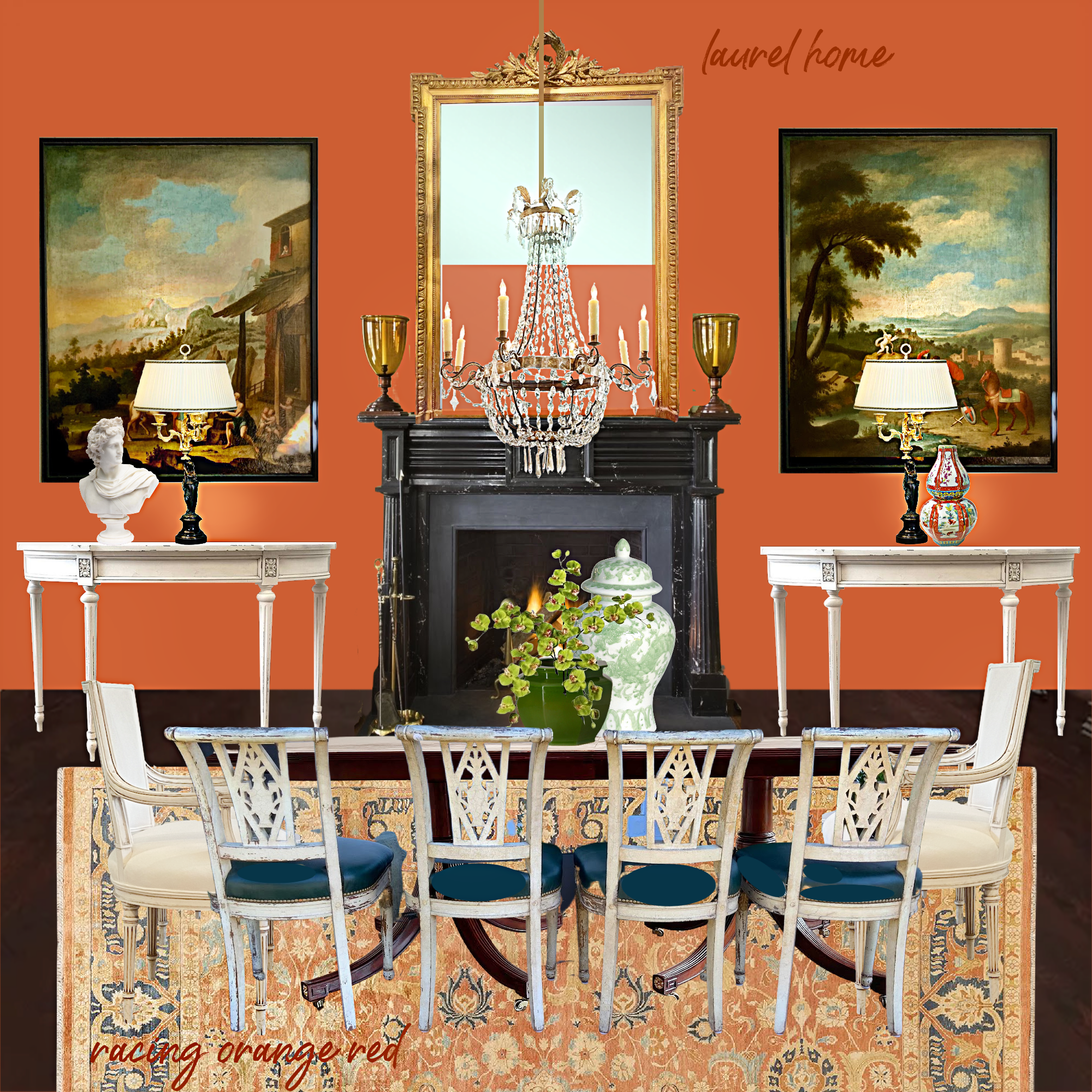
I like this version better. In fact, it reminds me a bit of Gil’s NYC townhouse that he sold after he got MARRIED. What do you think?
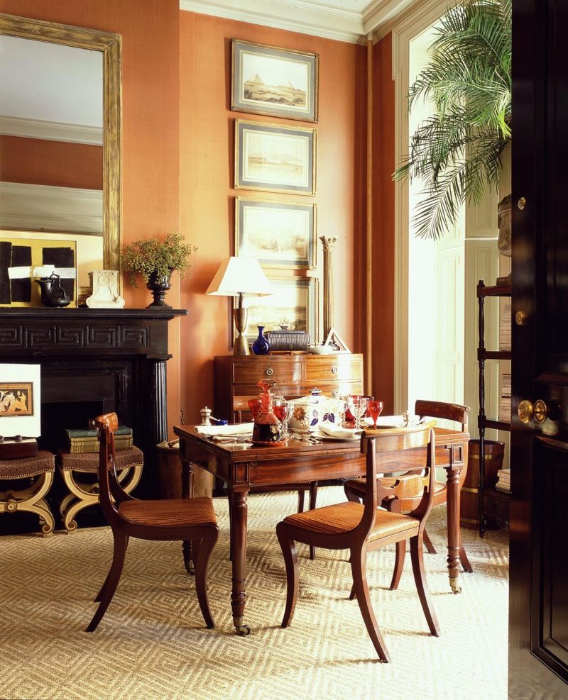
Gil’s color is more orange.
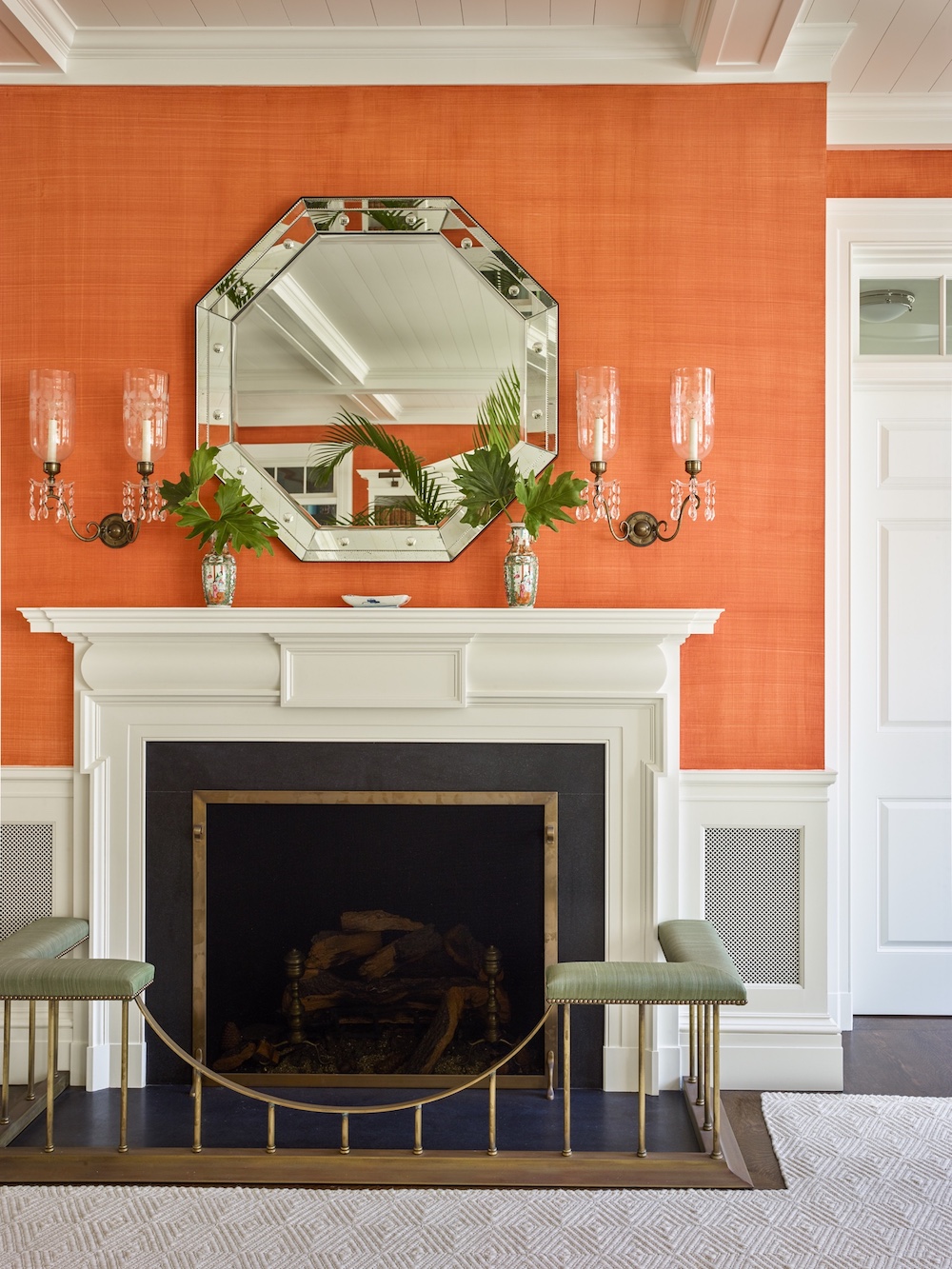
And one last coral color in a gorgeous vignette by Gil Schafer.
Please be respectful of other people’s opinions. You don’t have to like what I like. I like a lot of things. That doesn’t mean I would do them in my home; it means they are well done-and well-designed.
For the next post, I will try to explain more about balance and come up with a beautiful scheme to go with dried blood.
Thanks to those of you who sent me kind messages. I’m a little better but need to take it easy.
xo,

PS: Please be sure to check out the beautiful HOT Sales. There are lots of early Black Friday deals. Also, the all-new Holiday Shop for 2022 is now open.
