Table of Contents
Dear Laurel,
Thank you so much for all of your fantastic posts. Here’s my dilemma that I hope you can write about. I need help with the best neutral paint colors that are more interesting that the usual gray and beige. Here’s our situation.
We’re in a rental and are going to buy a house we just found.
The owner has agreed to repaint, as it was last done 30 years ago. The good news is he’s willing to let us choose the colors we want.
The problem is, I do want to redecorate and maybe do some renovations.
However, that might not be for another three years, or longer. I need some great neutral paint colors that go with everything. Well, that is, if there is such a thing. However, I don’t want boring neutral paint colors.
Sincerely,
Pinky Bayje
***
Hi Pinky, and Everyone,
Paint colors are one of my favorite topics, and one aspect I especially love are neutral paint colors that, instead of the usual:
BEIGE
GRAY
WHITE
are full of color!
There are other blog posts about beige and gray paint colors, and how to keep them from being boring and lifeless.
However, today, I’d love to examine colorful paint colors that act like neutral paint colors.
Laurel, are these neutral paint colors in that they go with everything pretty much?
The answer is, yes, for the most part. In the Laurel Home Essential Paint and Palette Collection, I call these Universal Colors. There are one or two here that aren’t on the list. Perhaps in the last seven years, I’ve loosened the reigns on colors that go together.
As for an explanation of WHY some colors work with everything and some don’t, I have examined it closely and can’t come up with any definitive reason. The best one is that most of these colors appear abundantly in nature.
Please be relieved that I just edited out several hundred words about a lot of boring color theory.
However, if you’d like to read more, about color theory and complementary color schemes, I found a terrific blog that explains this very well.
So, let’s move on and discuss 12 of my favorite colorful neutral paint colors. Most of these paint colors are Benjamin Moore, but a few are Farrow & Ball. Please assume it’s BM unless otherwise stated.
OPAL and TAYLOR TACK, a new Farrow & Ball color)
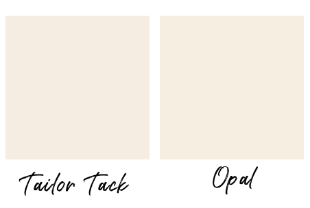
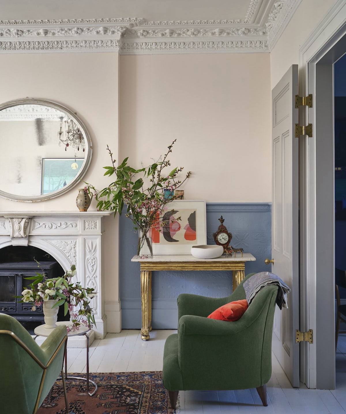
These twin colors are a warm, pale pink and the perfect choice for someone who’d like to try pink but maybe someone else they live with doesn’t like pink.
HERB GARDEN and CALKE GREEN (F&B)

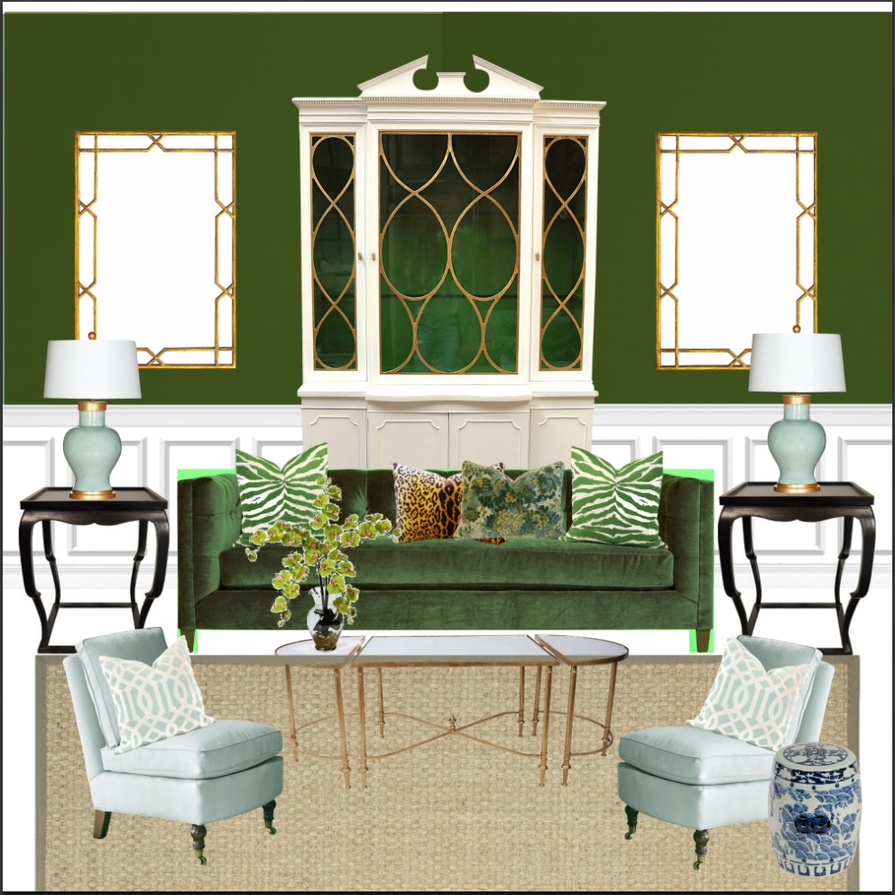
Herb Garden is from the Laurel Home Essential Paint and Palette Collection. It is a beautiful mid-tone green.

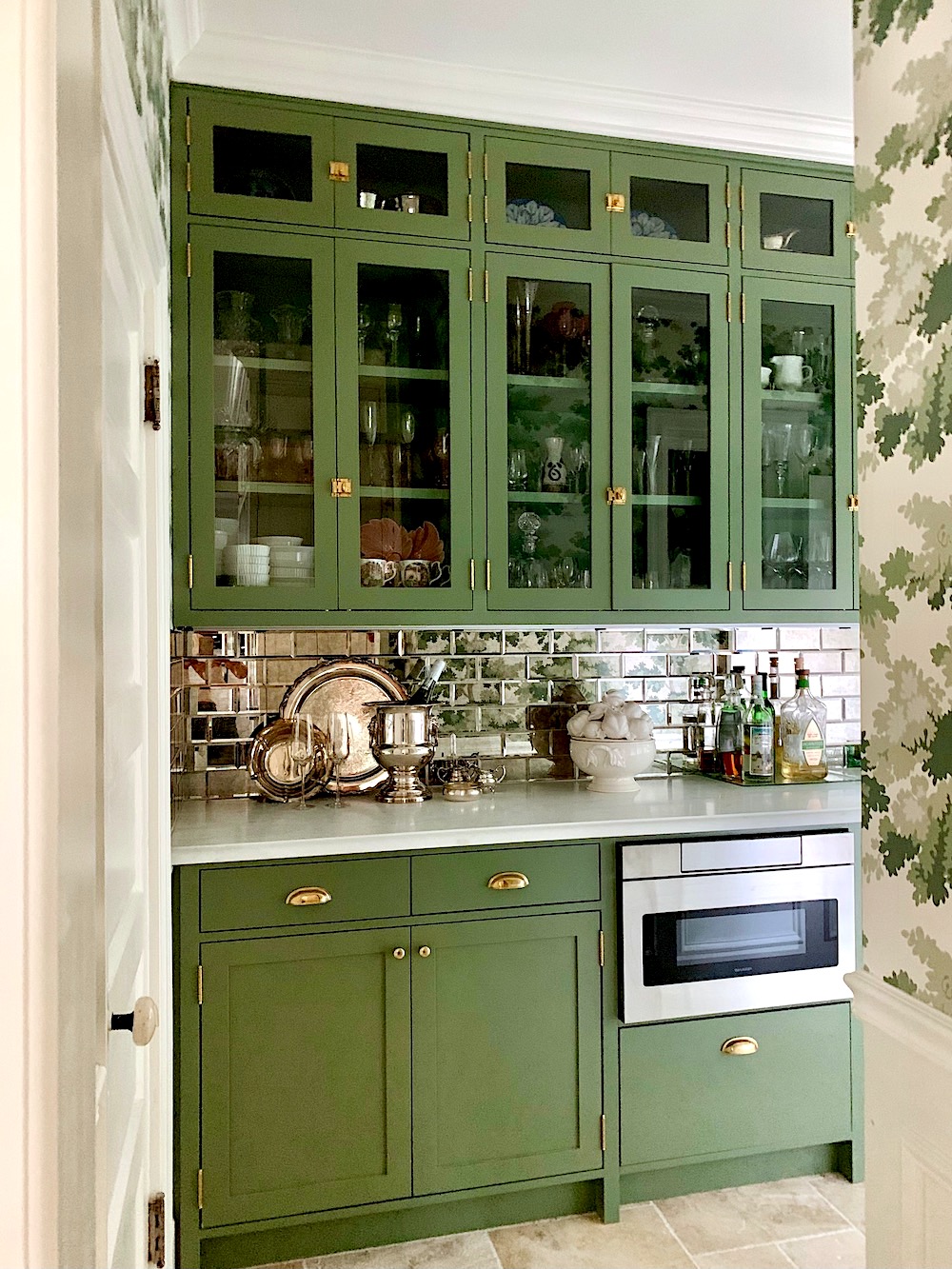
Calke Green is the color Mary used in her beautiful kitchen pantry a couple of years ago. It’s a bit darker but very close. Both are beautiful and colorful but definitely neutral paint colors.
AVOCADO GREEN and CHURLISH GREEN (F&B)

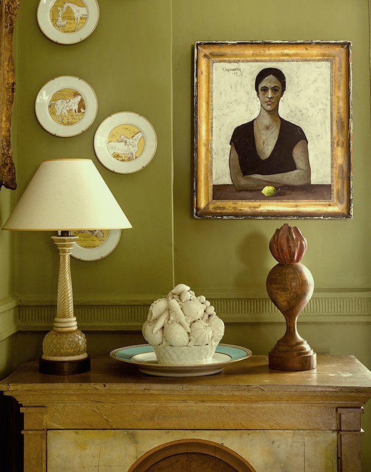
Churlish is one of the archive F & B paint colors, and Pale Avocado is a color frequently mentioned on the blog.
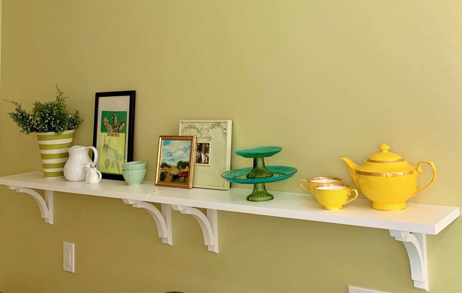
My old kitchen in Bronxville, NY was painted Pale Avocado. I lived with it for eight years and never tired of it.
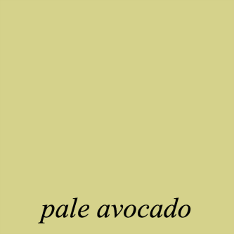
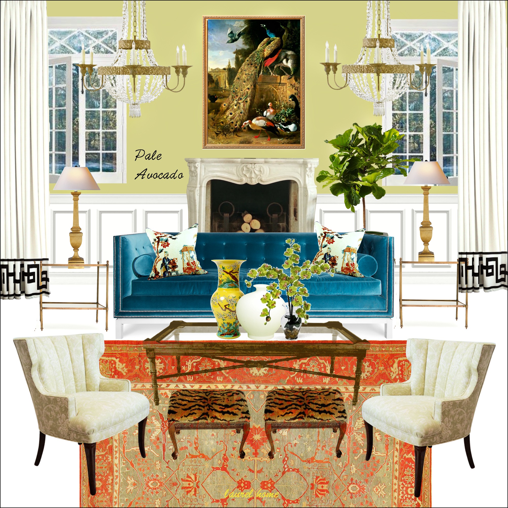
A palette board from the palette collection
TIMSON GREEN
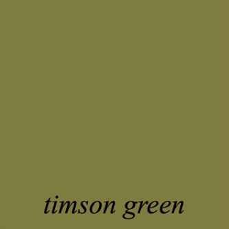
This beautiful olive green would be terrific in a kitchen or library.
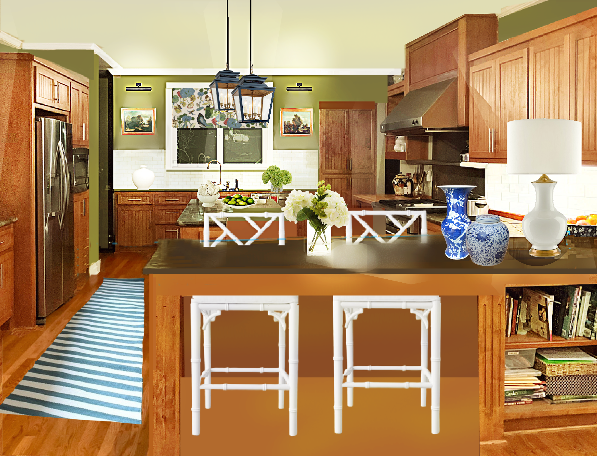
We used Timson Green in Mary’s kitchen refresh from last February.
COLONIAL VERDIGRIS and BEVERLY (F&B)
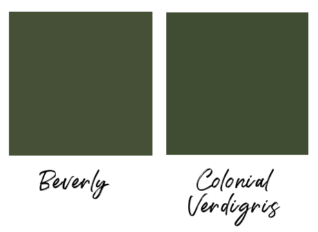
Beverly is a new color at Farrow & Ball. You can read my review of the new Farrow & Ball colors here.
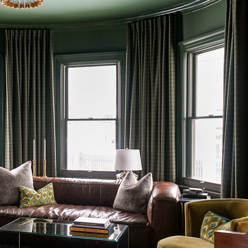
Stunning living room via Renovation Husbands painted Colonial Verdigris.
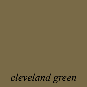
CLEVELAND GREEN
This is Bunny Williams favorite color. Or, at least, one of them.
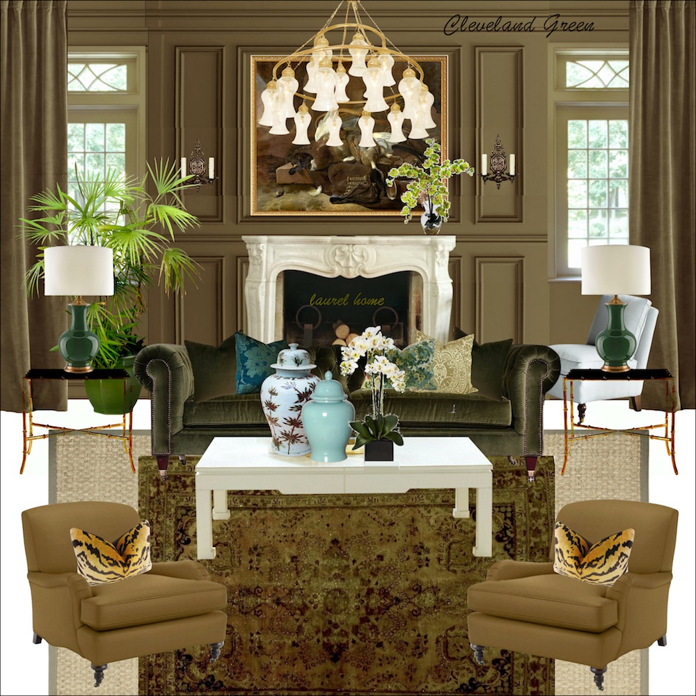
So, of course, I had to put it in the Laurel Home Paint & Palette Collection.
F&B PANTALON

This is another archived color from Farrow & Ball. Years ago, I was speaking to a rep from F & B who went ga-ga over this color. While it looks like green-tinged mud, here, I’m sure it’s glorious on a wall. Some of the best wall colors look like crap on a chip.
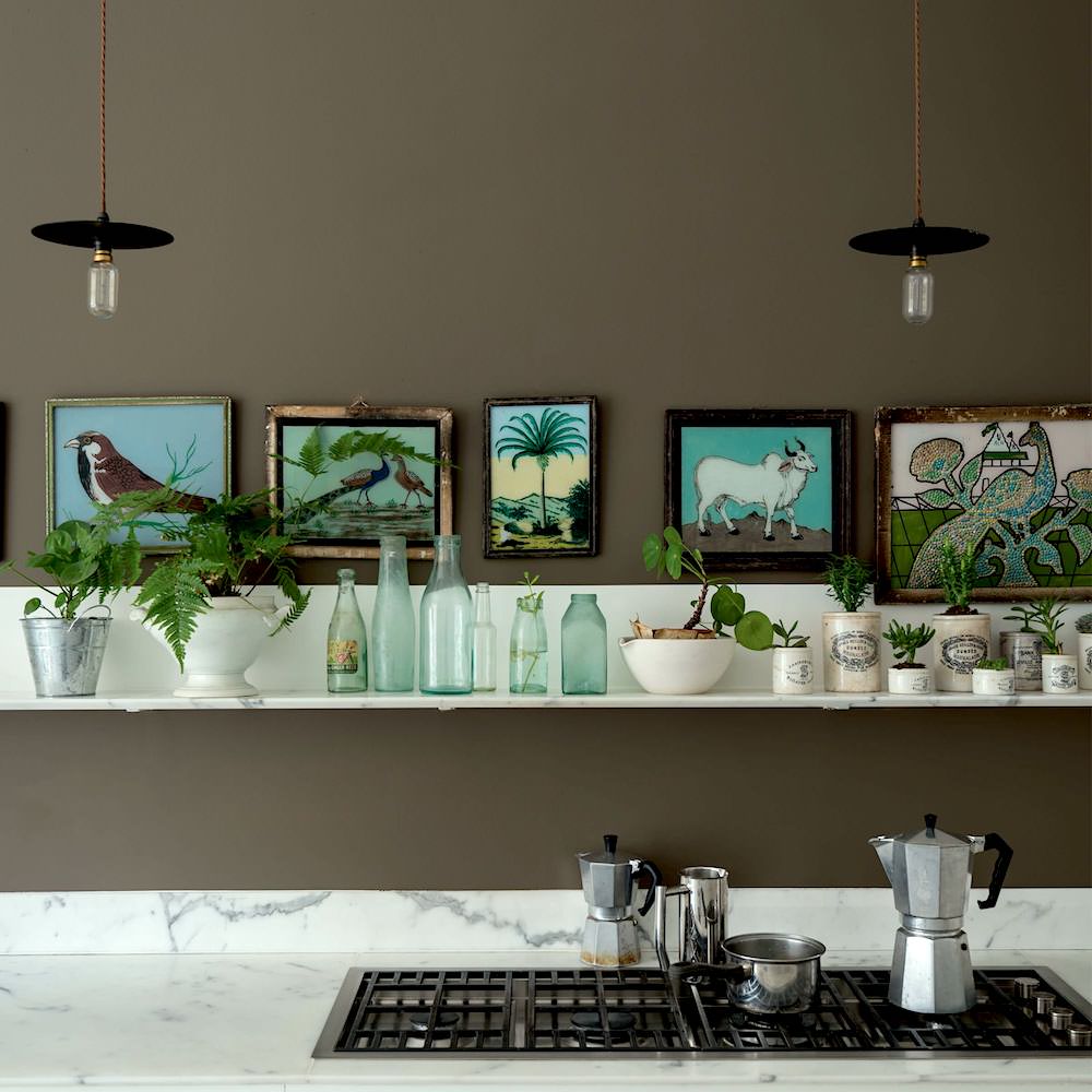
DOWN PIPE (F&B)

I’ve long been intrigued by this deep charcoal gray which has a cult following all around the globe. Sometimes it looks a little blue, and sometimes a little green.
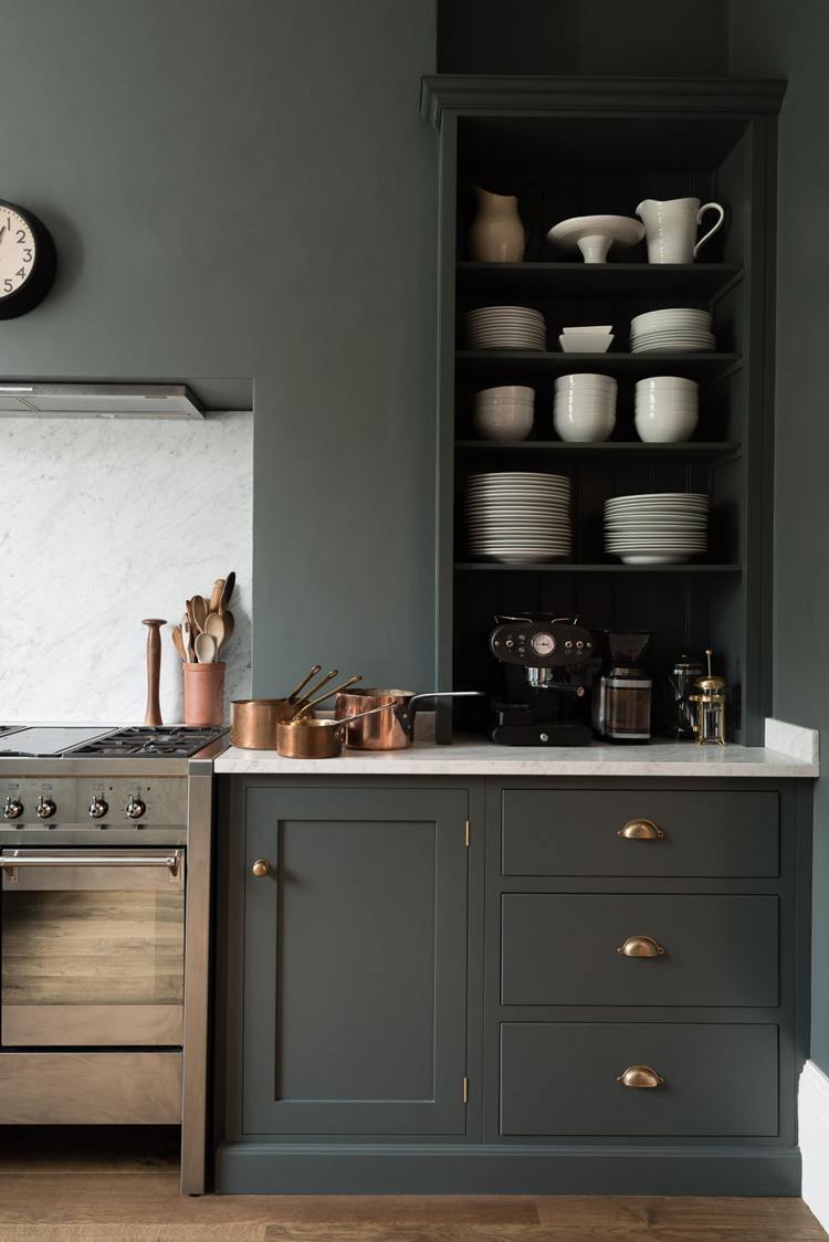
This is from my favorite DeVOL kitchen. Some of you may remember that I wanted to run off with this one.
So, why aren’t you doing this for your kitchen, Laurel?
Ack. I can’t. The kitchen has been telling me the entire time. “I need to be a creamy white.”
However, there’s a little vestibule on the way to the upstairs bathroom, and I’d love to paint that space Down Pipe.
DOLPHIN’S COVE

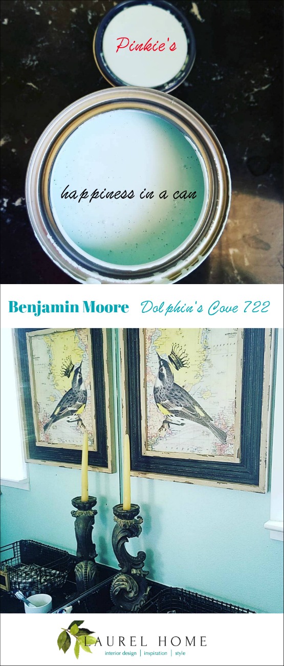
Via Pinky Crabtree, a lovely friend on Facebook! Although, I’m rarely on FB these days.
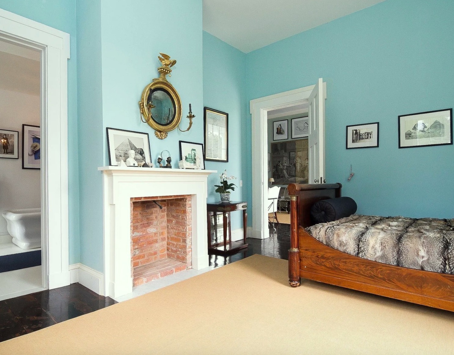
Remember the summer of 2020 when I was looking at houses? Well, I came across this Greek Revival gem in Kinderhook, NY.
VAN DEUSEN BLUE

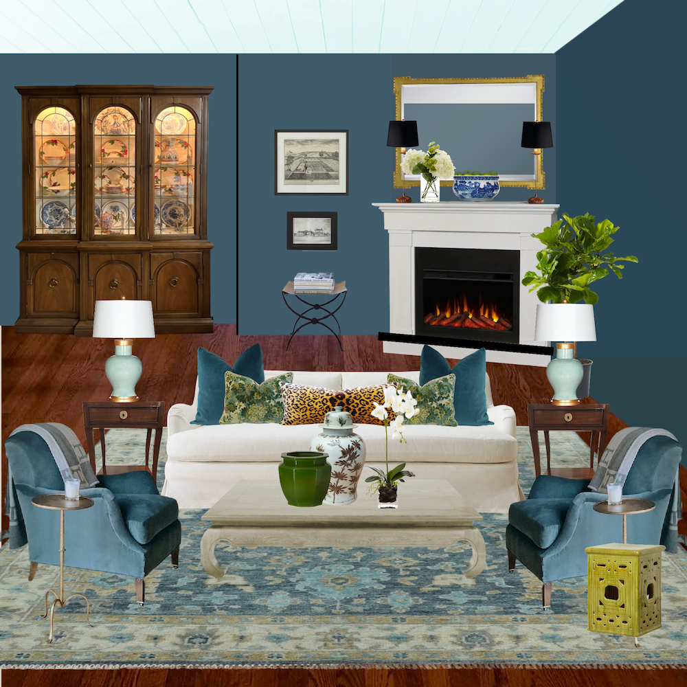
Ahhh, we were just talking about Van Deusen Blue in Cher’s home. She’s going great guns with her updates. You can see a pic of her new wall, here.
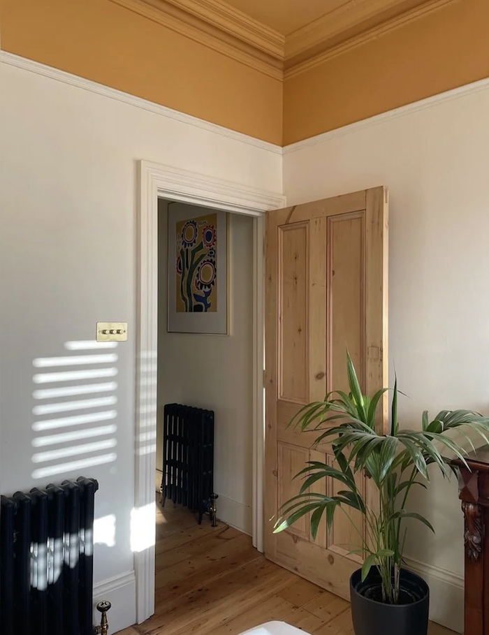
BRYANT GOLD hc-7 and ORANGERIE – (F&B)
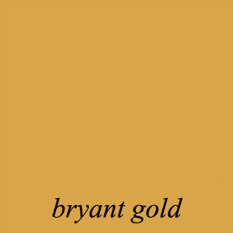
I know this color may seem quite saturated and bright for some. However, this color is beyond magical at night.
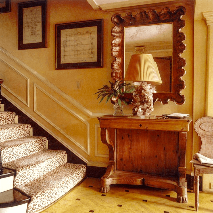
Miles Redd and Gil Schafer collaboration from several years ago.
CHILI PEPPER
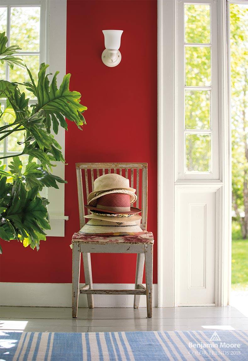
This is actually Benjamin Moore Caliente. But, close enough. I’ve used this for clients a couple of times. It’s not too bright and looks incredible when the lights come on.
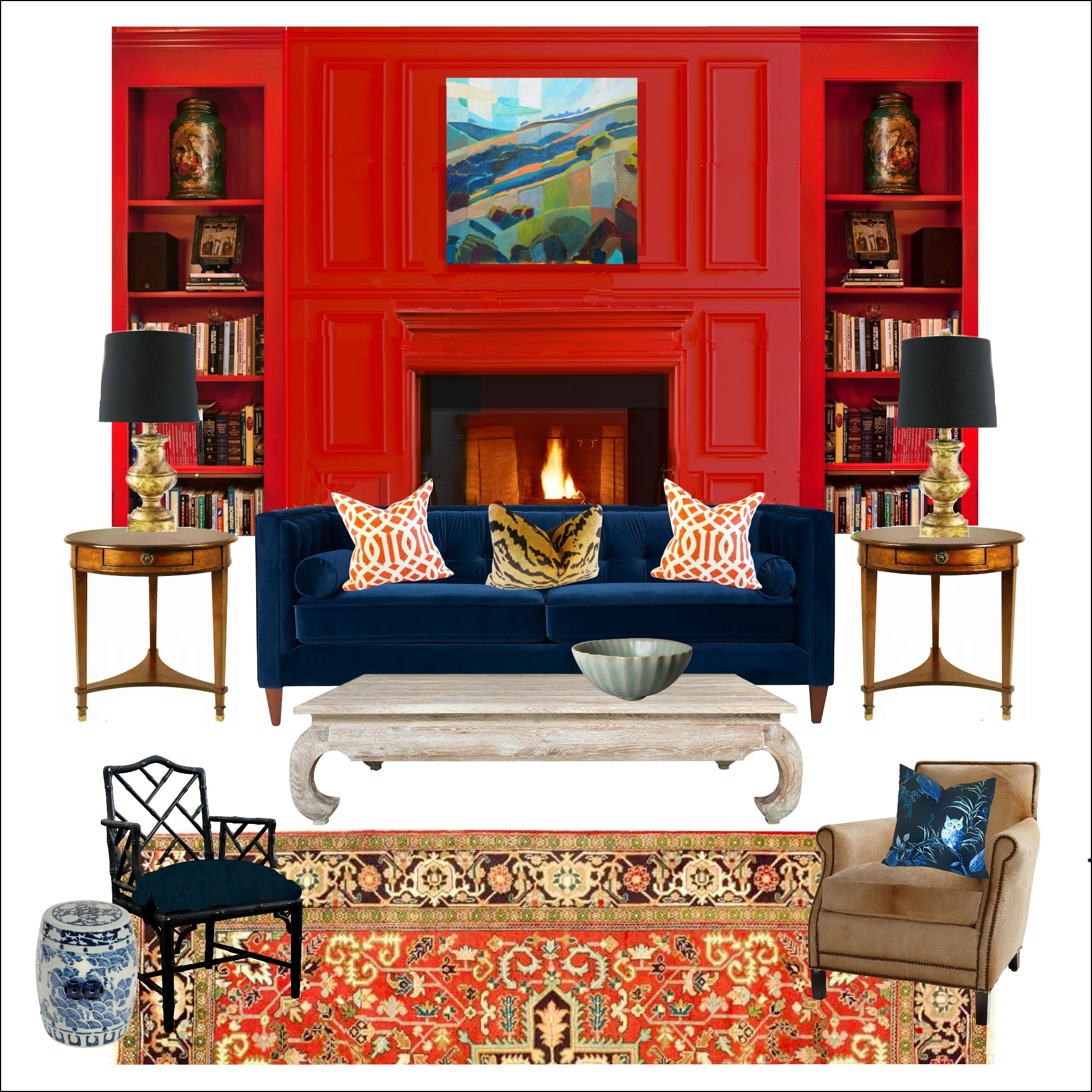
I also used it for one of my palettes in the Laurel Home Paint and Palette Collection. There are 40 boards, in all.
Hope everyone got enough rest, and that you enjoyed this post about colorful neutral paint colors!
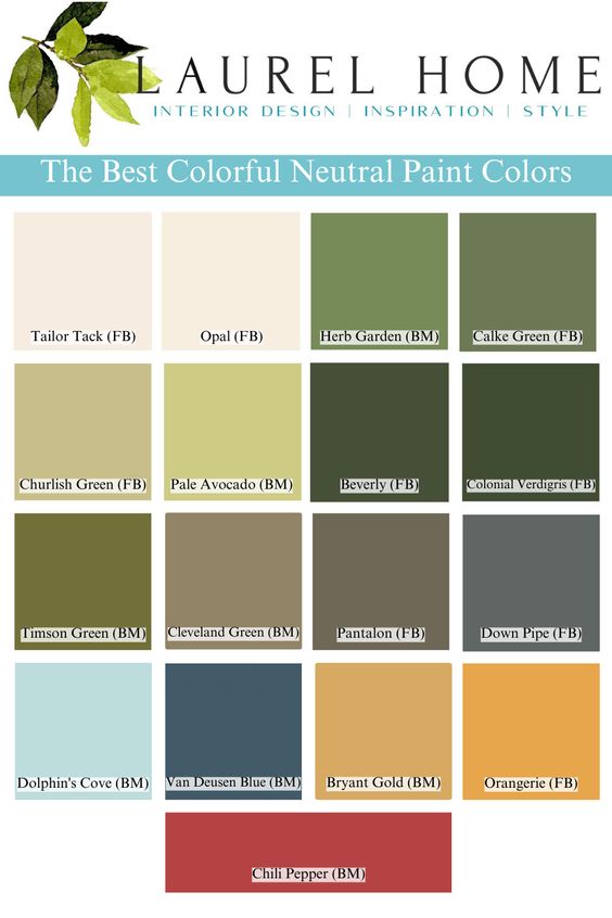
Bridget (Please see her comment) was so kind to make a graphic that you can pin to Pinterest, for reference.
If you’re looking for the best paint samples, I recommend Samplize, peel and stick, easily removable (over and over), and made with real paint! You can get Samplize for both Benjamin Moore and Farrow & Ball, here
xo,

PS: Please check out the spectacular and newly updated HOT SALES!

