Table of Contents
Every year, paint brands reveal THE colour of the year (also known as COTY for short) for the upcoming calendar year developed by their colour teams. Of course, there are many paint brands and they don’t all agree on the same shade. So what is the resulting colour palette of 2024 going to look like?
The COTYs and their creators are responsible for the following year’s paint trends which influence (whether consciously or subconsciously) our paint colour choices and decisions. While some companies agreed at least on the overarching theme or type of shade, others went in the opposite direction resulting in two (slightly opposing) colour tribes.
So if you’re looking to redecorate in the new year or sometime in the near future, these are the shades and the colour schemes that you should keep an eye on according to paint experts. Which tribe are you going to choose?
The paint colour palette of 2024

(Image credit: Dunn-Edwards)
While the two themes we’ve been seeing are very different, there is a common thread of wellness and making your home a calming and revitalising refuge.
‘For 2024, paint shades are getting richer and deeper. It is about adding warmth and cocooning within the home,’ says Grazziella Wilson, head of creative at Ca’ Pietra and Proper Good Paint.
Blue shades are a recurring theme too, which can be found in both camps as Benjamin Moore, Dunn-Edwards and Valspar all opted for tones of the colour blue. ‘All the blues we have seen are centred in tranquillity and calmness,’ Grazziella confirms.
So what are these two colour tribes of 2024?
Fresh and light

(Image credit: Dulux)
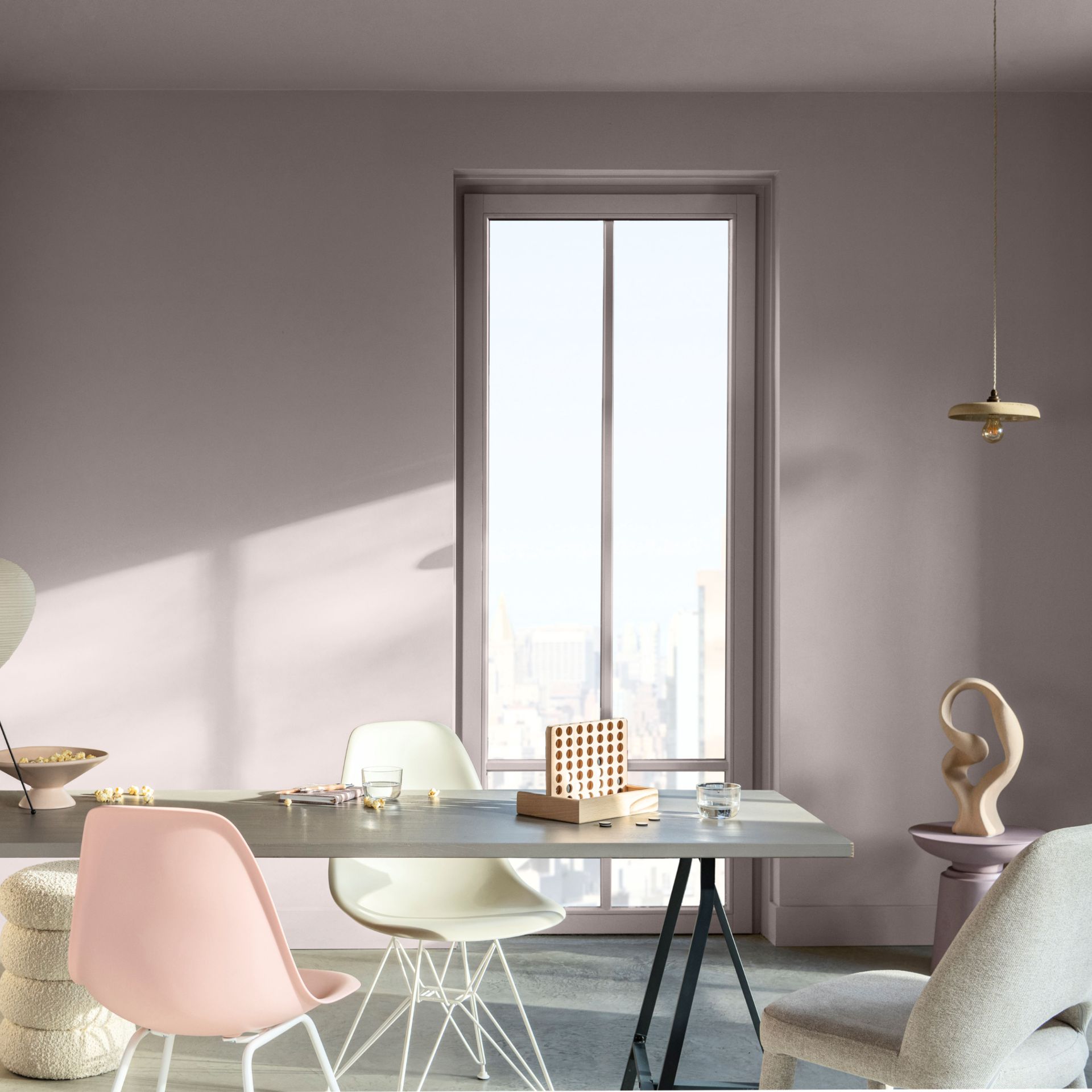
This colour tribe is led by Sweet Embrace, the Dulux colour of the year 2024. This shade of calming, soft pink has been the most prominent COTY 2024 since its launch last month as is always the case with Dulux’s focal shades.
Alex Stubbs, interior stylist at Flitch, comments on this defining hue, ‘Sweet Embrace is a perfect choice in the bedroom as it promotes relaxation and cosiness. Pair it with light greys, whites, or creams to create a harmonious and tranquil bedroom retreat. Adding blush or dusty rose accents through accessories such as bedding, curtains, or throws and pillows can enhance the overall sense of comfort and tenderness.’

(Image credit: Valspar)
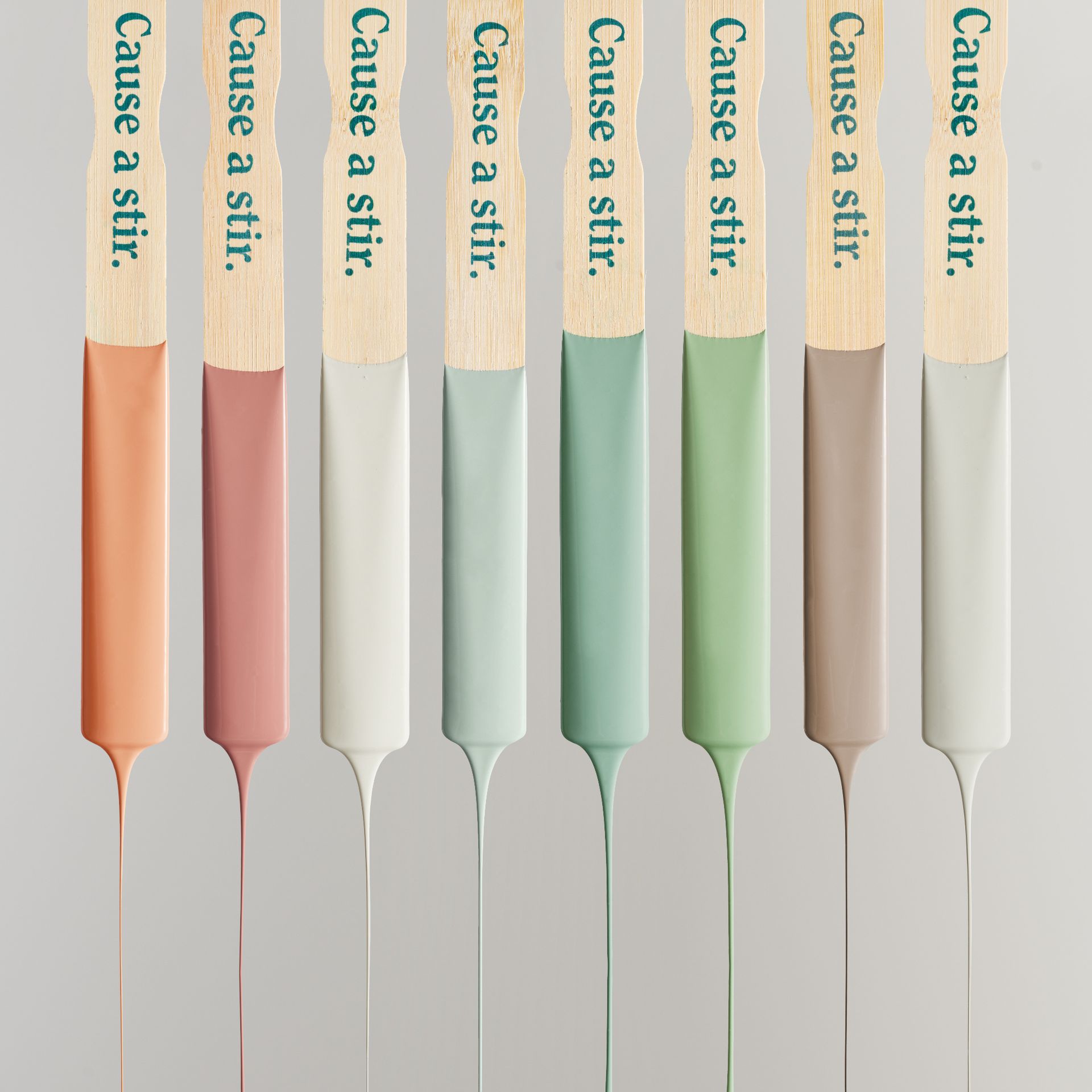
It is joined by Lick’s 2024 colour palette of the year. You read that right, Lick didn’t just launch a colour but a whole colour palette centred around beige, which has been modernised by pairing it with rejuvenating shades like zesty oranges and fresh greens. What a bright paint idea!
As for the aforementioned blues, Valspar’s Renew Blue falls into this category as a peace-inducing shade with green undertones. And as does Dunn-Edwards’ Skipping Stones – a serene, steel blue inspired by the colour of the sea.

(Image credit: Lick)
Dark and moody
‘In contrast, moody and dramatic colours are about warmth, sophistication and statement making. It allows you to curate your individual style and live in the moment,’ Grazziella explains.
This is perhaps most true when it comes to American paint brand BEHR’s COTY 2024 named Cracked Pepper – a softened shade of black. ‘This soft black is described as a bold and moody paint colour that offers endless expression for every style – and I agree I love this shade applied to walls, large rugs and bedding,’ says Daniel Prendergast, design director at The Rug Seller.

(Image credit: Graham and Brown)
And while the shades in this category are on the darker side, they all still have a softness to them as demonstrated by Cracked Pepper, as well as Graham and Brown’s Viridis – a beautiful sage green created with the intention of evoking a calming refuge away from the hustle and bustle of everyday life.
‘Thanks to the enduring influence of biophilia on home interiors, shades of green have been infiltrating colour trend predictions for a good few years,’ Daniel says. ’Shades will vary from a lighter leafy green to a deeper khaki. Treat this shade as a neutral. Don’t be afraid to go big and build your scheme around it.’

(Image credit: Benjamin Moore)
And last but not least, there is Benjamin Moore’s colour of the year 2024, Blue Nova, announced just last week. A dark yet warm shade of blue (yes, really) with violet undertones inspired by the night sky. It’s a confident colour filled with personality, as are all the shades in this category. So don’t be afraid to go big and bold, as Daniel said.
