Table of Contents

Rules are all well and good but playing with colour rules you should be breaking is even more satisfying.
When it comes to interior design, we’re used to hearing about the classic colour combinations that work in a space. But sometimes it’s about going beyond those to be able to create a space that truly sings and is reflective of your personality.
‘You should definitely break the rules when it comes to colour,’ agrees Emma Deterding, Founder of interior design brand Kelling Designs. ‘If you think of your garden for instance, nature provides a mix of colours and everything just works. It’s just the scale, pattern and tones that matter.’
‘We all have our favourites and know certain colours work really well together such as orange and pink, pink and red and orange blue, but don’t let your lives be governed by rules that are meaningless and spoil your fun! Experiment with colour and pattern, choose designs you truly love and make you happy and let your personality shine through.’
We’ve spoken to the experts and discovered 8 of the most common interior design colour rules you should be breaking…
Colour rules you should be breaking
‘Sometimes, breaking the rules can lead to unexpected results,’ says Flora Hogg, Interior Design Consultant at Craig & Rose Paints. ‘Taking risks and trying something new can lead to a serendipitous pleasure that can’t be achieved through strict adherence to rules.’
1. Avoiding dark colours in small rooms
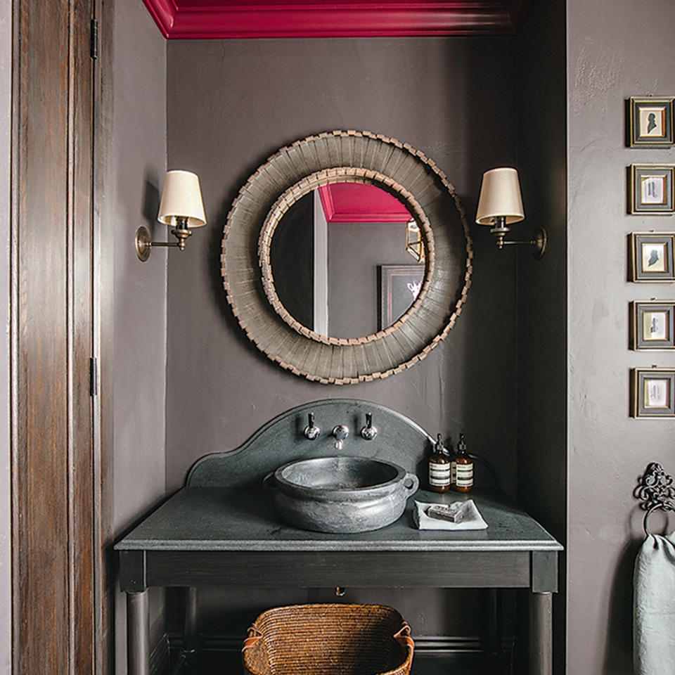
‘One of the big colour rules you should be breaking is avoiding dark-coloured paint in small spaces,’ advises Michael Rolland, DIY Expert at The Paint Shed. ‘There is a misconception that painting a small room with dark colours will shrink the room – this is not true.’
‘Dark colours don’t always lead to small, dark spaces. Dark colours can be a good idea for poorly lit rooms and smaller rooms because you are playing to the limitations of natural light rather than fighting it.’
2. Choosing white walls to be “safe”
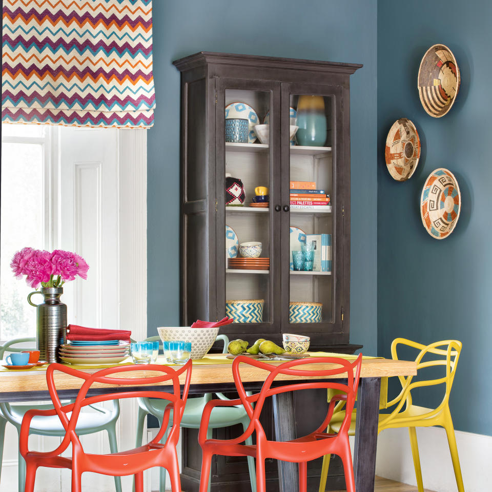
‘I hate making rules but if you are not confident about adding colour to your home, I would advise against keeping your white walls, which can be really hard to make work with other colours,’ advises Annie Sloan, Founder of Annie Sloan Chalk Paints.
‘Instead, start with a mid-tone colour and go from there – a blue wall, for example, is a great place to begin.’
3. Only using complementary colours

Choosing complementary colours seems like a no-brainer for interior design, but it’s actually one of the colour rules you should be breaking.
‘Clashing can be provocative but also demonstrates originality in a scheme, so pick one of your favourite dominant colours and start placing them against all colours on the colour wheel,’ advises Emma Bestley, Creative Director of paint brand YesColours. ‘I guarantee you will find something that sings to you. If it works for you, it will work for your home.’
‘Colour blocking is regularly seen and experimented with in fashion and the same creative twist can be applied to your home,’ continues Emma. ‘To ease yourself in, try experimenting with a few homeware accessories, it’s a great way to see if colour clashing is for you. Remember, you can always tone a colour scheme down by incorporating one or two neutrals.’
‘I absolutely adore vivid, juicy, Vitamin C packed orange with a soft pastel pink,’ suggests Annie Sloan. ‘Both colours are playful and beautiful, so they work fabulously in a social space such as a kitchen, living room or diner. The juxtaposition of hot orange and a cool-toned pale pink is simultaneously knowingly retro yet elegantly contemporary.’
4. Painting the ceiling white
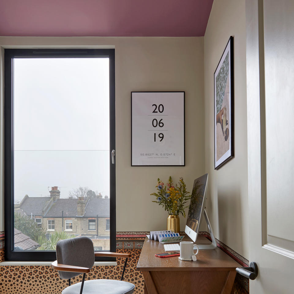
‘Another rule that many people follow is to always paint your ceiling white,’ notes Sarah Lloyd, Interiors & Paint Specialist at Valspar Paint. ‘However, although white is a safe option, you can bring so many more elements and depth into the room by painting it a different colour.’
‘It does depend on the size of the room, but experimenting with different colour shades, other than white, on your ceiling could really bring the space together. If you decide to paint your ceiling and walls the same colour this will give a cocooning feel to the space and can often be referred to as colour drenching, if you continue to use the same colour throughout the room.
;A white ceiling is a good choice if you’re seeking a classic design and don’t want to draw attention to the upward in the room, however, painting ceilings darker is becoming more popular,’ adds Michael from The Paint Shed. ‘If you’re after a bolder and riskier look, then a darker ceiling can make a room feel cosier and more intimate.’
5. Being led by colour theory
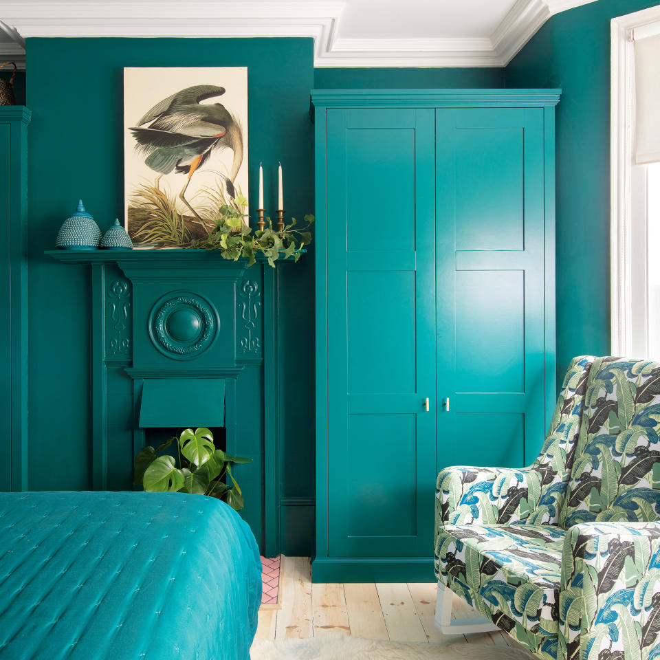
‘When it comes to colour rules you should be breaking, in terms of choosing colours try not to be influenced by the principles of colour theory,’ advises Clare Walsh, Brand Expert at Kukoon Rugs.
‘While useful for understanding how two colours work together, I believe it’s more important to select shades that you have an emotional response to, regardless of whether they match.’
6. Avoiding pairing blue and green
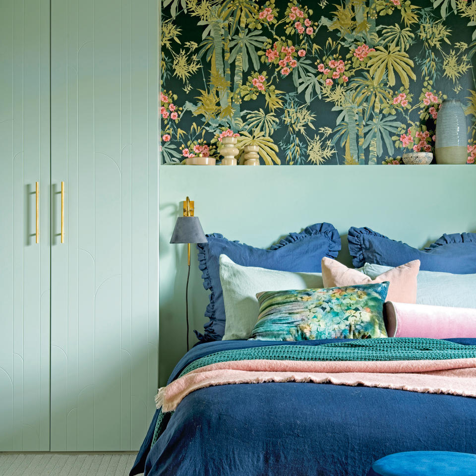
‘”Blue and green should never be seen” – everyone knows this is nonsense!,’ says Clarissa Hulse, founder of homeware brand Clarissa Hulse. ‘A deep navy compliments teals and earthy olives perfectly.’
‘A colour scheme consisting of one colour can be flat, you need colour to see colour. So when looking for colours that go with green, know that blue will help give depth and interest.’
7. “Disguising” cabintery
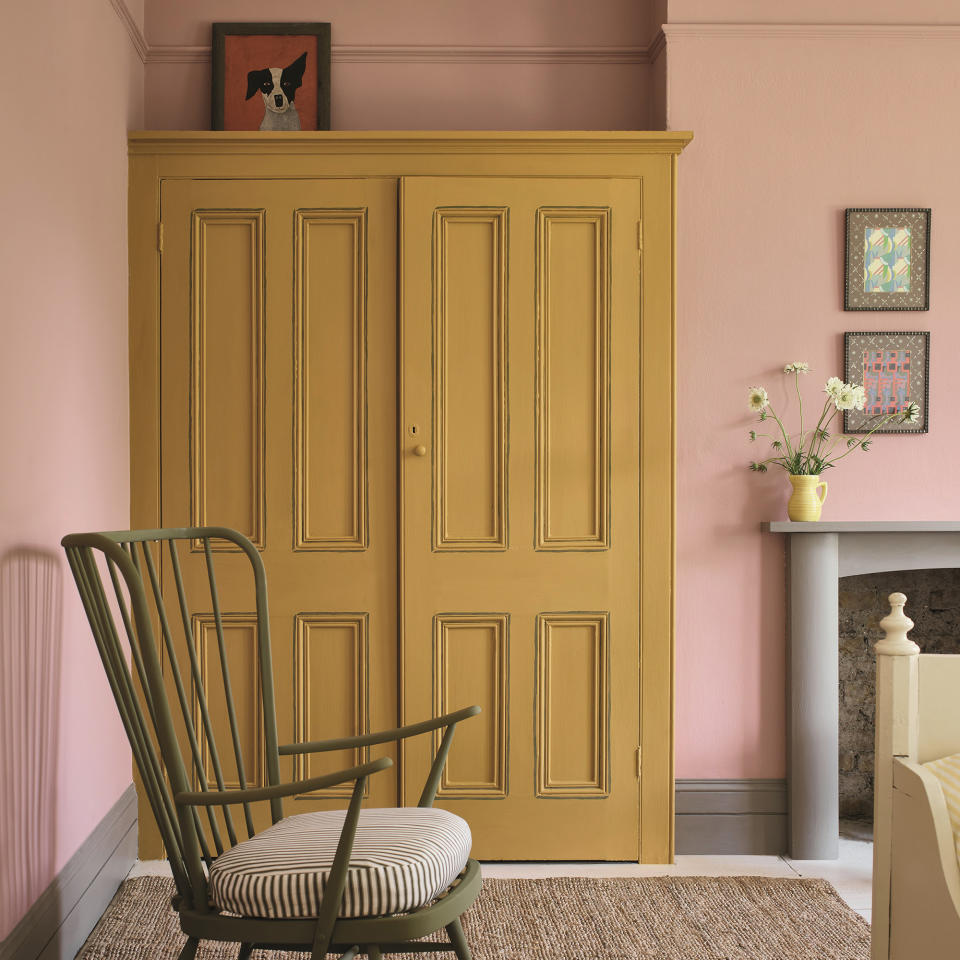
An easy way to make a room appear bigger is to disguise cabinetry and wardrobes by painting them the same colour as the walls. And while we love this trick, you can make this one of the colour rules you should be breaking if you want to make more of a statement.
‘Rather than painting built-in wardrobes to make them “disappear”, why not make these space-saving units a feature?,’ suggests Annie Sloan. ‘An uplifting shade evoking warmth and joy, when paired with softer pastels it creates a comforting yet unexpectedly fun backdrop.’
8. Limiting yourself to one feature wall
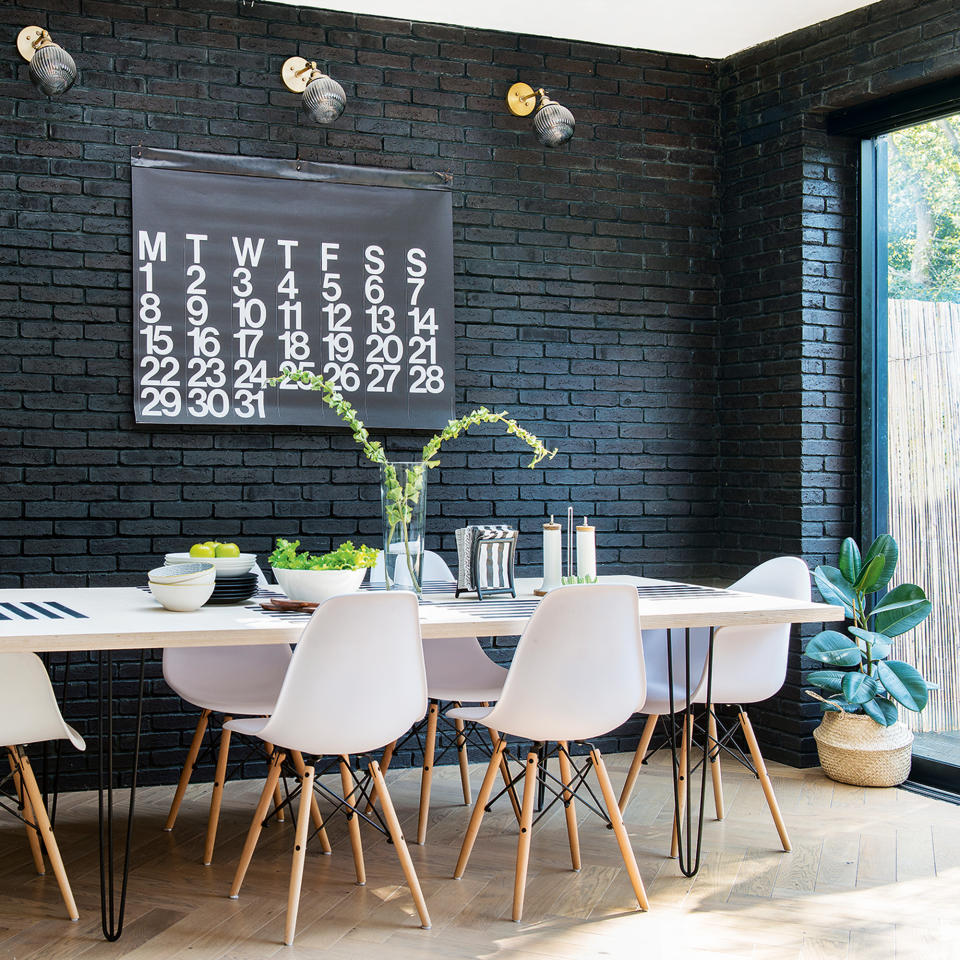
While we love a bedroom or living room feature wall, you shouldn’t let yourself be held back by thinking that’s what you have to do. There’s long been a push to only paint one wall of a strong colour but you can take the shade onto every wall without worry.
‘I think edges of contrasting colours emphasise the difference and draw attention more than a seamless wall of colour, which will become a backdrop,’ muses Clarissa Hulse.
