Rainwear brand Rains has juxtaposed minimalist restraint with free-form contemporary artworks inside its revamped flagship store in Aarhus, Denmark.
The brand’s first-ever store, originally opened in 2016, was updated with the introduction of industrial touches such as graffiti and stainless steel hardware alongside custom works by local artists.
“We want to tickle the customers’ curiosity,” Rains‘ in-house design team told Dezeen.
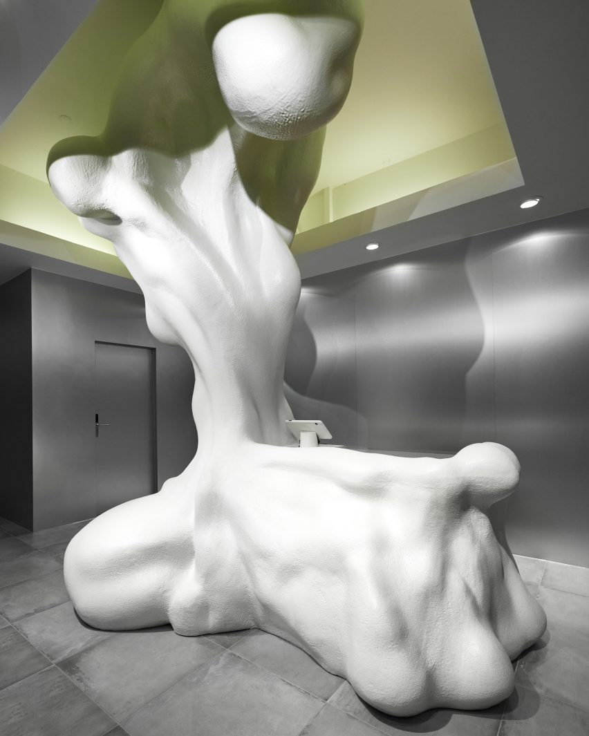
At the centre of the store, Danish artist Jacob Egebjerg played with the convention of the cash desk by creating a vast sculptural element to envelop this functional area.
Carved from polystyrene foam, the sculpture resembles a cascade of liquid caught mid-splash, which tumbles from the recessed, illuminated ceiling down to the concrete floor in a nod to the brand’s waterproof rainwear.
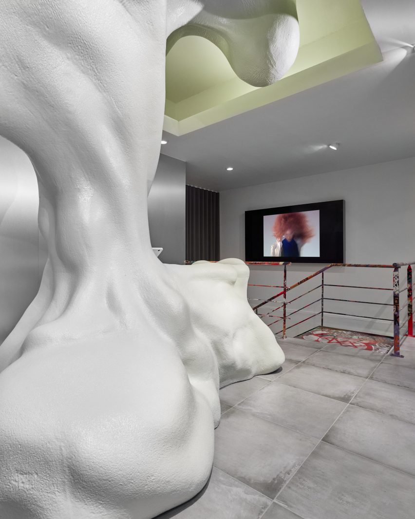
“The store was the first Rains store ever and we really wanted to manifest that with an extraordinary installation,” the design team explained. “Egeberg was tasked with creating a work of art with an integrated desk that would attract the attention of passers-by.”
“It brings a contrast to the clean shapes and surfaces of our point of sale,” the team added. “Our products are very clean, so to add contrasts to our stores, we use shapes and surfaces to create this duality.”
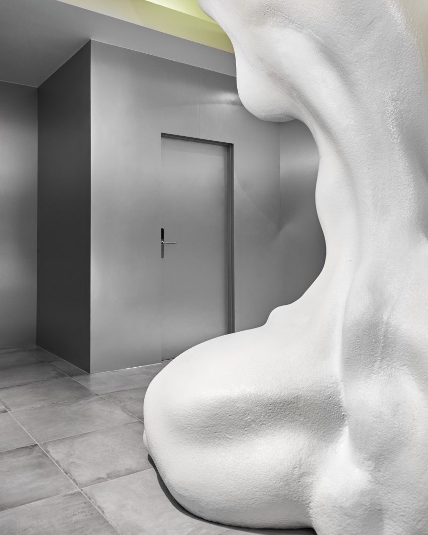
Allowing Egebjerg’s sculpture to take centre stage, the rest of the store is an exercise in cool, restrained minimalism.
Display cases are formed from industrial materials such as stainless steel and glass, chosen for its transparent qualities.
“Your eye can see the full room and isn’t blocked by a non-see-through material,” the team explained. “The products are just floating in the room.”
Echoing the qualities of the glass and steel, the Rains team used large-format concrete tiles for the floor, creating a “modern, refined but still simple base for the sculpture”.
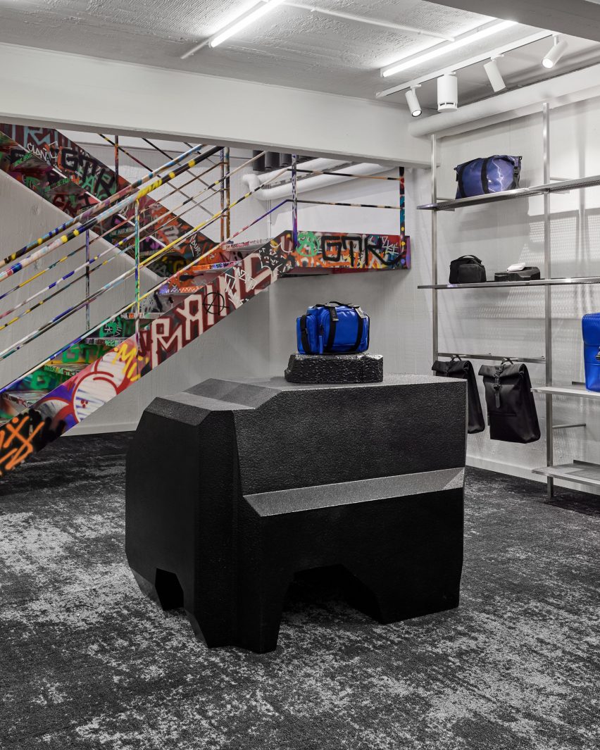
Downstairs, in a rare concession to softness, the design team opted for a custom black carpet with a distressed patina effect – another nod to the industrial.
“The carpet was chosen to give the white room a contrast and some more depth, while also providing some great acoustic benefits,” the design team explained. “The raw ‘scratchy’ print has been chosen to match the raw expression in the walls and ceiling.”
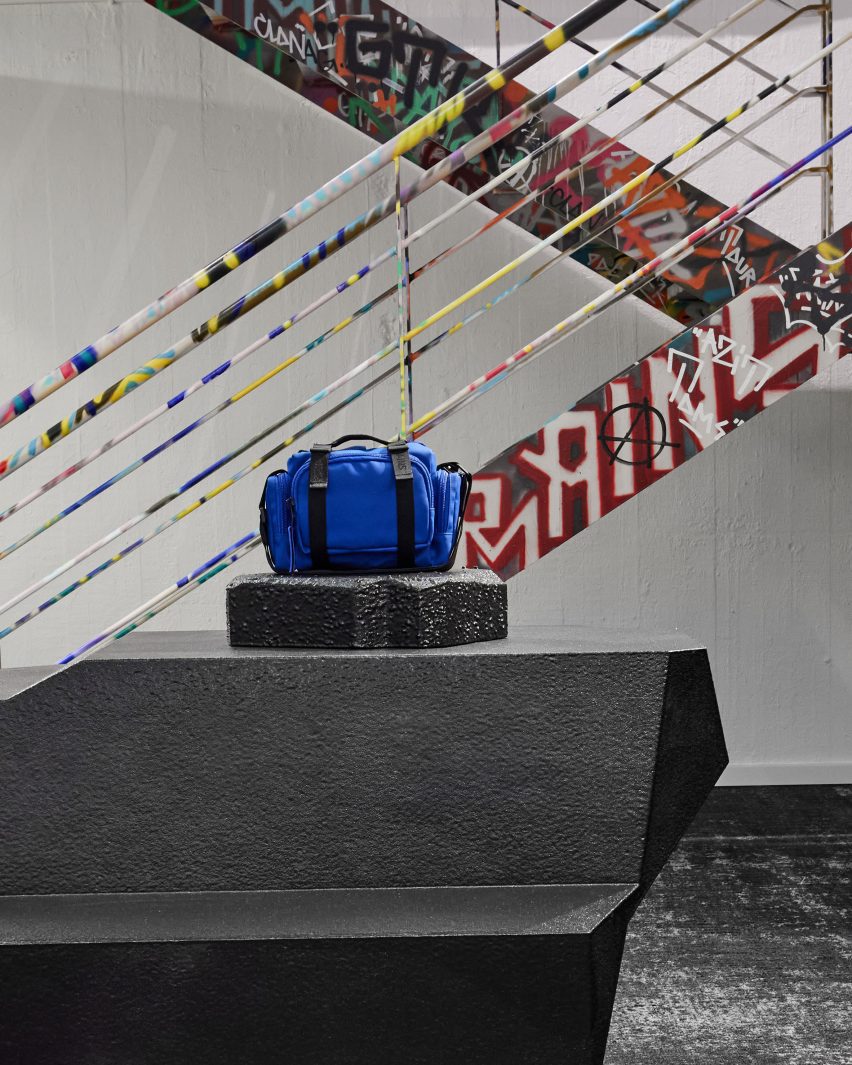
On this level, a futuristic black display plinth was carved from the same polystyrene foam as the sculpture on the ground floor.
Against a palette of greys and whites, colour leaps out in the form of another site-specific artwork: a graffiti-inspired piece that decorates the staircase, designed by Rains and realised by local artist Peter Birk.
“When we work with external artists, we also let them express themselves so their personal style shines through,” the brand explained.
Other sculptural shop interiors featured on Dezeen include a swimwear pop-up by SKIMS with a three-tiered diving board at its heart and an “otherworldly” moss-covered installation at a luxury bag store in Putrajaya, Malaysia.
The photography is by Rains.
