
Table of Contents
Just a few years ago, extreme minimalism was all the rage. Many interiors were beige and a bit bland. Some were downright clinical. We can certainly appreciate a measured approach to minimalism. After all, restraint is what separates a curated space from an overstuffed, unbalanced one. Plus, a neutral space can be quite calming. But as we all re-learned during the pandemic, our homes are meant to be lived in. They should express our personalities, support our lifestyles, and honor our memories. Over the last couple of years, homeowners and interior designers have replaced stark minimalism with moody dark colors, stunning jewel tones, and other shades they love. Beyond the confines of neutral palettes and subdued tones, the resurgence of vibrant colors and bold patterns has ushered in a new era of design—one that celebrates self-expression and creativity. In this post, we list our top colorful interior design tips so you can transform your home without falling prey to temporary trends. From varying intensity and saturation to considering natural light exposure at different times of day, here’s how to add visual interest and aesthetic appeal with color.
2023 Interior Design Color Trends
Earlier this year, interior design industry experts identified nature-inspired hues, warm tones, and colors with lots of personality as those that would dominate in 2023. As we approach the fourth quarter, let’s look back on those color trend predictions and determine whether design icons were right!
In an article for Elle Decor, Gemma Riberti predicted that unexpected hues like “hyper-brights [would make] a comeback, driven by the metaverse” and supported by Gen Z’s first forays into home design. While we’re not sure how much the metaverse has influenced interior design, bright colors – particularly jewel tones – have certainly captured quite a bit of interest. Of course, louder near-neon colors like Barbie Pink have also garnered attention, but many contemporary color palettes take inspiration from vibrant locales like Mexico City and Miami.
Writing for House Beautiful, Kelly Allen forecast a return to warm tones like cayenne, mustard, and burnt orange. While interior designers agree that tones are trending warmer, green hasn’t gone anywhere. Nature-inspired hues that reflect our post-COVID focus on wellness can be found in kitchens, primary suites, breakfast nooks, and sitting rooms all across the country.
Tasteful and Timeless Ways to Embrace Colorful Interior Design
Dissecting design trends is always entertaining, but the colors you and your interior designer choose should express your personality or evoke a certain emotion. Interior design trends are constantly evolving, and what’s in style can vary from year to year. Whether you love rich hues or vibrant colors, your selections should reflect your own taste – not current trends. This is key to creating tasteful and timeless interiors that age gracefully while capturing your unique sense of style. With that said, here are a few tips to help you create a sophisticated space that still has that playful element.
Think About the Atmosphere You Want to Create
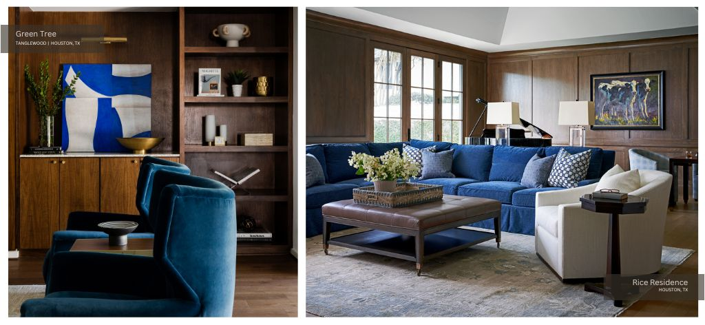
As you create a colorful living room, primary suite, or study, consider principles of color psychology. Color has a profound impact on the atmosphere of an interior space. By strategically selecting and combining colors, you can evoke specific emotions and set a certain mood. For example, the color blue is often associated with airiness and tranquility.
According to this resource from the London Image Institute, blue “is calming, reducing tension and fear, slowing the pulse rate and reducing appetite.” Alternatively, adding bold accents of red, orange, and yellow can help you achieve a lively and energetic feel. Similarly, opt for warm and saturated colors to create a sense of warmth and excitement.
However, it’s important to remember that the perception of color is subjective, and cultural differences can influence how colors are interpreted. The context of the space, lighting, and surrounding decor elements can also impact the overall atmosphere. Always consider the intended emotions and atmosphere when selecting colorful decor, paint, and more but understand that color psychology in interior design does have its limits.
Pay Close Attention to Lighting
Lighting plays a crucial role in how colors are perceived. It can affect the way they appear to the naked eye in terms of their hue (color), saturation (intensity), and overall ambiance. After selecting paint for walls in a room with large windows — i.e., breakfast nooks or living rooms –, you might have noticed that the color changes depending on the time of day.
It appears far different in the morning than in the late afternoon. A dark shade might appear bright and bold in a southern-facing room, while northern light might make that wall color appear softer and less saturated. But how exactly does light impact color perception?
How Lighting Affects Color Perception
Lighting is characterized by its color temperature, measured in Kelvin (K). Warm lighting — lower Kelvin values, around 2700K — has a yellowish or reddish tone, while cool lighting (higher Kelvin values, around 5000K) has a bluish tone. The color temperature of light can influence how colors look. Cool lighting tends to make colors appear crisper and more vibrant, while warm lighting can make colors appear warmer and softer.
Southern light will warm up cool-toned colors because it is direct sunlight. Northern light has a cool value because it is reflected — not direct. Color perception also changes as the sun rises and falls throughout the day. Natural light typically shifts from warm tones in the morning and evening to cooler tones at midday.
The angle and direction of light can influence color perception too. Direct lighting can create strong contrasts and shadows — making colors appear more vibrant. Indirect or diffused lighting softens shadows and can make colors seem more muted.
Artificial light — on the other hand — can be warm or cool depending on the type of bulb. Interior designers often mix natural and artificial light sources to create dynamism and depth within a space.
When selecting light fixtures for your home, be sure to consider CRI. CRI or color rendering index is a measurement of how accurately a light source reveals the true colors of objects compared to natural sunlight. A higher CRI — typically above 80 — means colors are rendered more accurately.
Lights with lower CRI values can cause colors to appear dull or distorted. We call this “color bias.” Be sure to consider CRI when choosing bulbs for spotlighting — not just ambient lighting. The colors in paintings, photographs, and decor objects will be more truly rendered if you select bulbs with a CRI of 80 or higher.
Create a Cohesive Color Palette
Select one or two main colors that will serve as the foundation of your design and will appear in larger areas like walls, furniture, or monumental art pieces. Choose 2-3 accent colors that complement the dominant color and each other. These colors will add depth and visual interest to the space. Consider using the color wheel to identify complementary or analogous colors. To avoid creating a chaotic or discordant space, consider using different shades of the same colors.
Begin with a Neutral Base if You Aren’t Ready to Dive In
Start with a neutral base for larger elements like walls, floors, and furniture. Neutrals provide a calm backdrop that allows colorful accents to stand out without overwhelming the space. Introduce color gradually and layer it thoughtfully, but remember that you can always edit later. Begin with a few colorful accessories — such as colorful pillows, wall art, or small decor items. As you become more comfortable, you can incorporate larger elements like furniture and drapes.
Vary Intensity and Saturation
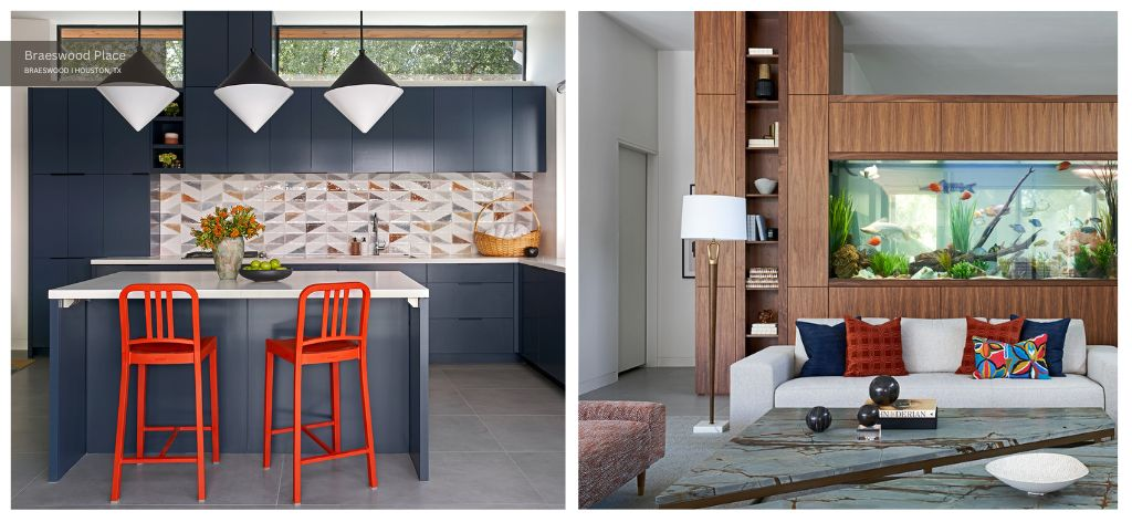
Play with different levels of intensity and saturation within your chosen color palette. Mixing muted and bold shades of the same color can add depth and interest without being overpowering. Consider the two spaces from our Braeswood Place project pictured above. Both feature vibrant hues complemented by softer shades of the same color.
In the kitchen of our Braeswood Place pool house, we opted for a geometric backsplash that incorporates Southwestern sunset tones in a soft, sophisticated way. Our team actually hand-laid the kitchen backsplash with the homeowner to create this dynamic pattern.
The near-neon orange bar stools from Design within Reach and the deep blue cabinetry add drama to this space while reflecting the backsplash’s color palette. The bar stools also match the color of stools in the main house’s craft room — ensuring continuity between both spaces.
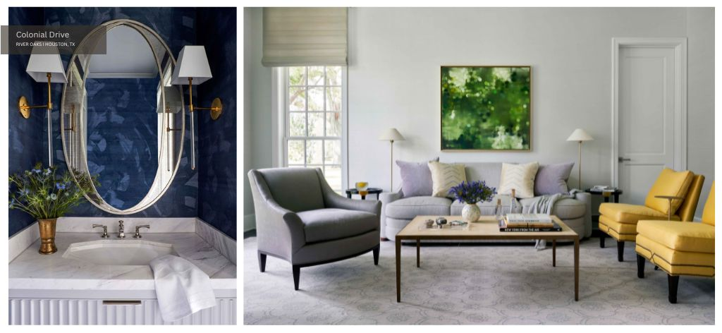
Use the Same Color Multiple Times
As you develop your design scheme, use the 60-30-10 rule to determine how much of each color to add. With the 60-30-10 rule, the dominant color covers 60% of the space, the secondary color covers 30%, and the accent color covers 10%. This helps you create a balanced space in which the proportions make sense and the colors work together in harmony.
Just be sure to use each color multiple times. Repeating a color guides the eye and creates a natural flow throughout the space. This makes the room feel more organized, and is especially important when establishing cohesion between two zones in a single open space.
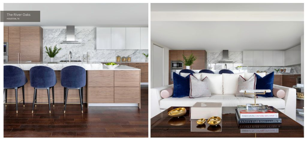
Consider the living room and kitchen from our River Oaks project pictured above. Throw pillows carry the same jewel tones from this home’s kitchen into the living space, and the blush bolster pillows recall the light-toned wood.
Take Inspiration from Nature
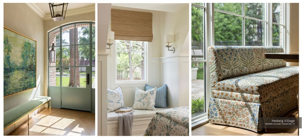
One of the easiest and most organic ways to introduce color to your home’s interior design scheme is to take inspiration from nature. A nature-inspired color palette can include everything from jewel tones to neutrals. They all occur in nature! From the entryway with its gorgeous paned glass door to the dining room with its floor-to-ceiling windows, views to nature provide the perfect backdrop in many rooms at Hedwig Village.
We complemented views of the garden with a gentle color palette of soft sage green, robin’s egg blue, and muted ochre. Impressionistic paintings, intriguing textures, classic prints, and beautiful embroidery helped us layer color throughout.
Draw on Your Heritage or Reference Your Travels
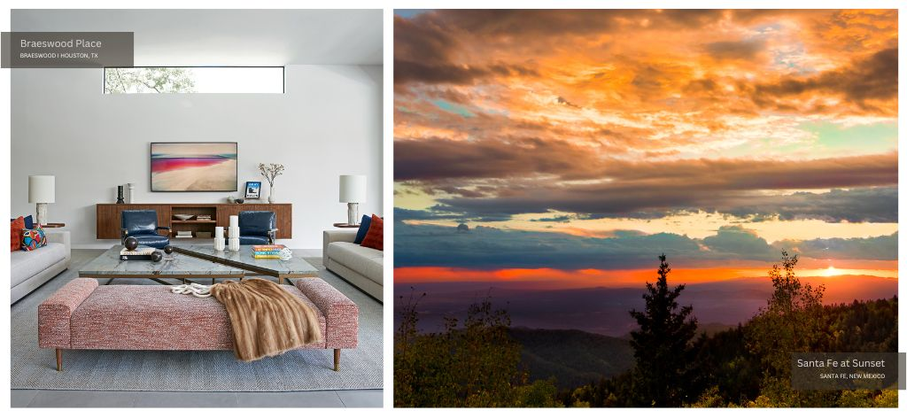
Another easy to way add color is by referencing your travels or drawing on your heritage. Incorporating colors from different cultures and regions can add depth and diversity to interior design. At Braeswood Place, our clients were inspired by their love of the Southwest. We looked to the poppy sunsets of Santa Fe when selecting a color palette for their home.
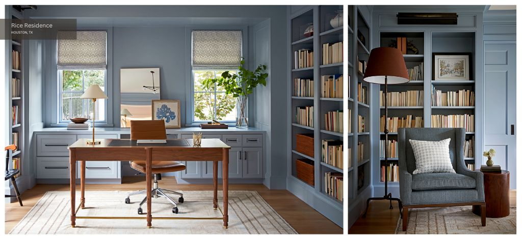
Add Dimension with Texture
Next, we recommend adding dimension with texture. This is especially important when decorating a neutral space with a single bold color as its focal point. If the space is monochromatic, textures can help unify a color palette by providing variation within the same color family.
Different textures catch and reflect light in unique ways — creating visual interest and making the space more dynamic. Textured surfaces break up the monotony of smooth, flat surfaces while adding a sense of depth by creating layers in a room.
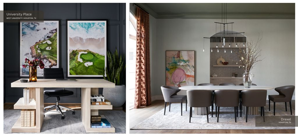
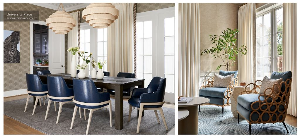
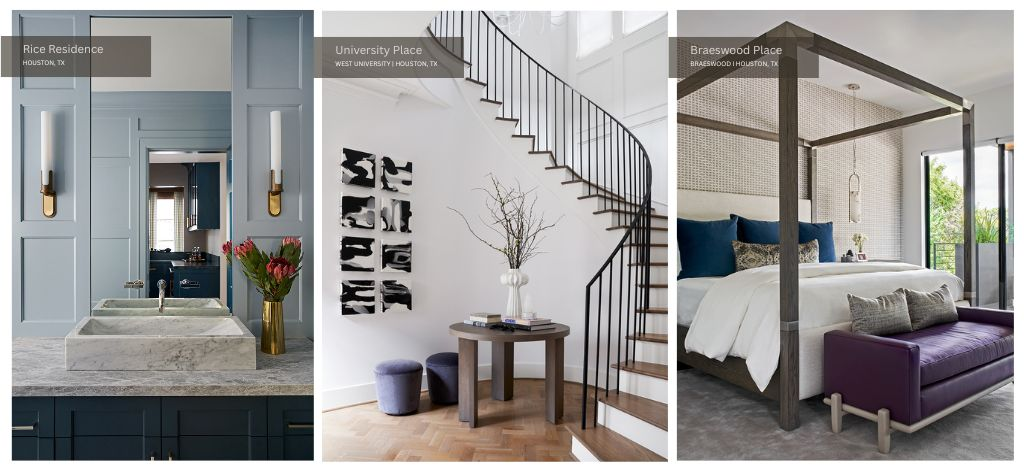
To create rich, multidimensional spaces in our University Place project, we introduced a variety of textures. From the grasscloth wallpaper to the Ella chairs with rattan bindings in the living room and from the Everly pendant lights to the mock-vinyl chairs in the dining room, the textural diversity adds structure and sumptuousness to largely neutral spaces.
Limit the Number of Busy Prints and Patterns
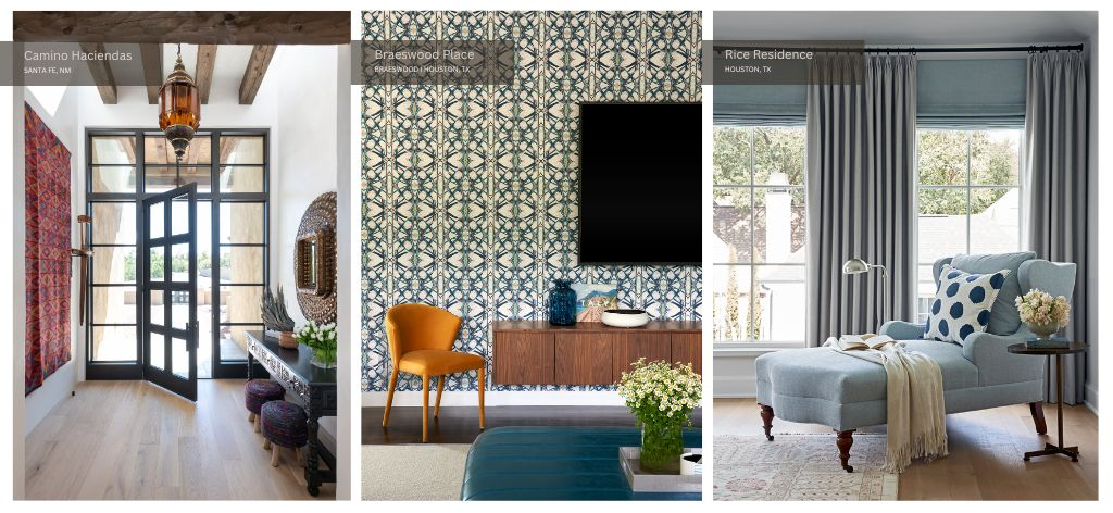
While patterns can be visually appealing, using too many bold patterns can make a space feel cluttered and overwhelming. Choose one or two statement patterns and use them strategically. As you can see in the project photos above, we added colorful patterns to these spaces through wallpaper, tapestries, and throw pillows.
Edit to Ensure You Haven’t Overwhelmed the Space
Last but not least, edit the space after you have decorated it to ensure it is not too crowded, chaotic, or discordant. Review your design and remove elements that feel excessive or clash with the overall aesthetic. Less can often be more when it comes to a colorful interior.
