Table of Contents
With Fall and Winter fast approaching, many of us will be spending more time at home. During these cozier months, we often search for ways to create special spaces that capture our memories, celebrate our interests, and share our stories with guests. One way to make your home’s interior more representative of your aesthetic, your personality, or the current season without undergoing a complete redesign is to restyle china cabinets, bookcases, and shelves. Striking the right balance between personal, practical, and aesthetically pleasing to create perfectly styled shelves can be tricky. Below, we list our top thirteen tips for styling shelves like an interior designer. LUDC’s Shannon Smith also offers her advice on how to style shelves in 2023.
How to Style Shelves Like an Interior Designer
#1 Begin with Bespoke Built-Ins
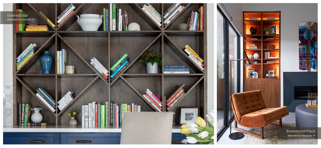
First on our list of tips for styling shelves is to choose your shelves carefully. Before parsing through books, collectibles and family photos to style your shelves, ensure those shelves are worthy of all your favorite things. While pre-manufactured stock cabinets certainly have their place, designers craft built-ins specifically for your home. As such, they make the most efficient use of space while matching your interior design scheme to a tee. In “Beyond the Built-in Bookcase” for The NYT, Michelle Higgins writes custom built-ins are “like a bespoke suit tailored to flatter your body.”
Custom built-in shelves “elevate the design [of your home], offering creative solutions to everyday problems.” In short, “‘if you do it right, the built-in becomes a hybrid of a work of art and a hardworking machine.’” Custom-designed built-in shelves “‘should last a long time and be a sound investment.’”
LUDC installed bespoke cookbook shelves in navy and wood grain for our Dumbarton Residence project in Braeswood Place a couple of years ago. We designed these bookshelves “as a special spot for the homeowner to place their cookbooks and other beloved tomes.” Our design team “found inspiration in a geometric design that embraced triangular holders” that resulted in an elegant design. This design reflects the rest of the interior seamlessly. Now, these special shelves are the ideal spot for our clients “to share little pieces of their life with family and friends.”
They can do so in a more meaningful and impactful way than stock shelves could have achieved. A unique design like this custom piece can spark conversations with guests and visitors — making your home a more engaging and memorable place.
#2 Clear the Entire Shelf Space
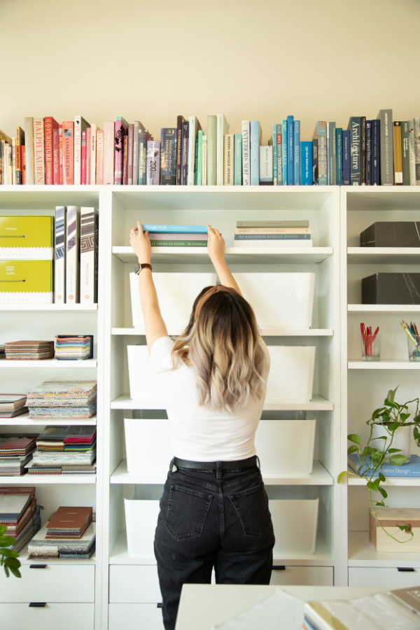
Next, homeowners should clear the entire shelf of decorative elements in order to provide themselves — or their design team — with a clean slate. Remove everything from picture frames to paper weights. Whether you plan to decorate floating shelves, cubby shelves, or hanging shelves, it can be impossible to arrange pieces without clearing your workspace first.
Clearing the shelf first allows homeowners to view that shelf and their possessions in a new light. It offers them a fresh perspective and new direction for their arrangement. LUDC Senior Designer Shannon Smith recommends removing all items from the shelf before laying them out on a table or other surface. Smith notes that her design team “sets everything out first and then grabs” what appeals to them.
#3 Consider Context
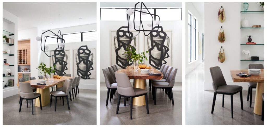
Third on our list of top tips for styling shelves is to consider the context of your space. Choose pieces that make practical sense in each room. For example, avoid placing cookbooks in your home office or delicate artworks in your master bathroom. Considering how you use each space before choosing decor elements ensures you pick pieces that feel appropriate and mesh well with their surroundings.
#4 Establish a Repeating Rhythm Throughout the Home
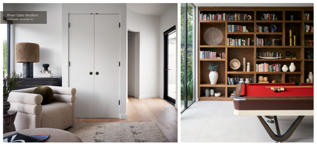
Fourth on our list of tips for styling shelves comes from LUDC’s Shannon Smith. Smith recommends homeowners establish a repeating rhythm throughout the house. One can achieve this by carrying textures, tones and thematic elements from one room to the next.
For example, scattering pieces from your raku pottery or 19th century miniature portraits’ collection throughout the home helps create a cohesive yet dynamic interior. It encourages the eye to travel, led from one familiar object to the next. These shared elements establish a framework in which unique objects can shine without feeling out of place. When decorating a floating shelf, this is even more important because floating shelves already have a tendency to feel disjointed.
#5 Remember, Consistency is Key
Contrast creates drama, sparks interest, and adds weight to a space. It prevents an interior design scheme from falling flat or underwhelming its viewers. When styling shelves at home, be sure to prioritize contrast between colors, sizes, textures, glosses, shapes, and motifs. Juxtapose shiny with matte, textured with smooth, antique with contemporary, large with small, vibrant with muted, and abstract with figural to create visual interest.
Pair the practical with the purely aesthetic and the natural with the synthetic. For example, place an organic sculpture next to a geometric frame or a delicate antique book next to a hefty paper weight. Choose a variety of objects — such as decorative sculptural items, bookends, bowls, boxes, books and frames — to keep the eye moving.
Homeowners should keep in mind that contrast is especially important in neutral and/or monochromatic spaces. In his article “What Not to Do With Monochromatic Paint and Decor” for Architectural Digest, Peter Webster elaborates. He suggests opting for tones, textures, and finishes that create a “subtle contrast that energizes the space without visually destroying its integrity.” For instance, adding a grasscloth wallpaper backing to a shelf populated by smooth ceramics should keep your neutral interior from feeling too one-note.
#6 Avoid an Overly Curated Look
.
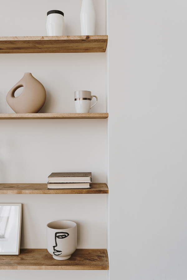
To prevent your custom built-in shelves or freestanding shelving units from appearing stiff and unnatural, avoid over curating. Each shelf should be welcoming and intriguing rather than cold and clipped. Over-editing can make a shelf appear too bare, almost as though the decorator never completed his or her design scheme. First and foremost, residential interiors should be livable and practical.
Treating your shelves like clinical gallery walls with lots of empty space does a disservice to the pieces you have lovingly collected. It also diminishes the functionality of your interior. Instead, Shelby Wax of Lonny.com recommends homeowners truly “enjoy the art of collecting and be unafraid to showcase those items…[because] the sterile, cold elements just don’t carry the same appeal.”
Styled shelves can add balance and symmetry to a room’s design, but they should not be too sparse. Consider placing items of varying heights, textures, and colors on the shelves to create a visually appealing composition. Just a little bit of variety can make an enormous difference.
#7 But Take Care Not to Overcrowd When Arranging Shelf Decor
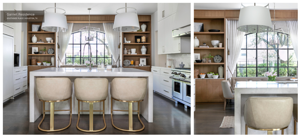
On the other hand, avoid overcrowding your wall shelves with too many different objects. Choose only pieces that are either useful, meaningful or attractive. Eschew bits of clutter that make little sense as part of your design scheme. In her article “Tips for Styling a Bookcase” for Atomic Ranch, Jickie Torres elaborates. Torres notes that “sometimes a library collection of tomes adds to the eclecticism of a sophisticated and collected space.”
However, “other times a full bookcase is more chaos than curation and can make a clean space feel jumbled.” Not only do overcrowded shelves have a tendency to look messy, but they can also put your precious possessions at risk.
When one packs art objects too tightly together, cleaning or rearranging the shelf becomes dangerous as moving one without bumping another is almost impossible. Overcrowding books can lead to other types of degradation unrelated to the accidental topple.
According to the Conservation Center for Art & History Artifacts, “overcrowded bookshelves are a common problem because they can cause books to be crushed.” If possible, the CCAHA suggests grouping books and other objects “by size, so they can support one another on the shelf.”
#8 Create Groups of Items on Your Wall Shelves
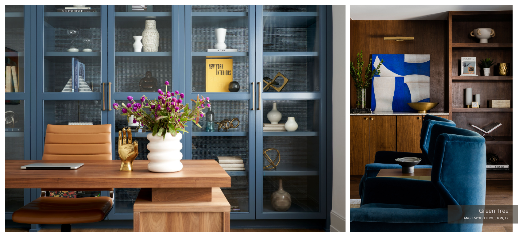
Next on our list of shelving decor ideas is to create groups of items on each wall shelf. When decorating shelves, be sure to group objects to create miniature collections that each tell a story. Separating items into groups makes the shelf design more engaging and digestible. It also prevents the space from feeling cluttered or disorganized.
While the total number of objects appropriate for each shelf varies, the LUDC team prefers to create groups of threes. Though one might imagine symmetrical arrangements of even numbered objects would create the most harmonious display, the opposite is actually true. For decades, interior designers have relied on the “Rule of Threes” to create balanced displays with lots of visual impact.
Dabney Frake explains in her article “The Rule of Threes: Why You Should Know It, Love It, & Use It” for Apartment Therapy. According to Frake, objects grouped in threes “are more appealing, memorable and effective than even-numbered groupings.” This is because odd numbers force the eye “to move around more.” This results in a “more interesting visual experience” that captures the viewer’s attention for a longer period of time. Designers often opt to group objects in trios rather than in families of five, seven or nine.
They do so because “three is the smallest number that can be used to form a distinguishable pattern in our heads.” A group of three objects provides the viewer with a bite-sized sample of what else they might encounter throughout your home’s interior. To make your shelf display even more dynamic, stagger the placement of small decorative objects in each group rather than arranging them in a single line.
#9 Display Books Safely and Appropriately
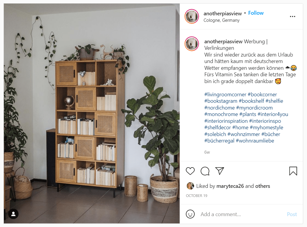
A few years ago, designers and homeowners alike began flipping books around to hide their spines as pictured above. They argued that this approach neutralized books with multicolored covers which would otherwise contrast too dramatically against surrounding decor. However — as mentioned above — practicality is a key element of successful interior design.
For example, one would not gather furniture so closely together that guests were unable to navigate the space. Similarly, one should not flip books around, so guests are unable to decipher which title belongs to each tome. Forgoing functionality not only makes a design practically infuriating, but also visually confusing. Amanda Sims offers the best advice in her article “Please Don’t Organize Your Books This Way” for Clever. Sims warns: “don’t stack them in such a way that you can’t ever find the book you want to read!”
While inverting books on your shelf is a bit ridiculous, stacking them could occasionally be dangerous. Though very heavy volumes like atlases and coffee table books should be stored flat, novels and other “normal-sized” books should be upright. According to Invaluable.com in their post “How to Store, Preserve and Care for Rare Books,” books must be stored upright. They should be stored upright “with a small amount of space between each book to reduce pressure on the binding.” Books should also be stored closed rather than open to avoid cracking the spine.
#10 Wallpaper or Paint Behind Shelves for Added Interest
Tenth on our list of shelving ideas is to add wallpaper in a contrasting color, texture or finish. Writing for HGTV, H. Camille Smith and Allie Holcomb King note that adding paper to built-in bookshelves is a “favorite designer trick.”
In our post “Nine Iconic Objects Worth Collecting,” Laura U agrees. She notes that “adding wallpaper to the back of your bookshelves is a great way to add a pop of color or pattern.” While our team is partial to grasscloth, any wallpaper design you like will provide a bit of personality to your shelf display.
Adding wallpaper is also an easy, relatively inexpensive way to try out a trend without overspending on brand-new wall shelves. For example, if the honeycomb shelves trend appeals to you, consider a hexagonal accent wallpaper like this one from Cole & Son. In doing so, you can create that desired focal point with your existing living room shelves.
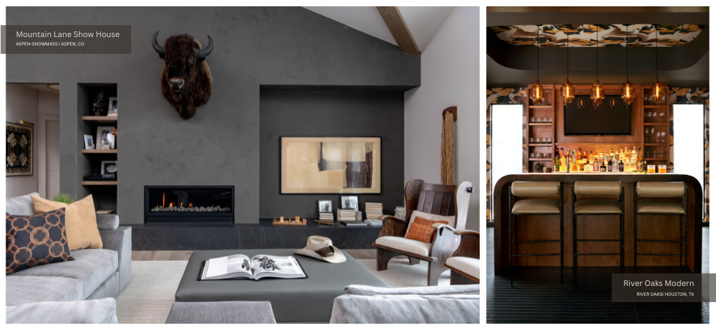
You can also paint or wallpaper around the shelves to make them stand out, as we did in our Mountain Lane Show House project and at River Oaks Modern.
#11 Arrange by Scale
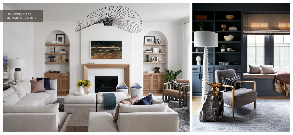
When we asked LUDC Senior Designer Shannon Smith for her shelf styling tips, she suggested arranging pieces by scale.” Smith recommends starting with “the tallest pieces first.” By starting with the tallest, largest or heaviest objects first, homeowners are able to anchor their design. Then, they can fill in the surrounding areas with smaller companion pieces.
In her article “You love books. Here’s how to happily coexist with them.” for The Washington Post, Mari-Jane Williams extends this approach to books. Williams recommends “ordering books by size” instead of by color “to keep the finished product looking neat and organized.” Homeowners can opt to “put the tallest books on the outside and work toward the smaller.” They can also choose to “put the tallest in the middle of the shelf and have them get smaller as they fan out.”
#12 Float a Few Pieces
When styling shelves at home, avoid limiting yourself solely to each shelf’s surface. Rather, take advantage of the wall space behind each shelf where you can float small paintings, hang photos or mount ceramic plates. Expanding your display past the shelf itself creates a more dynamic, interplanar experience for viewers.
#13 Consider a Seasonal Switch-Up
As we leave the bright colors of summer behind and head into the cozy palettes of fall, consider giving your shelves a seasonal switch-up. When shifting from summer to fall, homeowners usually exchange the coverlets on their beds, curtains around their windows and throw pillows on their couches.
To successfully transition your shelves from one season to the next, take cues from the rest of your home’s interior. Embrace the textures and tones of each season and pay particular attention to how each shelf is lit.
Now you know exactly how to style shelves like an interior designer no matter the season!

