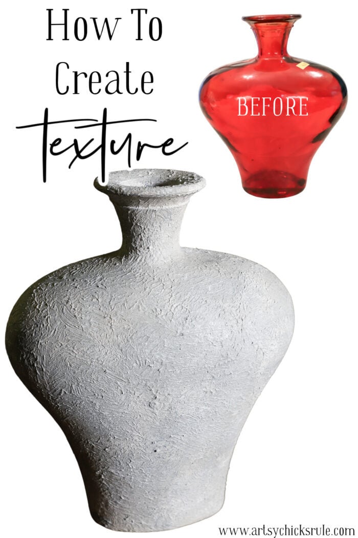
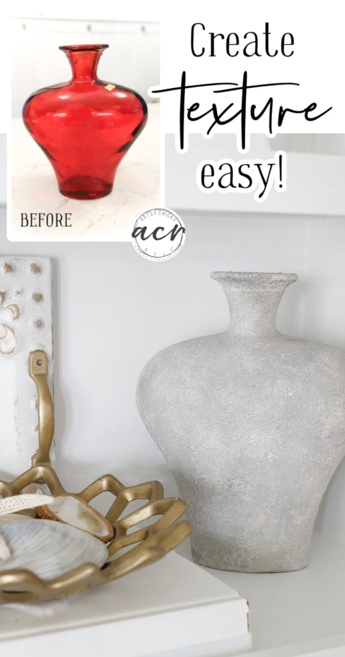
Learn how to create texture and bump your projects up a notch with one simple product! And it does more than that! Stay tuned…
Hello beautiful friends! Happy Thursday!
I’m back today with a super fun makeover. I found an old RED vase (circa 70’s-80’s) and thought I’d give it a whole new look.
And I’m going to show you how to create texture just like I did because not only is it no longer red, it has a super fun finish.
Here is how it began…
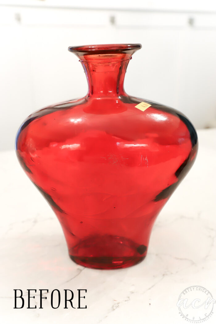
$4 and a little dated. I have nowhere and I do mean nowhere to display a red vase like this.
So, I gave it a whole new look by creating a fun, textured finish.
How To Create Texture
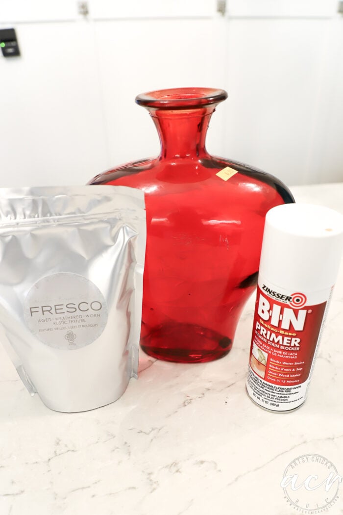
So, I began by cleaning the vase well with TSP Alternative and then spraying it with BIN Primer.
Once that was dry, I mixed up my Fresco with the Victorian Lace paint.
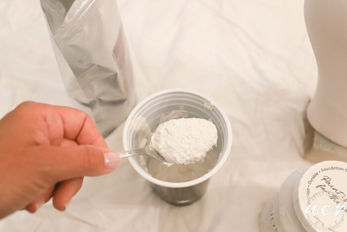
For texture, you would use equal parts.
Side note: You can also use Fresco to create a matte, chalk-style finish too. So, if you are looking for that type of finish, this is your product for that. I’ll have to try that next! Stay tuned.
Mix well.
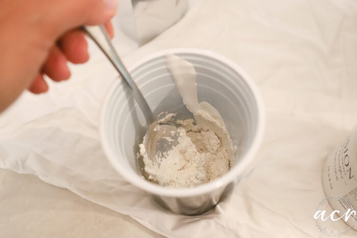
Then I used a chip brush to apply it.
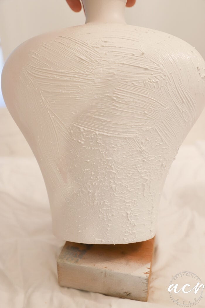
I brushed it on (see the top section) then pat it a bit with the side of the brush and some with the tips. (see the bottom section)
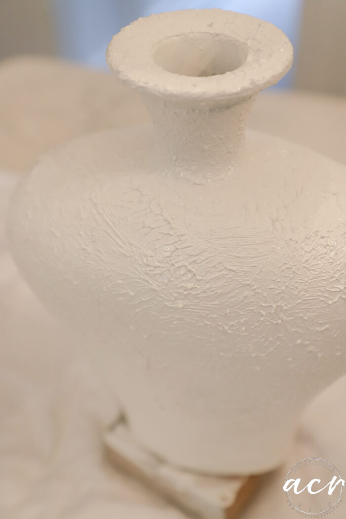
I purposefully left some small brush strokes here and there though. (see above)
Once that was fully dry, I began to add texture in a different way, through varying colors.
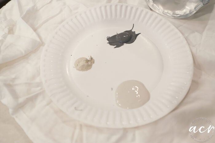
The colors are Cobblestone, Putty, and Soap Stone. Just some I had already opened and figured they would do the trick.
I started with the lighter, beigy Cobblestone color.
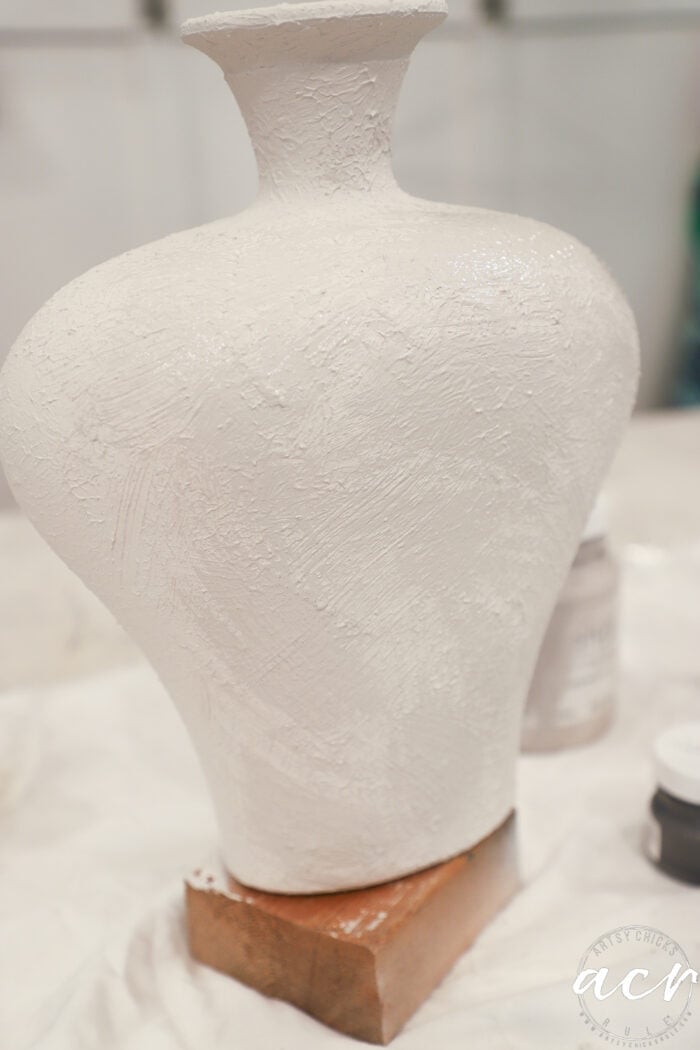
It’s hard to tell but you can see above where I’ve applied the slightly darker Cobblestone. I purposefully didn’t apply it fully, leaving some of the Victorian Lace (white) shade showing through.
Next, I went over that with the slightly darker, Putty.
Oh hi, Ryder!
My little helper. lol
And finally, I decided to lighten up the Soap Stone with more of the Putty color.
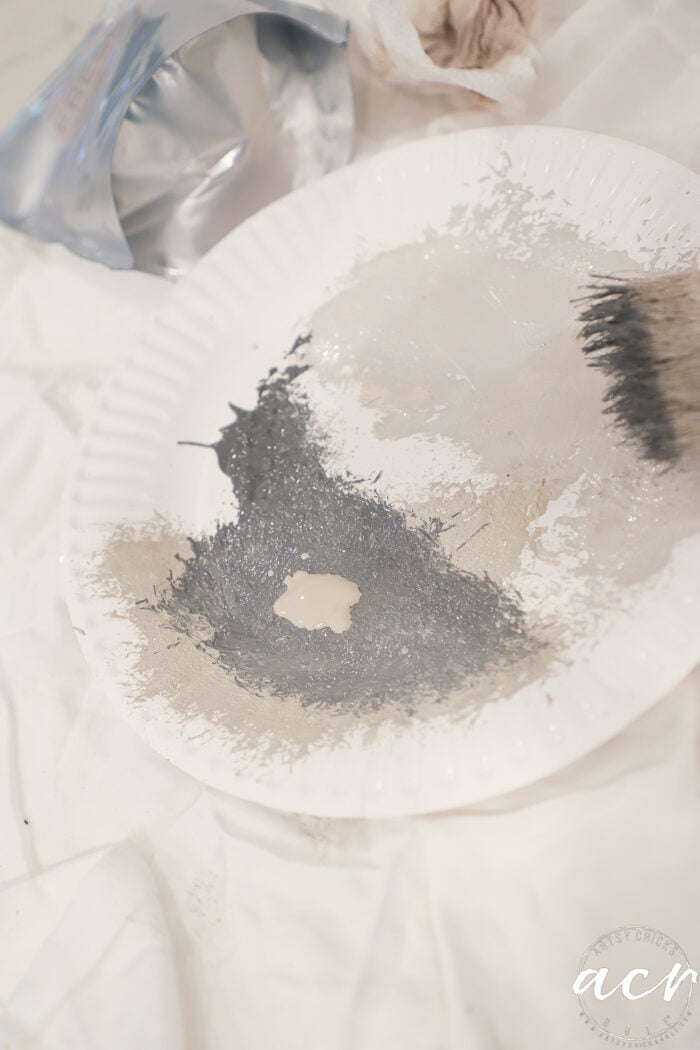
I wiped off most of the color and applied it in more of a “dry brush” style.
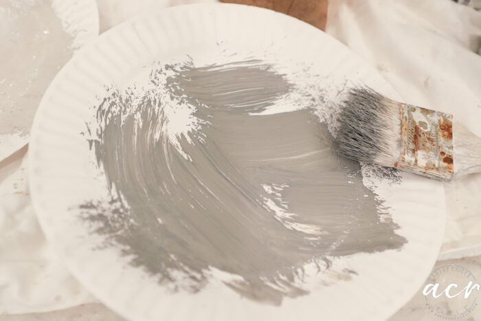
Want to know more about “dry brushing”? Watch my video here.
See how it is very subtle that way?
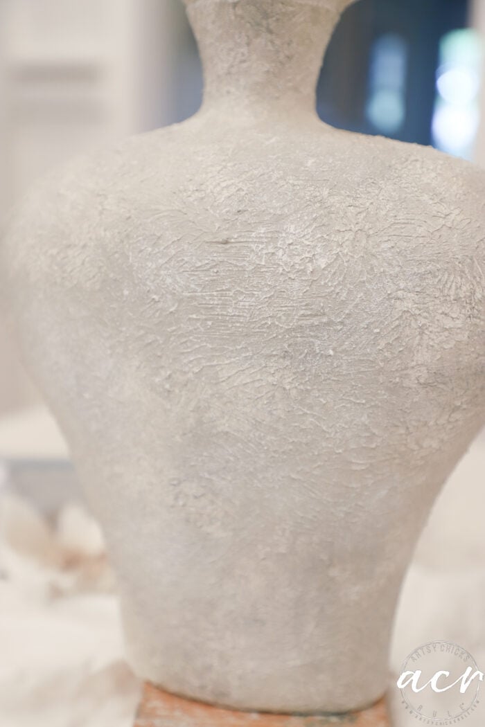
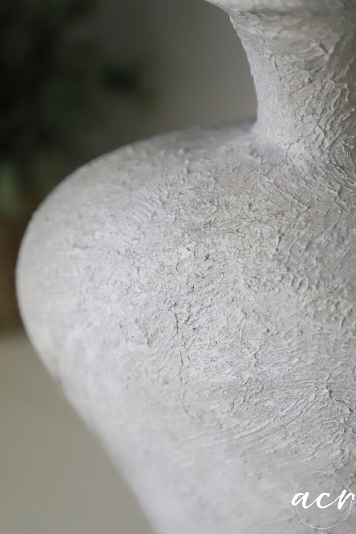
And do you see how not only did the Fresco add texture and dimension, but so did the varying paint colors?
The key here is to try to get all of these subsequent coats in while it’s still wet. You want it to blend a little as you go.
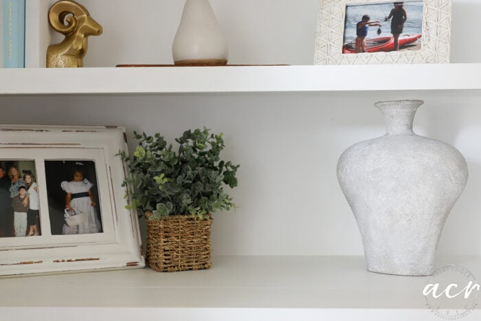
I just love that look. So much more interesting than when it was red!
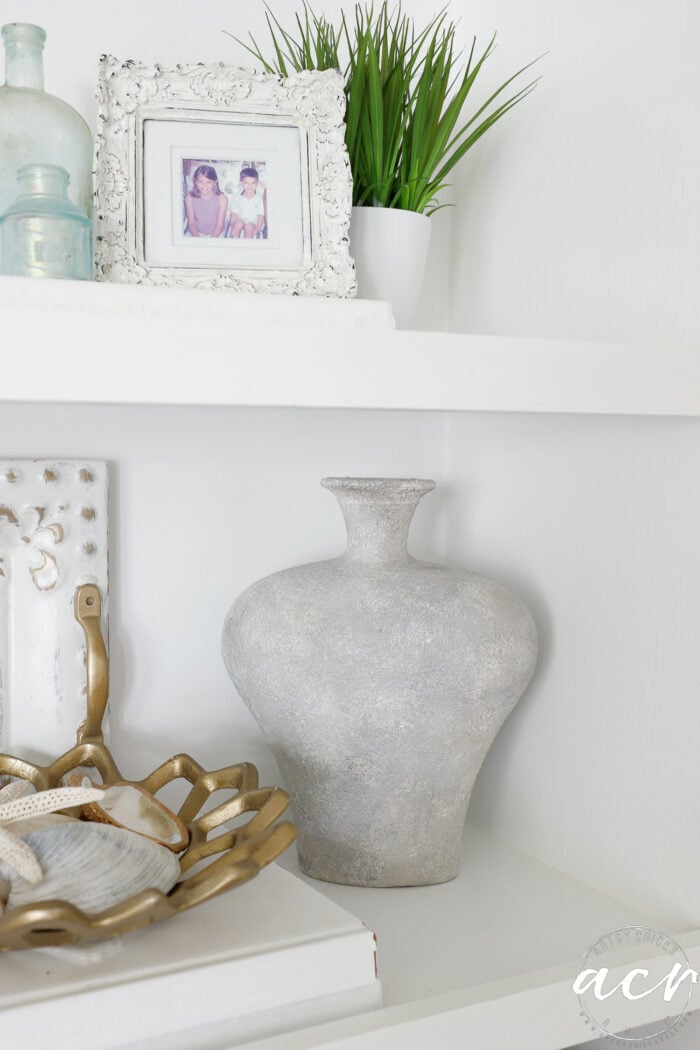
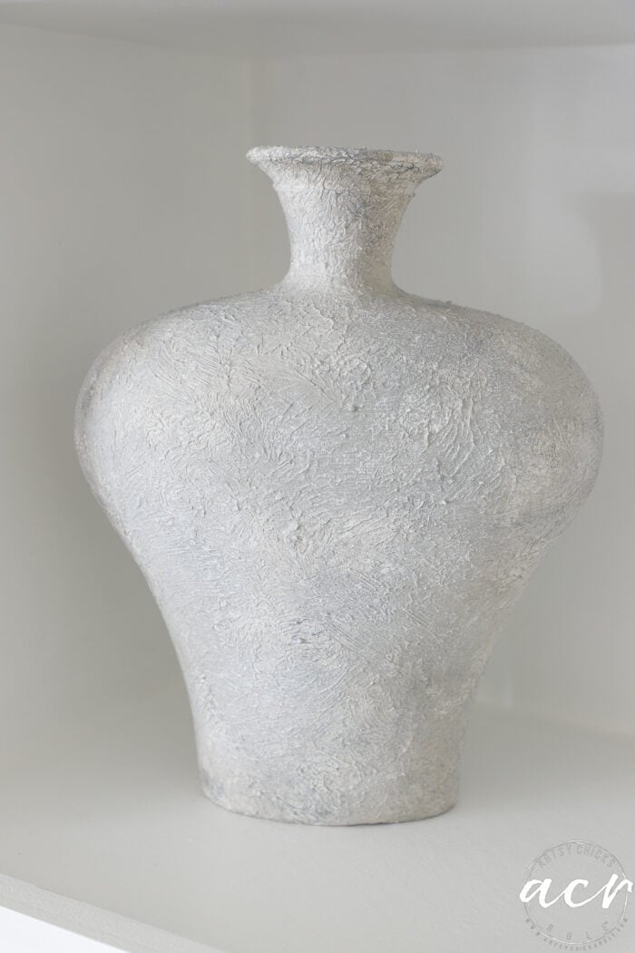
Looks completely different now.
It’s hard to capture the varying shades and dimension in the photos…
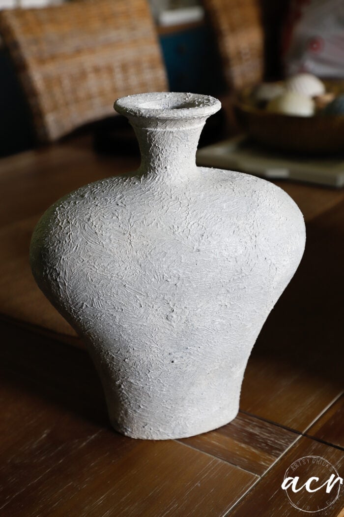
The camera wants to “white” it out.
The other side. Hopefully, you get the idea.
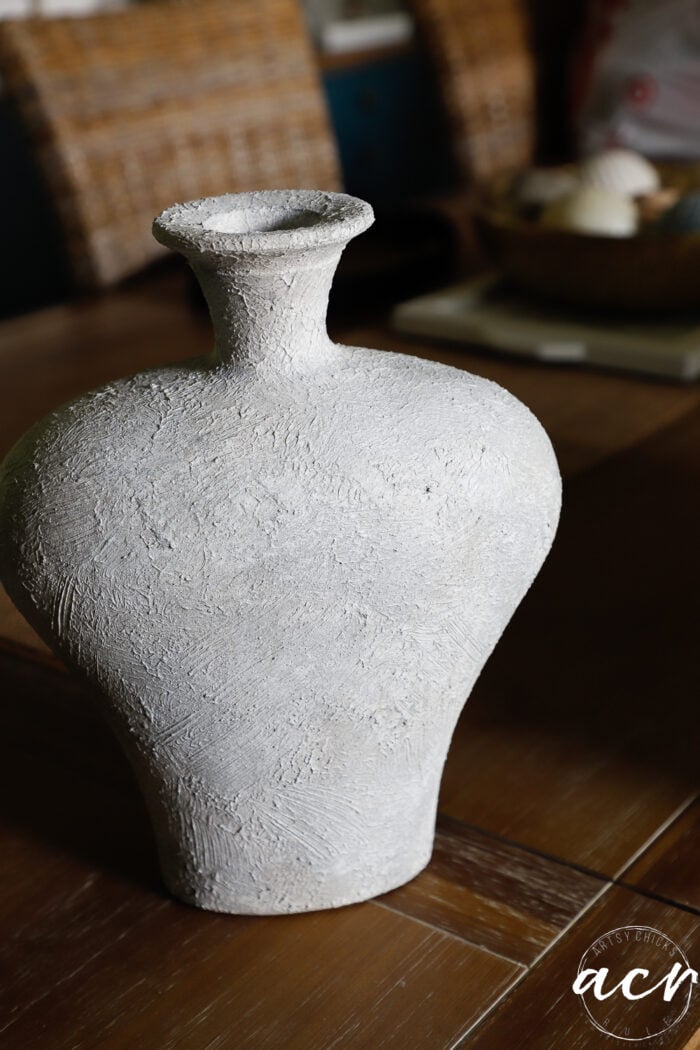
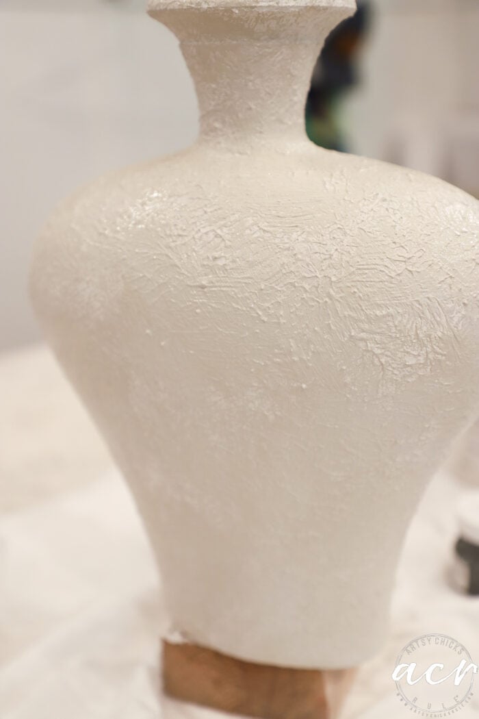
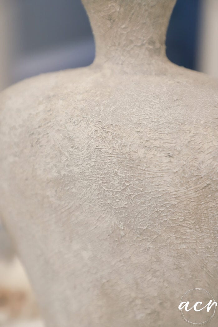
Let’s try an up-close shot…
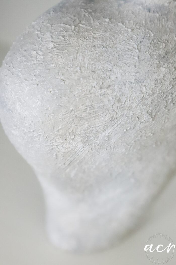
Can you see the different shades a bit better here?
Not bad for $4! Right?!
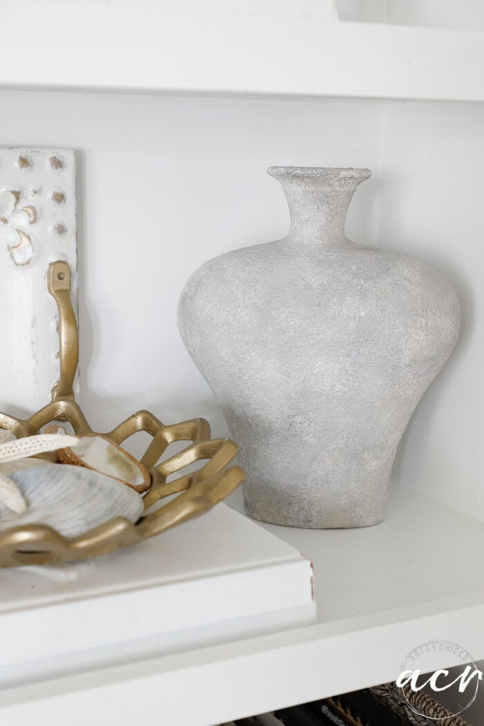
Here are a few you can buy, but for quite a bit more! 😉
And you can see a lamp I gave some ‘texture’ to recently, here. (but with a different product)
I’ll let you know when I try out the Fresco as a matte finish. Can’t wait to see how that looks.
PIN it to save it!
