Table of Contents
Sharing our playroom design and our approach to creating a neutral minimalist space.
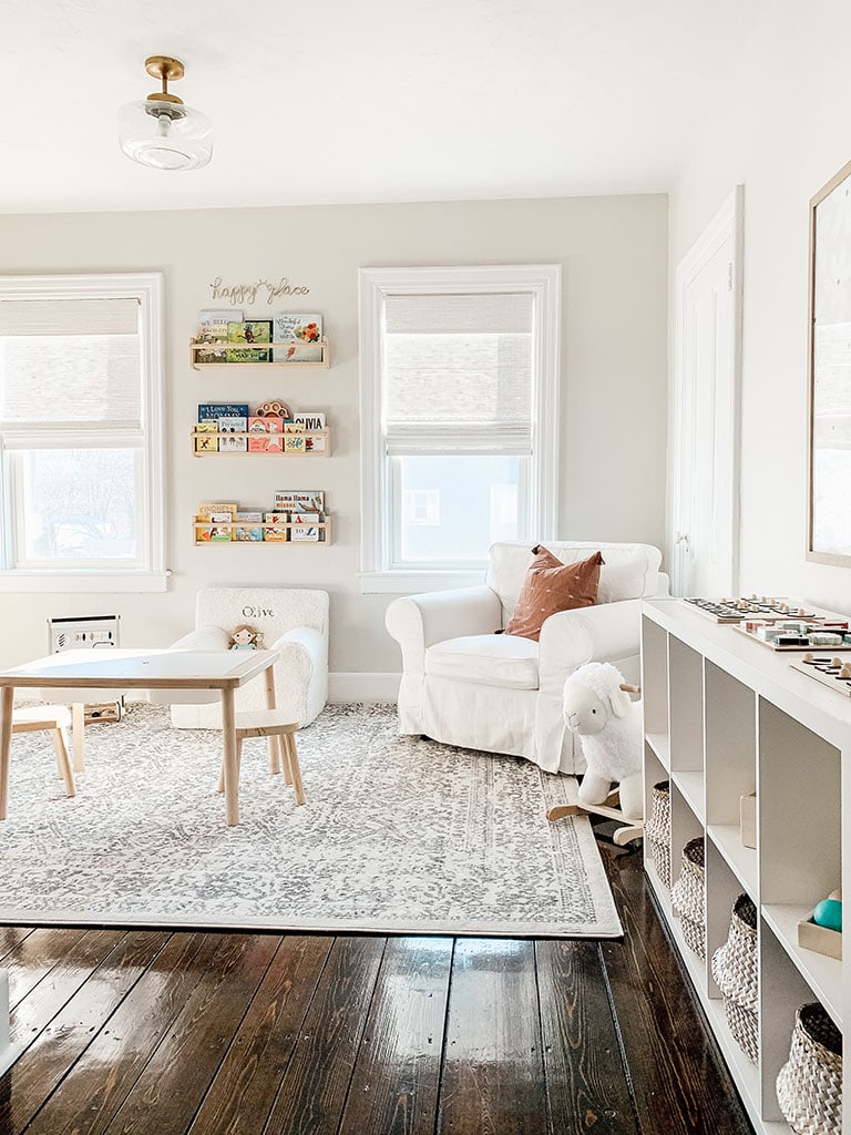
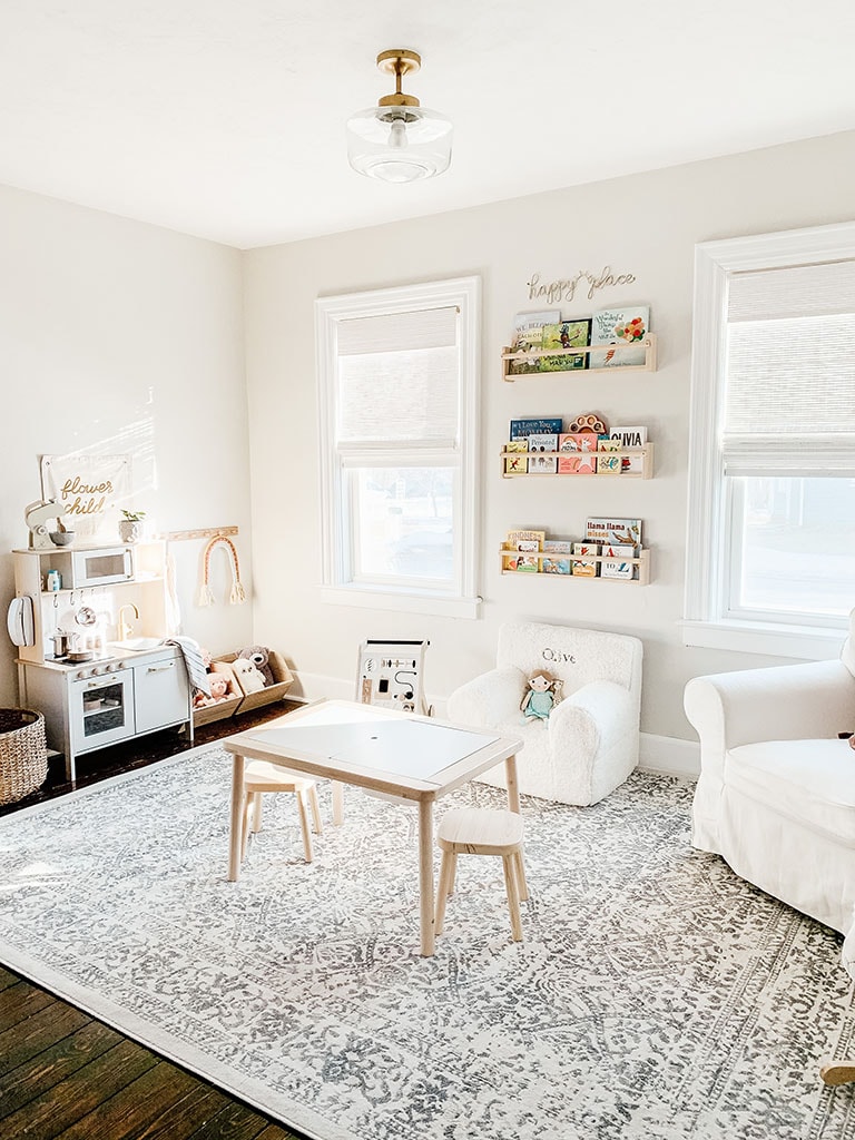
When we moved into our home we had always dreamed of this room one day being a playroom. I can’t believe it is finally complete and our little girl has a space that encourages imagination and exploration. And if I am being honest it’s the best way to get all the toys out of our main living room 🙂
As always I started with a design style board. This is a great way to pull a design together and make sure everything is cohesive. It should be used as a reference each time you are making a purchase for your space.
Below is the design board for this project.
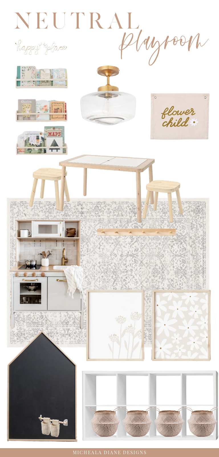
When coming up with a design for this playroom I had two design ideas in mind. I wanted it to be neutral and I wanted to take a minimalist approach. These neutral minimalist playroom concepts helped guide all the ideas and purchases for our playroom.
Neutral Playroom Ideas
You may be thinking why neutral, isn’t this supposed to be a space for kids. Well, you would be right it is a kid’s space. But hear me out, I have three reasons to go neutral.
The first one is that it is still a space that is a part of our home. It is on our main level and even though it is a playroom I wanted it to feel like a continuation of our home. If you have been around here for any length of time you will know that I take a neutral approach to all of our interiors.
My second reason for keeping this space neutral is that it is going to be filled with toys. These toys more than likely provide color all on their own. By providing a neutral base, meaning choosing a neutral paint color, furniture, storage, and rugs. You are allowing space visually for colorful books and toys.
The third reason is that by creating a neutral playroom you are creating a calm and relaxed space. Playrooms by nature can be chaotic, often a storage room for overflowing toys, crafts, and mess. This leads me into my next design approach for this space and that is taking a minimalist approach.
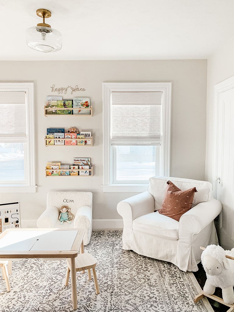
Paint Color: Benjamin Moore Classic Gray
Minimalist Montessori Playroom
Most times when you think of a playroom they are anything but minimal. But there are design strategies that you can implement to create a less chaotic and more organized space. This also creates a better space for a child to play and explore without being overwhelmed.
This can be achieved in a few simple ways. The main two that I focused on for this space were storage and the number of toys/activities I chose to display.
Montessori-ish
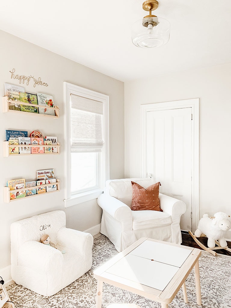
I took a Montessori style approach to the playroom which in itself leads to a minimalist design. Montessori style play encourages independence and deep concentration. This can be achieved by limiting the number of toys and selecting toys that are age-appropriate at the moment. Toys that challenge their brain and develop fine motor skills.
I say Montessori -ish because we do not follow all the practices of the Montessori approach. For example, our space features a play kitchen, imaginative play is not encouraged in a Montessori approach. But when it comes to the majority of her toys we do keep these principles in mind.
Wondering what Montessori is check out this article.
Toy Rotation
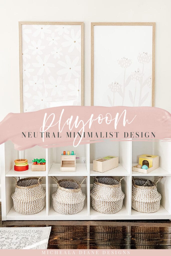
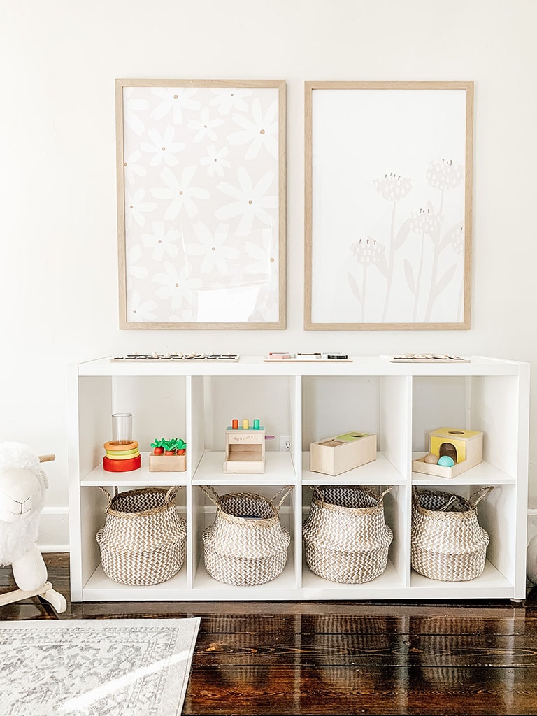
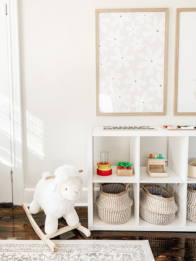
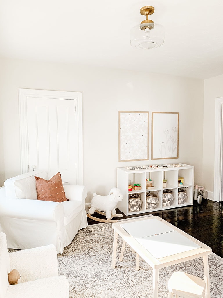
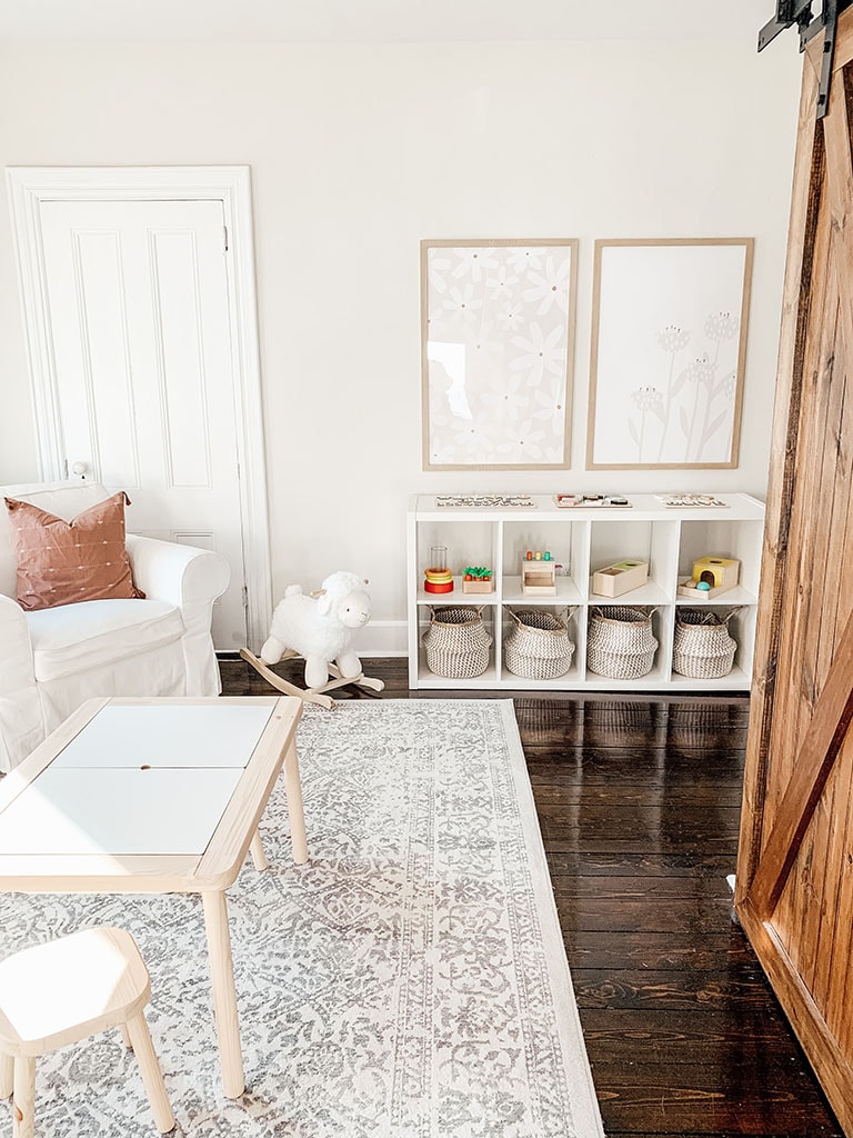
Toy rotation and display are an important part of creating a minimalist style playroom. For our main storage, we used the Ikea Kallax piece. This features eight cubbies.
The bottom row I used for basket storage. Each basket contains an activity. For example blocks in one, and music makers in another. Then on the top row, I feature our favorite Montessori-style toys from our Lovevery play kit subscription. These toys are all age appreciate. I love that Lovevery takes the guesswork out of selecting the right toys. And that they are delivered right to your front door.
Part of the Montessori style is to create an open play shelf. This makes the toys accessible and fosters independence. The Ikea Kallax provides a similar concept.
We fill this space and put all other toys in storage. I plan to rotate the toys every few weeks based on the interest that our daughter shows.
Playroom Storage
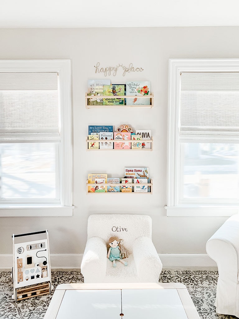
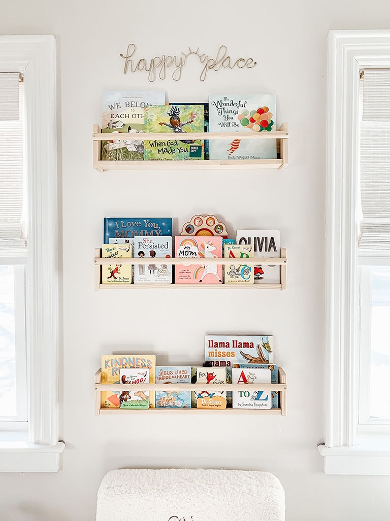
Other than the Kallax we have a couple more areas with toy storage. This includes our book wall. This allows me to display her books in an organized way and provides wall decor. We did the same thing in here nursery. I also have a large basket full of books that she can access on her own. This also encourages independence. I rotate the books on the wall and the basket often because books are her favorite. You could also install these book wall storage lower so that your little ones can reach it on their own.
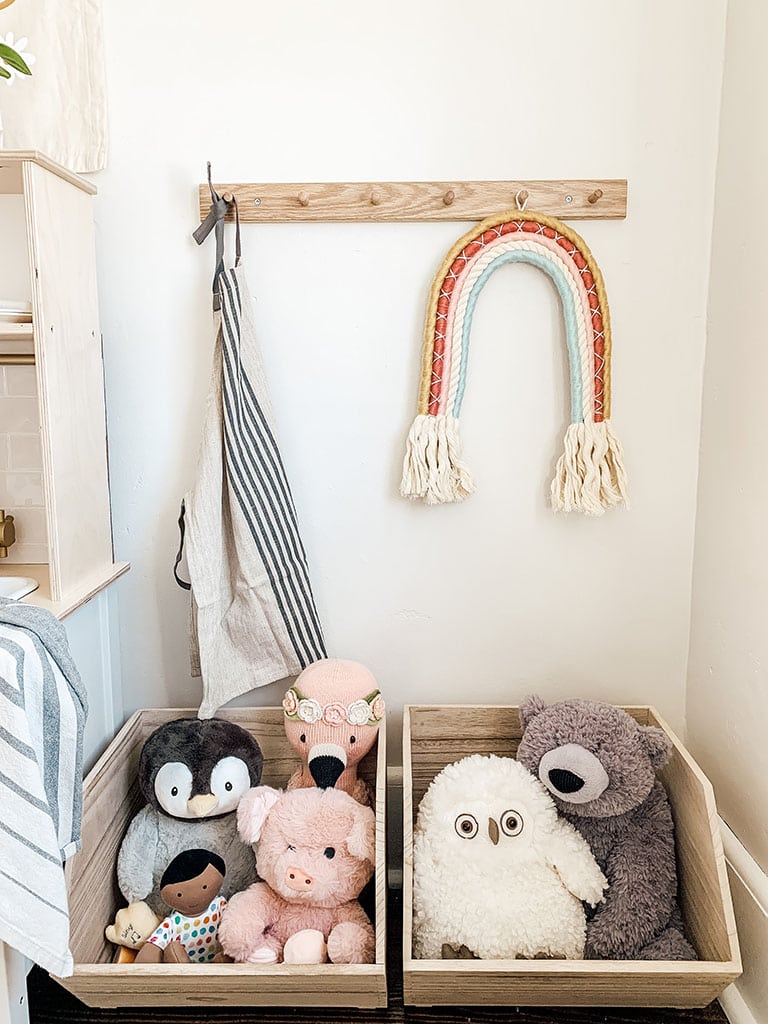
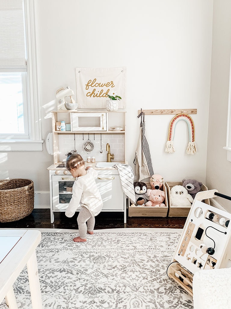
Another great storage option is these stackable crates that I used near her kitchen. They currently house her stuffed animals, but in the future will provide storage for all her play kitchen items.
Storage will help limit the clutter and hide the mess, but it is also important to limit the number of toys/books available. If you have a closet in your playroom that is the best way to store toys that are currently not in rotation. Or you can store them in a container in another part of your house.
This has kept our playroom from feeling overwhelmed and allowed our daughter to focus on a few toys.
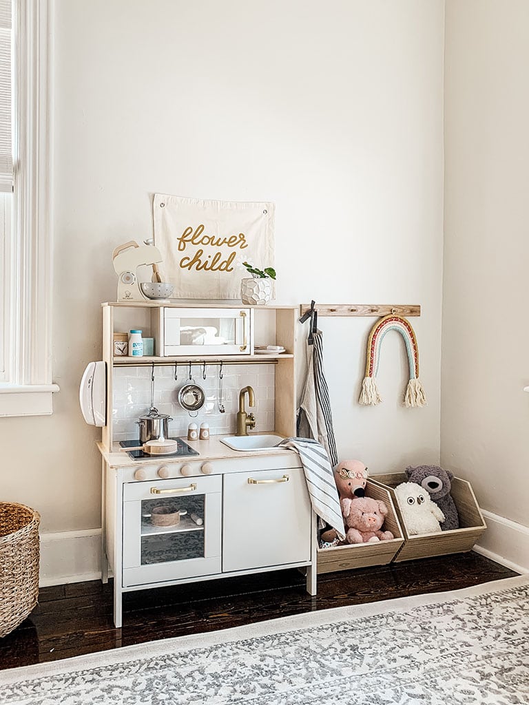
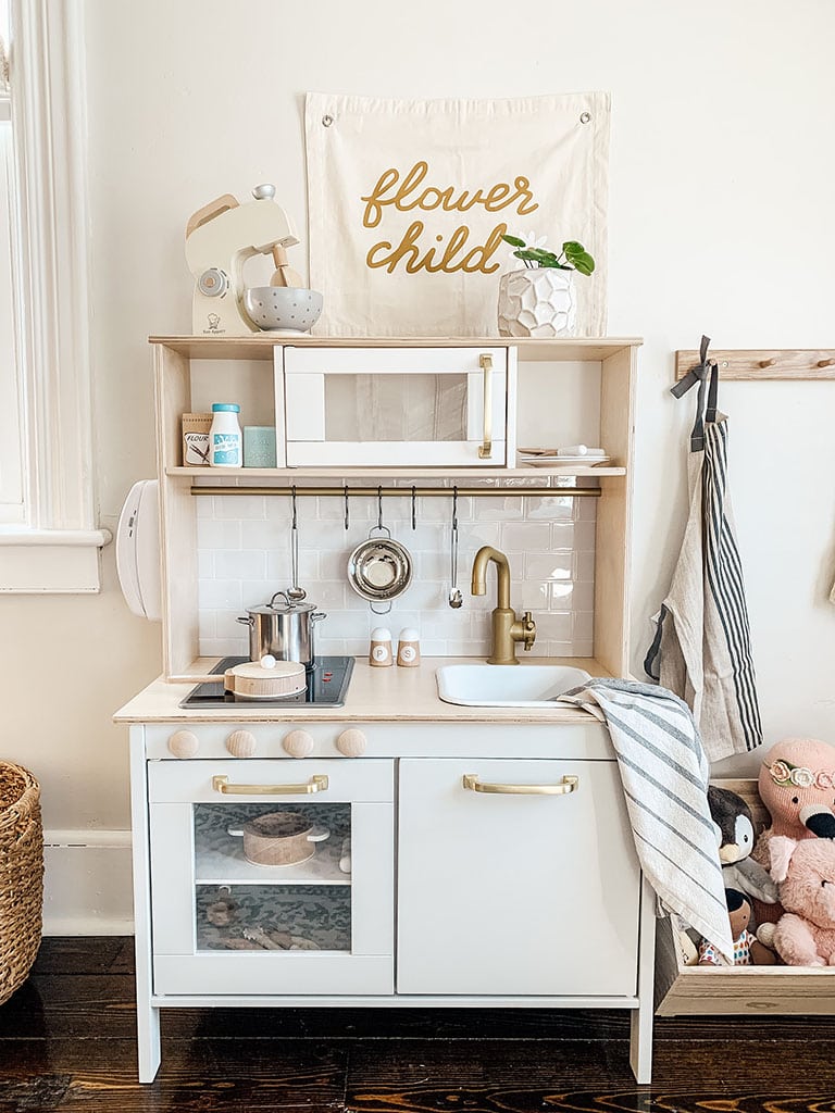
One of my favorite additions to our neutral minimalist playroom is the Ikea Duktig play kitchen. Play kitchens can be very expensive if you are looking for one that resembles a real kitchen. We decided to go with the budget-friendly Ikea play kitchen and DIY it to look like a real modern kitchen. You can find our full step-by-step tutorial on our Ikea Kitchen Makeover HERE.
It is honestly nicer than our own kitchen and I am obsessed with how cute it turned out.
Our daughter is one and already loves playing with this kitchen. I know it will be one of those toys that will last for years as she gets older. So it was totally worth putting in a little effort to make it nice.
You can find some of her kitchen accessories here:
Duktig Play Kitchen / Stand Mixer / Pasta Pot Set / Wooden Cooking & Eating Set / Flower Child Banner
Related: Ikea Play Kitchen Makeover
Ikea Playroom Ideas
Ikea has the best products for a playroom, hands down. Almost all of the furniture for our playroom is from Ikea. One of my favorite products and the most sought-after item is the Flisat table and stools.
This table has two large cut-outs to hold activity bins. There are endless possibilities for how to use these. Believe it or not, there are entire Facebook groups dedicated to activities based on your child’s age.
Ikea Flisat Hack: Our girl just turned a year and isn’t quite tall enough to reach the other side of the bins. We removed the legs and replaced them with the legs that come on the Flisat stool. This lowers the height and allows us to easily switch it out when she is taller.
The other items that we got from Ikea for this space are, Kallax cube storage unit, Duktig play kitchen, Hovolm peg hooks, Filsat book wall storage, Nereby wall organizers ( near chalkboard).
If you do not live local to an IKEA I have listed the options to purchase through amazon under my shop list. Note that the prices are almost double than the store locations. It is however still less expensive than playroom furniture from other retailers.
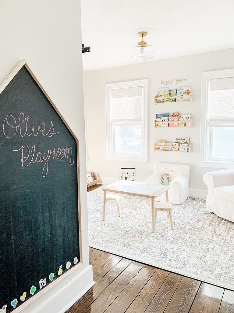
The last thing we added to our playroom is this oversized chalkboard. I saw these on Etsy for a small fortune and knew this was a project that we would be able to take on ourselves. Not only is it a chalkboard but it’s also magnetic. Our girl is still a little young for chalk but she loves to play with magnets. I found this super cute set of Baby’s First Words Wooden Magnetic Shapes that are made for 1 year and up. You can find them HERE.
You can find a step-by-step tutorial on how to create your own magnetic chalkboard house HERE.
Neutral Minimalist Playroom
You can shop these items by clicking the links below!
“ Affiliate links provided for your convenience, please read my disclosure for more information.”
Gold Flush Mount Light Fixture
Comstock Area Rug– use exclusive code MDD62 for 62% off any rug
Ikea Play Kitchen Duktig– Here is our Ikea Play Kitchen Hack Tutorial
Magnetic Chalkboard
Chalkboard Wall Storage– Ikea Nereby
Favorite Montessori Inspired Toys
Our favorite toys are from Lovevery! We subscribed to their play kits when Olive was a few weeks old and we have loved them ever since. It takes the stress out of finding age-appropriate toys, they are beautiful and encourage exploration. Many of the toys here in our playroom are from Lovevery. You can take a look at their play kits HERE.
Below are some of our other favorites.
What to Read Next:
Ikea Play Kitchen Makeover
DIY Magnetic Chalkboard House
Gender-Neutral Nursery Reveal
Best Warm Gray Paint Colors
Want to save this for later? Post this Neutral Minimalist playroom to your favorite Pinterest Board!
