
Table of Contents
This room, our family/TV room was a struggle until it wasn’t. The original vision was lost in my renovation haze (memoir title?) and then once I had some mental space I found it again. Phew. Once we fixed the problem (the paint color) it was like OK THERE WE GO. So let’s recap where we are and talk through what happened.

I love where it is in the house – close enough to the kitchen so that IF we were to eat in front of the TV we aren’t lugging plates far, but with a pocket door so that if the kids are watching something annoying and I want to listen to something or watch The Golden Bachelor on my laptop while cooking, I can shut them out. It’s an internal room (for the most part) so there’s natural light coming from the French doors and the hallway’s door, but no real windows.
Here’s what it looked like before:

At one point it was a community room, an adult foster care wing (I believe, no real confirmation but that’s what we were told). So this whole wing, from the 1960s, was once a big room (with a bathroom) and then broken up into smaller rooms once a family moved in during the ’90s (this is when they were moving out, not how they lived in it).

ARCIFORM drew it up, reimagined it and we came up with this cozy room – serving more as a TV room, than a playroom.

We designed the TV wall with a stove fireplace from Vermont Castings, and a huge TV next to it. There is a clear purpose for this room and it’s to snuggle and watch TV (and we do).
On Choosing The Paint Color…
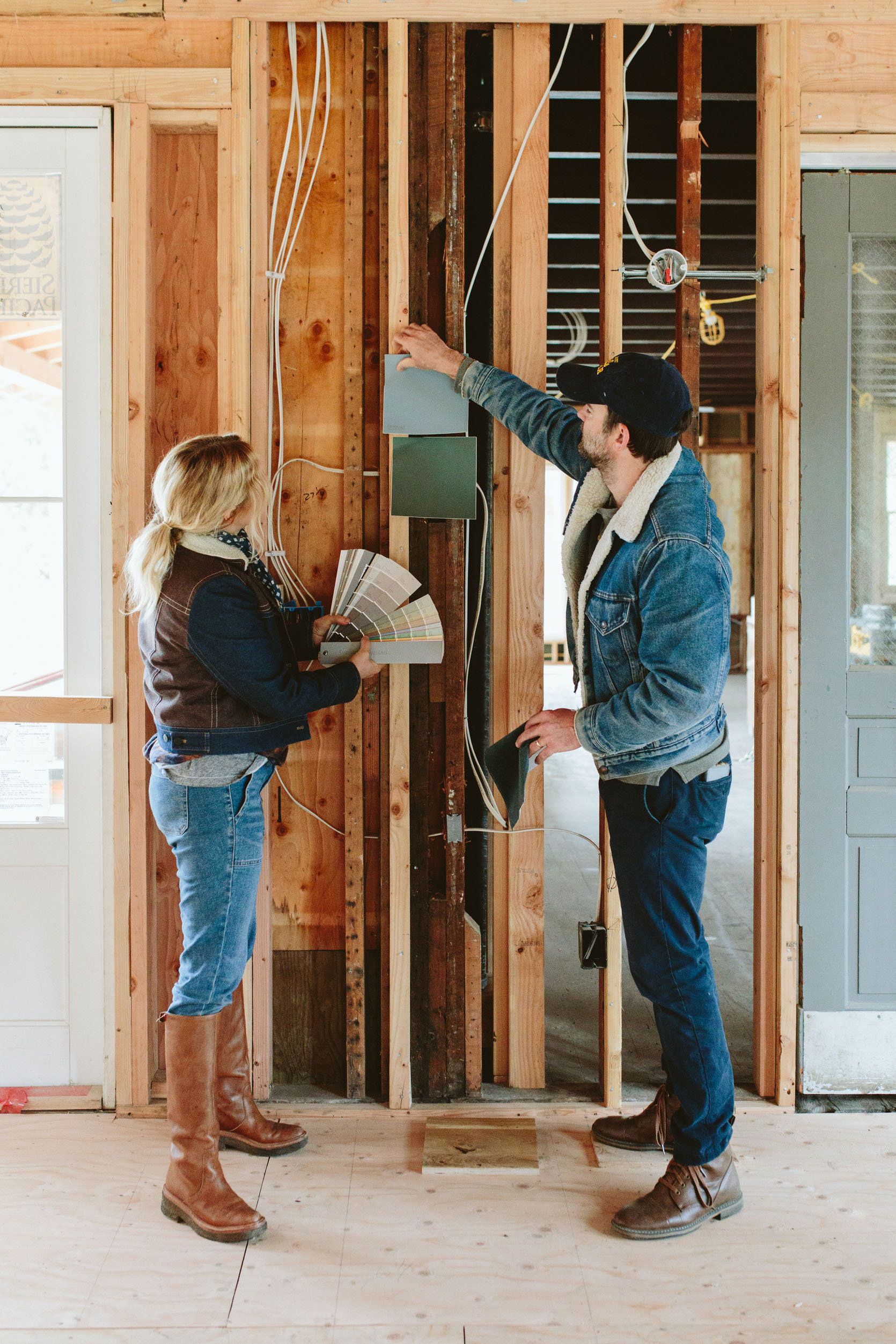

I’ve said it before and I’ll say it again – I HATE choosing colors when you are still in the construction phase. In my perfect world, you have the house all drywalled and primed then you put up samples, stare at them for hours at different times of the day, and choose room by room. Maybe you bring in furniture or rugs that you know you are going to use. But in my experience that has NOT been possible because there are so many moving parts and unless you want to hold up the whole project, you kinda need the painters to get started in certain rooms that are sitting ready. But what happens is that the dry-wallers protect all the tile and window frames from dust and you are expected to choose the color without seeing those or the real amount of natural light. Anyway, this is just me complaining about something I can’t change, but that’s all to say choosing colors without context and when you are overwhelmed is dumb and sucks, It can actually lead to more regrets than just priming everything, living in it and, painting room by room (but yes, the taping off and prep-work is what is so laborious, so once it’s taped off and primed you feel pressure to just choose a color). I honestly think that AI could help us here (yes, Sketchup is obviously an option, but can’t account well for the light IMHO). Come on robots!

ARCIFORM paneled this room with the large-scale beadboard that was a custom run. At one point we were going to stop it at the lower ceiling line, but I think during the installation of it we decided to take it to the ceiling. Oh, and that’s another thing, we popped through the original ceiling to have more height. I love this but there are times when I wonder if this was necessary. Is a tall ceiling important in a room that is meant to feel cozy? I think at the time we were trying to recreate the sense of expansiveness that we had at the mountain house so we wanted to raise the ceilings anywhere we could. But there are a lot of financial and construction implications to doing this (mostly structural and HVAC). I’m certainly glad that we did, but I’m so excited when AI makes it easy to re-imagine a room instantly in a few different ways and do a VR walk-through. Now THAT’S a way that AI can positively affect my life.
Originally I wanted this room to be dark – a dark green, in fact. This was where we started regretting not putting in stain-grade wood because my goodness it was soooo pretty (this is poplar which is more affordable but doesn’t stain well – some parts are very green so we’d have to go very dark stain to make it look even).

So we chose the green and put it to bed (temporarily).


It felt kinda like a sad day when they primed, but we always knew it would happen. Now that it’s dark again I can’t IMAGINE it a lighter color. But I chickened out and chose a light color at the last minute thinking that having a dark color in this space would break up the house too much since it’s also a pass-through room.


The color I chose, Ponder, could totally be beautiful in a light room but (and I KNOW THIS) a room without nice natural light should never be a light color. What happens (or doesn’t happen) is that the light doesn’t pick up the pigment in the paint, rendering it kinda dead. How would a seasoned designer make this rookie mistake? Renovation exhaustion, that’s how. Not having lived in a house and not fully understanding how it flows and how the light works. You make a decision, it’s a bad one, then you have to fix it and move on. And y’all I felt CONFIDENT about Ponder when I pitched it to Brian. CONFIDENT. HA. It would be funny if it hadn’t cost us $2k to fix (painting wood is more expensive than drywall).


AHHHHHH. Stillwater by Sherwin-Williams. But y’all choosing this color was HARD. Getting it perfect was still unknown until the painter pulled off the plastic. It’s a real lesson that you have to choose the color in the light that you wish to experience in the room. AKA it’s so easy to bring the swatch into a brighter room to “see” the color, but it’s SO DIFFERENT. This color looks like a really bright teal in other rooms, but in here it’s the perfect amount of color, saturation, and moodiness. Any darker would likely read almost black when the lights are low, but any brighter would be too bright for the vibe of the room. I’m SO PLEASED to say that while it took an expensive mistake, this color has NAILED IT.
Choosing A Rug
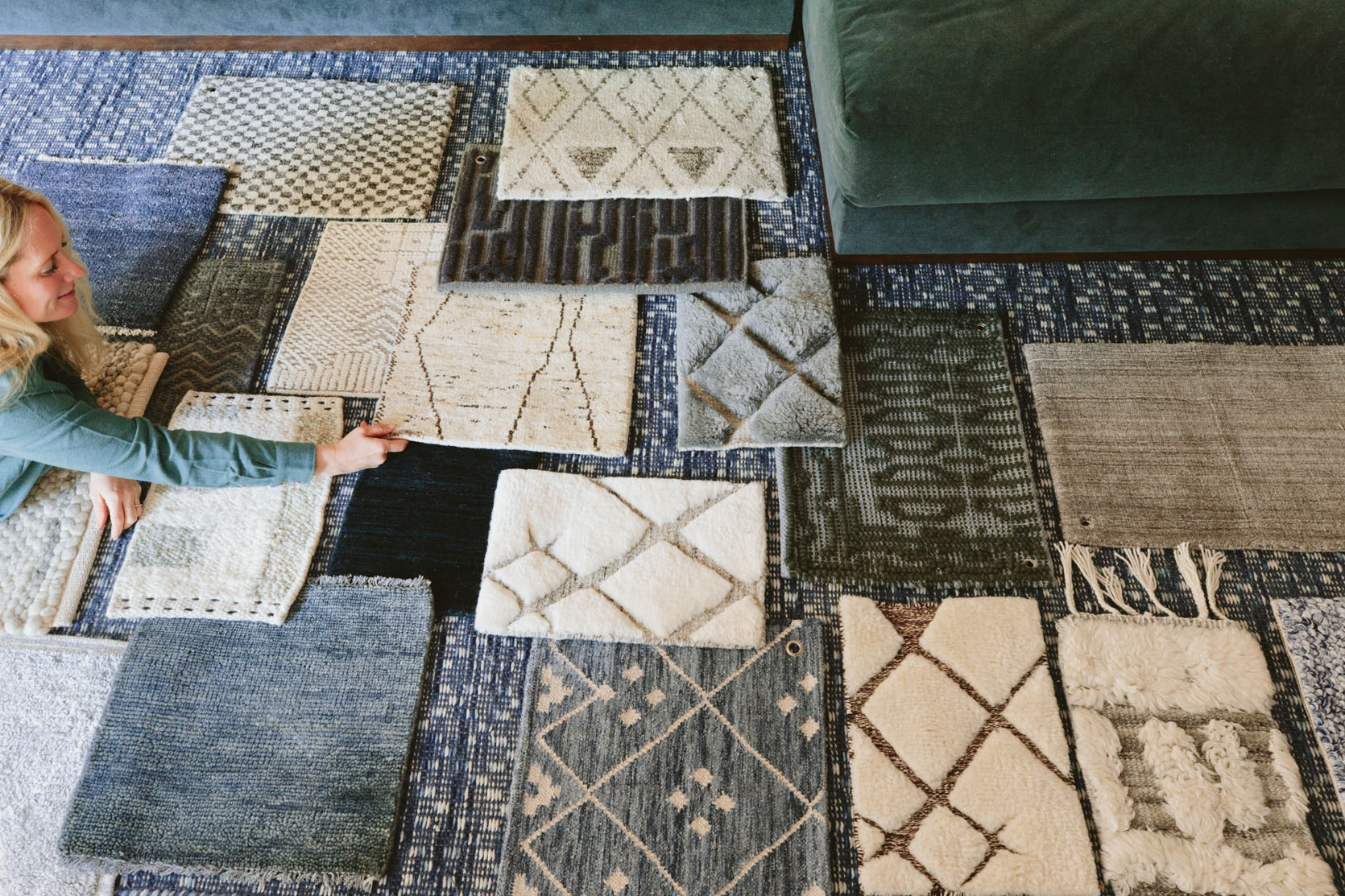
So the goal of this room, the original vision, was always a dark tonal TV den. Now we were back on track. So for the rug, you could go different ways (and shooting the lighter rug for the Rugs USA collab certainly made a case for it) but I wanted to stick to the original vision and put in a darker rug, in the blue/green tones that we loved. But of course, I had to “audition” all the different rugs that I was considering and boy did we find the perfect one (spoiler – it’s from Enkay and it’s GORGEOUS and textural and has so many different thread tones).
What’s Next!!

Art, lamps, window treatments… Come back tomorrow to see how we executed the seascape gallery wall without ONE WRONG NAIL HOLE. First time in Bachelor history, folks. You gotta to see it to believe it. 🙂
*Pretty Photos by Kaitlin Green
