Table of Contents
This week, the Blockheads tackled their studios; self-contained apartment spaces once combined with last week’s guest bathrooms. Scores aside, they now all have a much-needed place to move into for the rest of the build (what luxury!), and some are definitely more practical than others!
And that was a bit of a theme last night. While most of the rooms (sorry Eliza and Liberty!) looked lovely, some performed much better than others in the practicality and self-contained stakes.
So onto the scores, the winners, the pictures and how to shop the look!
Steph and Gian (First): 24.5/30
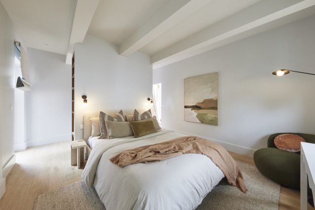
With a fireplace blazing, featuring beams overhead and a nib wall behind the bed, Steph and Gian’s room was warm, cosy and beautifully executed, the judges said. With a great bed and great flooring it was: “all really lovely!” Darren gushed, with Marty agreeing this is a space that will take a buyer’s breath away.
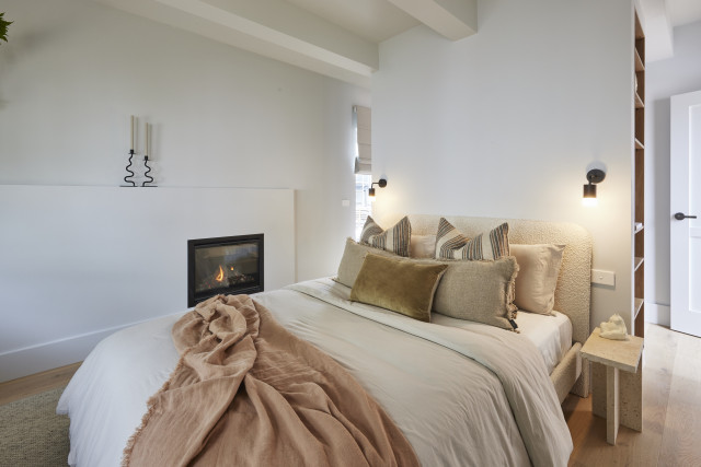
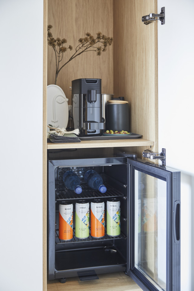
Featuring a bar fridge and coffee station in the wardrobe, a border-hugging lighting plan and door accents and a colour palette that will appeal, this is a personality filled space Marty said would definitely appeal to a large audience.
The judges are even coming around to the beams!
My view: Loved the fireplace, the nib wall (so many styling opportunities!) and the ultra cosy factor. This was my favourite for sure!
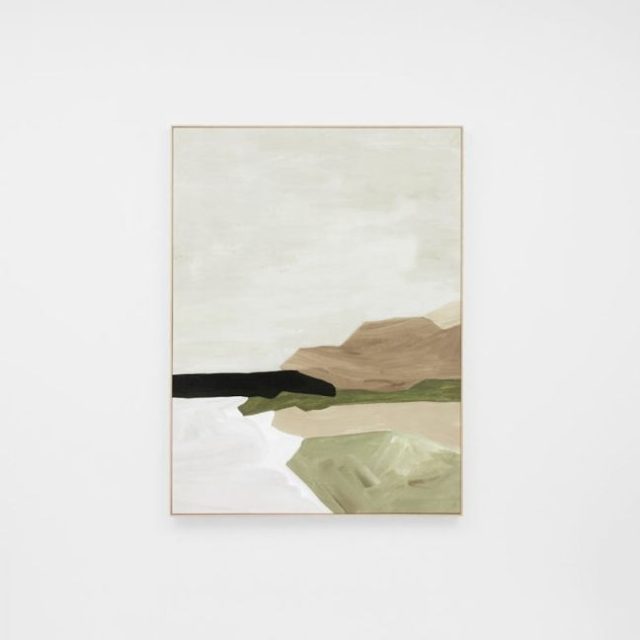
Shop the look: Tranquil Olive Coastline framed canvas, $490
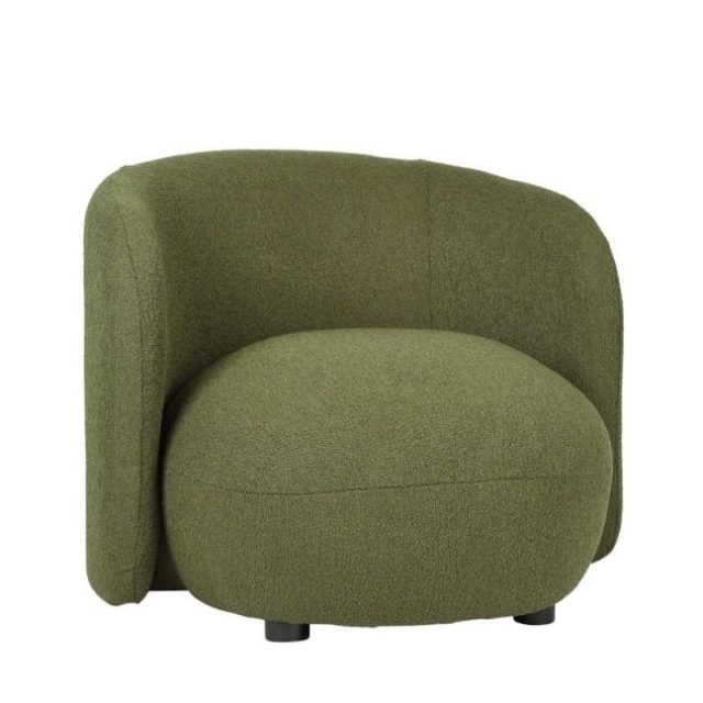
Shop the look: Plume occasional chair
Kyle and Leslie (Second): 23/30
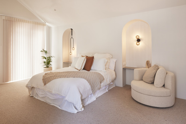
One word summed up the judges’ reactions to Kyle and Leslie’s guest studio: “Wow!”. With what Shaynna called “a real understanding of minimalism” it was a space that blew Marty’s mind (to start with anyway!). From the Hardie Groove panelling in the arches to stone shelving, concrete finish cabinetry, Anna Blatman wallpaper and a separate pilates space, this was a space all agreed would complement the home to come.
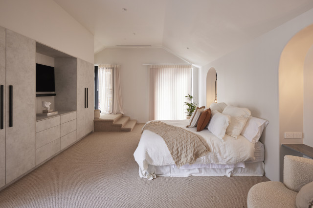
But was it too big, Marty wondered? Separated from the main house, he felt a disconnect and with a pool planned for outside, perhaps a bar area could have worked. Close they agreed, but not perfect.
The judges agreed it looked great but didn’t do enough and that the segment of buyers who would want a pilates studio was too small.
My view: I’m sorry but what’s going on with the recessed bedsides which are totally impractical?! I love the curves and the stone shelves (jury’s still out on the mismatched lighting) but how are you actually supposed to use them with ease? And if they’re not meant to be bedsides, what are they for? Arches for arches’ sake? Not sure about the random chair right next to the bed either.
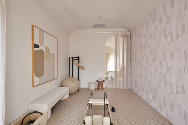
Shop the look: Peaches and Cream art print, $850

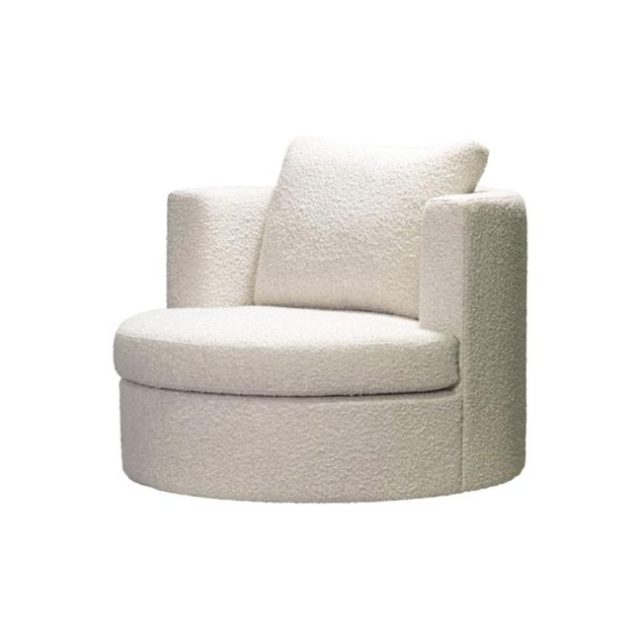
Shop the look: Bergman swivel chair, $2,130.
Eliza and Liberty (Third), 21.5/30
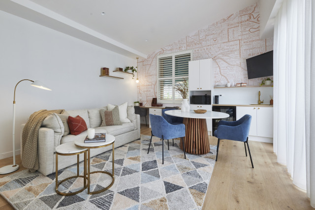
Striking a balance between serving the pool that will land outside and the needs of guest accommodation, this could be, Darren said, the “Goldilocks zone” he’d been looking for all day. He loved the space, the outlook and the amenities, and Shaynna agreed that this was a room you could sleep, relax and work in.
But then Marty stepped in. The wallpaper, he dismissed, was juvenile. The styling was outdated and if he’d been presented with an empty room, he summed up, he’d have been happier. A crushing judgement for Eliza and Liberty, but with time to tweak, it left them with a lot to consider.
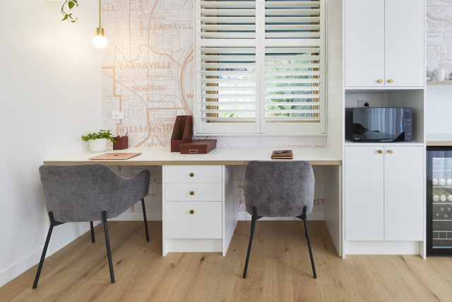
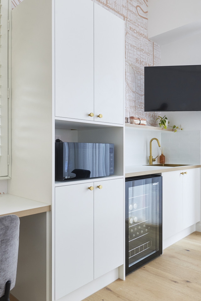
While Darren thought it was great they’d included everything, Shaynna thought they’d tried to cram in too much and that it had cheap motel vibes. Marty said nothing felt luxurious enough. They’d missed the mark.
My view: Hated the wallpaper, the rug and the styling but agreed with Darren it was much more poolside-appropriate. Have to agree with Shaynna on the motel vibe too. Just not luxe enough.
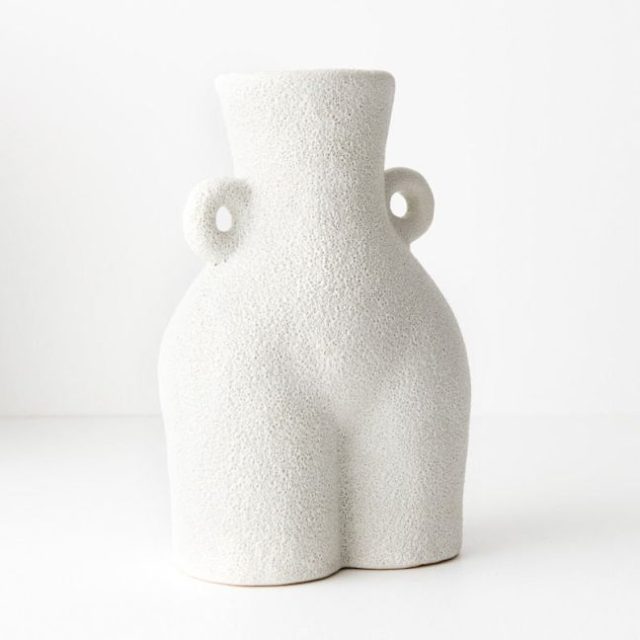
Shop the look: Felisa vase, $49.95
Kristy and Brett (Equal Fourth), 21/30
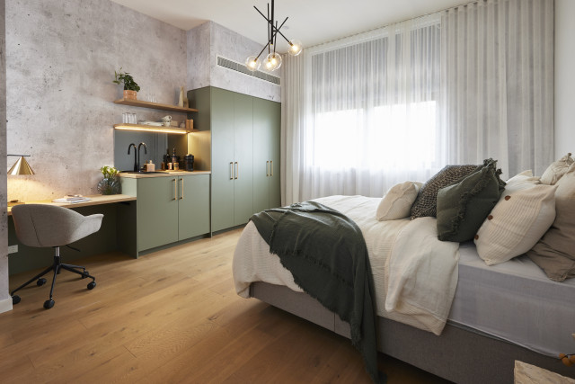
Sultry, moody and with a beautiful view to the adjacent tree thanks to the Velux skylights, Kristy and Brett’s has, Marty summed up, a definite New York loft vibe. Is that a good thing, though? Shaynna asked, pointing out last week’s bathroom – just downstairs and part of the same studio space – had a more Moroccan feel. She didn’t like the bed facing the sink either. Marty asked where was the TV and lounge furniture?
Either was fine with Darren, who saw a Moroccan, industrial, coastal mashup happening, but he was concerned that for a guest space it wasn’t as self-contained as he’d like, with perhaps a washer, dryer and dining area needed. That aside, the judges agreed the execution was perfect and with a few tweaks, this could be a perfect retreat.
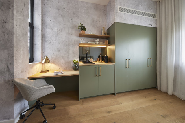
Darren said it was a bedroom with some added amenity. It wasn’t fully self-contained. And it didn’t have a rug, which made it feel sparse.
The judges were impressed by the effort and execution however.
My view: I actually really liked this one. I think it needed a TV and a rug though!
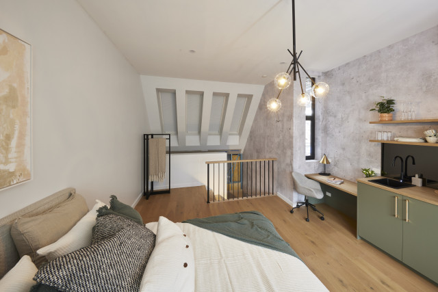
Shop the look: Distressed concrete wallpaper
Leah and Ash (Equal Fourth), 21/30
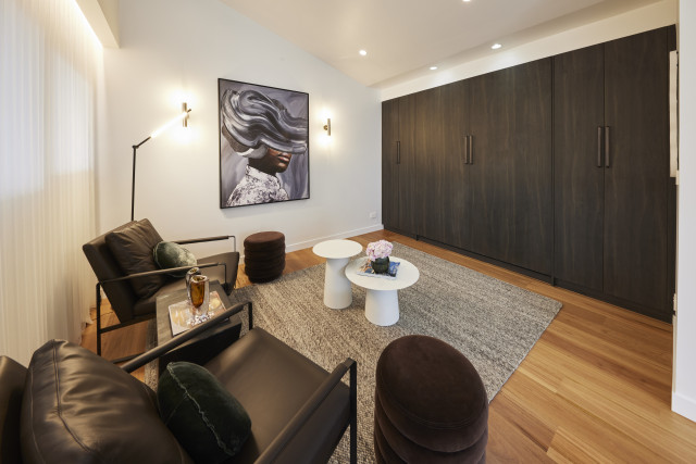
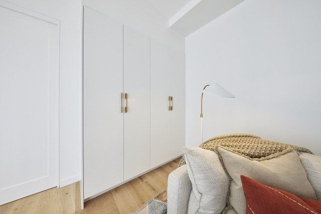
With a fold-down bed, separate bar/kitchenette area and living space looking out over what will be the backyard, Leah and Ash’s studio had a lot to earn the judges’ praise. Darren in particular loved the colour scheme, with the floors complementing chocolate-coloured furnishings and velvet ottomans and marble benchtop echoing the nearby bathroom. But where was the personality, he asked. And Marty agreed.
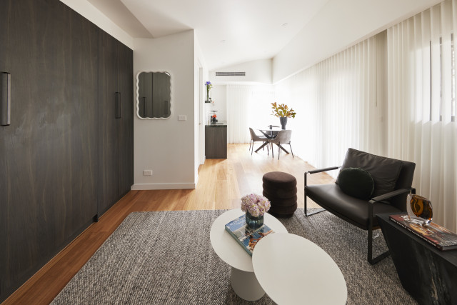
By trying to combine a studio with a pool cabana, neither theme truly worked, he said, but it was a great start. Swap out the existing bed for a sofa, he suggested, bring in a television and inject more drama!
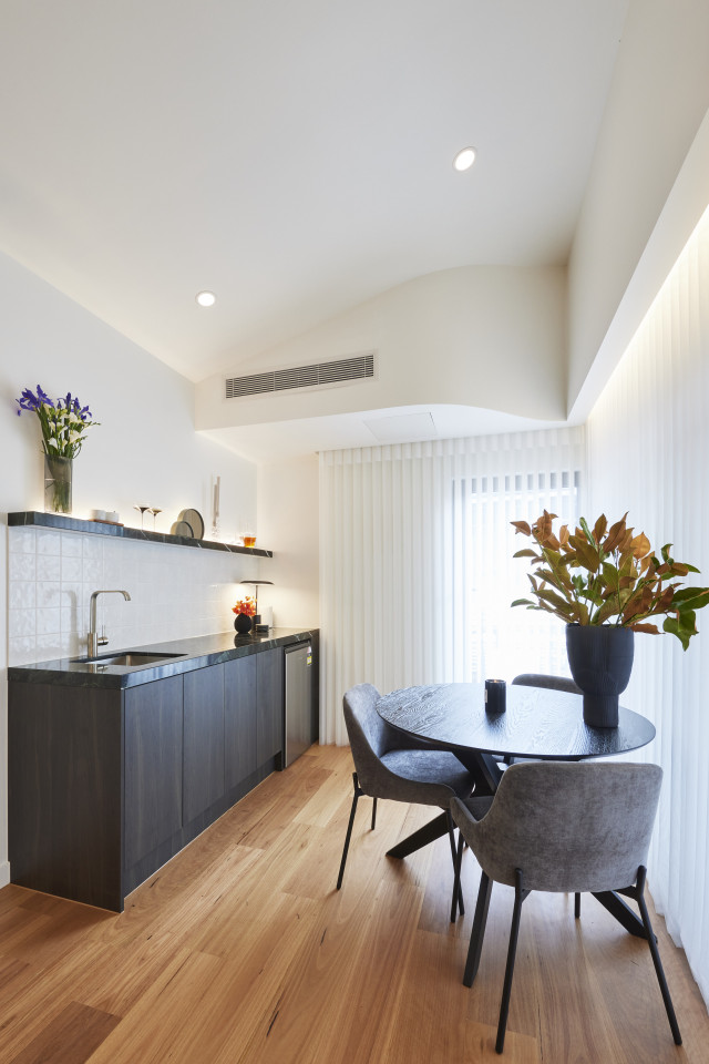
The Murphy bed wasn’t actually the best choice, Darren said. Having a seating area facing a wall of cabinets (which turned out to be a bed in disguise) was confusing and odd.
On the plus side, the execution and many of the choices were great. And the amenity also. But Marty said the room will be hard to shoot from a real estate perspective.
My view: I agree with the judges wholeheartedly!
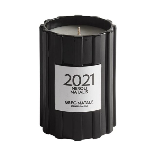
Shop the look: Greg Natale candle
Photography via David Cook Photography, The Block Shop and nine now.

