

Interior decorating is truly a technology based process these days. And this is all good when it comes to searching for resources (or designers!) that may not be right in our own back yards. But, there is a real problem with technology and picking paint colors. It just shouldn’t be left to computer screens, cellphone apps or even the pages of a magazine. In other words, if you see a color you love, don’t assume it will look at all in person how it looks in the image.
Take, for instance, the image above. This is probably the third post I’ve shared this image in because I love it so much. The pink paint color in the bathroom is listed as Farrow & Ball’s “Setting Plaster”. After painting much of my own cottage a much deeper and brighter shade of pink, I was having second thoughts.

And started obsessing over the color to the point where I decided to search for other spaces that have used this beautiful paler shade of pink. What I found was fascinating and perfectly illustrates the problem with technology – in other words, how images are digitized and how different screens render the colors differently.

As you can see – all of these images show a different shade of pink. Some are a little muddy like the fireplace image above and others are show a much clearer hue, as in the photo right above.

The color is back to being a little more muted in the space above – possibly because it’s been painted on a plaster wall.

And the image above we see a paler, cleaner pink again.

And on it goes. Each space shows a different shade of what is supposed to be the same color.
The images below are directly from Farrow & Ball’s online marketing materials:


In the image below, taken from F&B’s product page, the top thumbnail is more beige to orange than the room shot image appears.
All the different images show a slightly different color. I went to my F&B paint palette – which uses real paint on the chips, not color paper. Here are two photos I took of all the pinks:
The top one was propped up vertically on my mantel which faces a big window

And I took this second image with the palette lying flat on the window sill.

In both cases, the chip shows a color that is beige, a pinky beige to be sure, but beige nonetheless. As a matter of fact, it’s what I would call “Ace bandage” beige.
And yet, how beautiful is it in all these photos??
I guess my whole point is this: If you see a color in a photo (in a magazine, on a screen, in a movie, whereever) that you love – check out the real paint in your own home. The quality of light always changes how a color looks. A tiny paint chip doesn’t look at all how it will look spread over a large vertical surface. Had I been looking for a pale, soft pink on the F&B paint palette, I wouldn’t have given “Setting Plaster” more than a glance. I probably would have gone for their “Pink Ground”

In fact – the image above is Setting Plaster on the baseboard and table and Pink Ground on the wall.
Another example:
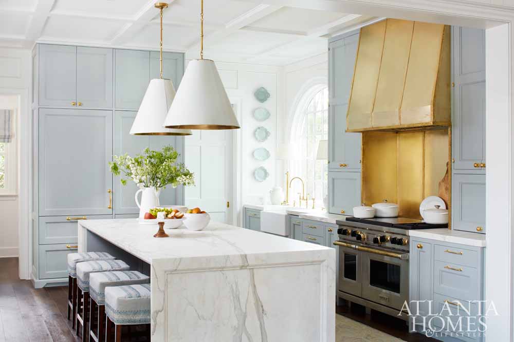
This beautiful kitchen and dining area was part of the Atlanta Homes & Lifestyle Designer Showcase a few years ago. I profiled it here. This beautiful pale blue is described as being Farrow & Ball’s Light Blue – which makes sense given how it looks in the images.


Now – if you were going to guess which of these colors below is Light Blue – which would you pick? Or I should better ask – which one would you NOT pick?

Light Blue is the middle swatch. From left to right Farrow & Ball paints: Borrowed Light – Skylight – Light Blue – Parma Gray – Lulworth Blue
This is why picking paint colors can be so tricky especially if you’re counting on what you see on your screen to look the same in your own home. The quality of light coming in from the windows, interior lighting and even the color of the house next door (if it’s close enough) will affect how paints look.
When I’m picking paint colors, I usually do search for rooms painted that color on Google, Pinterest and Houzz just to see how it looks in room size scale. But nothing will ever beat buying a sample pot or ordering real paint wall samples from Samplize to get how a particular color will realistically look.
If you’re looking for lots of help picking paint colors – I highly recommend the Color Muse. You can use it to find comparable paint colors across a wide range of paint companies.

(Pin for future reference)


