A neutral palette is anything but boring, as this tastefully done up Mumbai home emphatically proclaims! Clean aesthetics, delicate prints and a neutral palette lends minimalistic appeal to Srinath and Jyothsna’s charming 4 BHK apartment in upmarket Dadar East, Mumbai. An air of understated opulence runs through every space in this stylish home, with lightweight prints and softly soothing textures setting the tone for the visual vignettes. Each room flows into the other in a seamless and fluid continuum of space, echoing the subtle, simple visual narrative that embodies the very soul of the home itself. Thoughtfully curated accessories enhance and uplift the overall design language.

Srinath and Jyothsna Srinivasan are discerning and articulate homeowners, well travelled and with an eye for fine craftsmanship and functional design. Sachin travels a lot on work, and shares, “When I travel, I take a lot of photos of the hotel rooms I stay in, which are mostly 5 star luxury hotels with very nice décor!” Their home, therefore, had to match and exceed the exquisite level of luxury and design he had experienced in his travels. HomeLane designer Sachin Berde more than delivered!
As Srinath put it, “How do we do something that is absolutely superlative, but within a budget? HomeLane did a good job of recommending a senior designer, Sachin Berde. He was very patient with us. He said it’s your home, so we’ll design it the way you want— and if you don’t like it, we will change it!”
The result of their synergy is this gorgeous abode, with interior spaces that have perfect relevance to their lifestyle and are a true match to their personality.

Awash in warm neutrals that are offset by muted patterns and delicate textures, the living room oozes elegance. Fine-veined italian marble on the wall behind the TV ups the luxe quotient in the space, and the plush leatherette sofas add abundant style and comfort. Floor to ceiling drapes in light fabric allow diffused light to filter in; a theme that is used through the home to add a translucent and almost ethereal lighting quality.
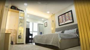
Dipped in shades of grey, cream and gold, the master bedroom is a symphony of pastels. With tactile layers in the soft furnishings and minimal furniture that reflects the simple aesthetic, this room is as functional as it is artistic. The lighting is a surprising and unconventional mix of white and yellow that perfectly complements the spaces.

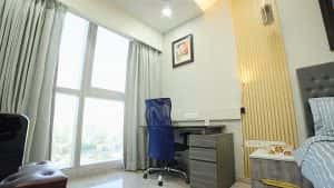
The basic neutral palette is pulled into perfect contrast with metallic finishes in gold and silver that add character and personality to the room. Taking advantage of the stunning views, a compact work desk is placed right next to the window and is finished in metallic grey.
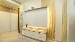
Jyothsna’s brief to designer Sachin was simple and very straightforward. “Every day, maintaining the house should be practically easy for me. It is not going to be a show flat that’s going to be kept unused,” she told him, and Sachin kept this requirement at the top of his mind when selecting materials and finishes. On the wall opposite the bed, a backlit projection screen allows them to watch their favourite TV serials when lounging in bed.

Jyothsna laughs as she speaks about her colour preferences. “We realised that the designer plays a major role, no matter what you choose! You might like something, but the designer has the final say about whether or not it will look good in your home, and that’s very important! I am more into pastels, so I ended up choosing all white. Ultimately it looked too white, but then the designer told me that we can change the look with the right lighting.” Sachin took a lot of initiative to tell the couple what would look good, and whether their ideas were practically possible or not.

One of the bedrooms has been converted into Srinath’s home office, for days when he chooses to work from home. The uncluttered desk top and ample storage space provide a neat and super-organised environment for focused work.

Jyothsna paid special attention to the choice of soft furnishings and artwork in each of the rooms, and Sachin helped her to zero in on paintings and posters that were a fitting finishing touch to the décor. Fine detailing in the wall panels and ceilings serves as a lovely backdrop to the display of art, allowing it to visually merge with the overarching design story.

When asked what it was about HomeLane that they ultimately loved, Jyothsna was quick to mention that she had fallen in love with HomeLane’s modular design. For Srinath, it was the good finishes and top-notch quality that set HomeLane apart. As he says, “The quality of HomeLane is very good, and they deliver within a timeline. Given our poor experience with carpenters, we knew that HomeLane would surely deliver it within the time promised!”
Warming up to the subject, Srinath added, “We’d like to applaud their combination of functional interiors, money and aesthetics. And what I also liked about HomeLane was that there was no mess in our home, with someone sitting and working here. While work was going on here, simultaneously furniture would be produced in the factory, brought in and installed, which was a huge plus for us!”
Being an investor, Srinath is someone who has a firm finger on the pulse of financials, and the budget was an important consideration for him. “With HomeLane, we didn’t have to deal with a lump sum figure that could change as we go along, till finally you give up! Here you know what’s coming— it’s all planned down to the last nut and bolt. That was very important for me – we were paying rent for the other house, and Mumbai is pretty expensive. So, getting things done within a certain time frame was important, and every aspect had to be slotted and detailed out!”
All pluses and no negatives, as far as this happy couple’s experience with Homelane went! Are you ready to join the HomeLane design revolution, just like Srinath and Jyothsna? Let’s connect!
