Table of Contents
Color psychology—a field at the intersection of psychology and design—examines how colors influence human emotions and behaviors. For interior designers, this understanding is pivotal, as the choice of color palette can significantly impact the ambiance of a space and the psychological well-being of its occupants. In this article, we explore how color psychology informs current trends in interior design—highlighting its role in shaping environments that are not only aesthetically pleasing but also conducive to the desired emotional and psychological responses. Understanding the nuances of color psychology is essential for creating spaces that resonate with the moods and needs of those who inhabit them. Let’s take a closer look at current color trends and how societal changes are pushing certain colors out of style.
Basics of Color Psychology
As noted above, color psychology is the study of how colors impact human emotions and behaviors. Studies have shown that color affects mood and that various shades have different impacts depending on culture, tradition, and individual experiences.
It is a field that blends elements of psychology, design, and cultural studies to understand how different hues can evoke specific responses. This branch of psychology is particularly relevant in areas where color plays a pivotal role—such as marketing, branding, and notably, interior design.
Whether vibrant shades, darker hues, or lighter shades, colors have the power to influence mood, elicit certain feelings, and even affect physiological reactions.
A Calming Effect: Shades of Blue
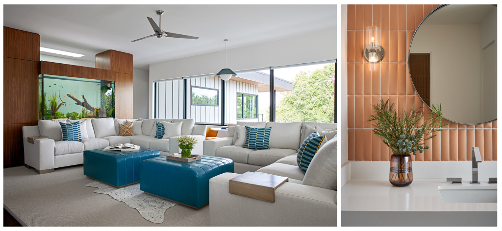
As an interior designer, understanding these color-induced responses is crucial. For instance, blue is often associated with calmness and serenity. Different shades of blue are believed to lower blood pressure and slow respiration and heart rate, making it ideal for bedrooms or relaxation spaces. Blue’s various shades—from the soft hues of sky blue to the depth of navy—offer a range of emotional tones—each creating a different atmosphere within a room.
Intensity and Excitement: Shades of Red
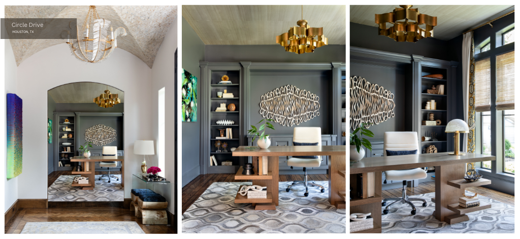
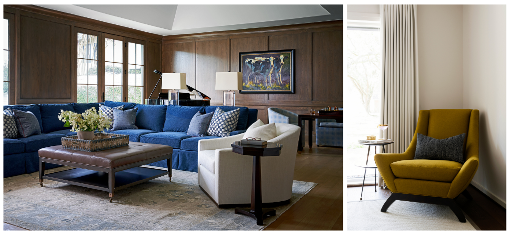
Conversely, red is known for its energy and intensity. It’s a stimulating color that can raise energy levels, which is why it’s often used in spaces designed for dynamic activities. Red can increase respiration rate and elevate blood pressure—making it less suitable for areas meant for relaxation. However—when used correctly—it can add a vibrant and exciting feel to a space. Purple falls in the middle, with many noting that purple inspires creativity and can thus be used in home offices, craft rooms, and living spaces.
Odes to Nature: Green and Yellow
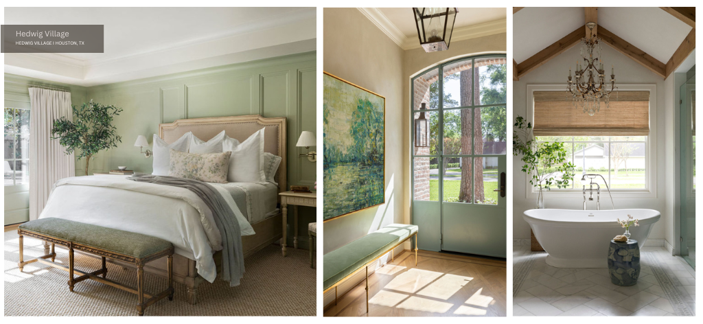
These associations extend to other colors as well. Green—often linked with nature—can create a sense of tranquility and health—making it a popular choice for spaces where peace and balance are desired. Yellow—associated with sunshine—can evoke feelings of happiness and liveliness but in large amounts might also lead to feelings of frustration or anger. Neutrals like white and gray offer a backdrop of simplicity and flexibility—allowing other elements in the room to stand out and influence the mood.
Understanding these associations is key in interior design. The choice of color not only defines the aesthetic of a space but also contributes to the emotional and psychological experience of those who use it. This awareness is essential for creating environments that are both visually appealing and emotionally harmonious.
Historical Context of Color in Interior Design
The use of color in interior design has a rich and varied history—shaped by cultural, societal, and psychological factors. Tracing back through different eras—the prevailing color trends often reflected the broader social and economic climate of the time.
Color During the Victorian Period
In the Victorian era—for instance—interior colors were dark and rich, with deep reds, greens, and blues dominating spaces. This choice was partly due to the limited availability of pigments and the popularity of heavy, ornate furnishings.
The use of such deep colors also signified wealth and status. However, most dark shades later gave way to lighter, airier colors as the 20th century approached. This lighter and softer deviation signaled a shift in social attitudes and technological advancements in the production of paint colors.
Color During the Early 20th Century
The 1920s and 1930s saw a drastic shift with the Art Deco movement, which embraced bold colors and geometric patterns—reflecting the optimism and growth of the era. The post-World War II period—particularly the 1950s—brought in an era of bright, cheerful colors like pink, turquoise, and mint green—resonating with the era’s sense of hope and prosperity.
Contemporary Uses of Color in Interior Design
The late 20th century saw a more eclectic approach to color in interior design, influenced by the rise of individualism and the increasing global exchange of cultural ideas. The 1960s and 1970s—for example—featured a mix of earthy tones and psychedelic colors—mirroring the era’s social movements and cultural revolutions.
Throughout history, color trends in interior design have been closely linked to societal changes and technological advancements. They not only reflect the prevailing attitudes and values of the time but also demonstrate how people’s psychological responses to color can be influenced by their cultural and social context. This historical perspective is crucial in understanding the evolution of color trends and their psychological impacts—offering valuable insights for contemporary interior design practices.
Recent Color Trends in Interior Design
In recent years, interior design color trends have gravitated toward a blend of comfort, functionality, health, personality, and aesthetics—reflecting contemporary lifestyle needs and attitudes. These trends also demonstrate a heightened awareness of the psychological impacts of color—influencing choices that range from soothing neutrals to vibrant accents.
Neutral Tones and Odes to Nature
A significant trend over the last decade or so is the increasing preference for neutral and earthy tones. Shades of beige, gray, and off-white dominate many modern interiors—offering a backdrop that is both calming and versatile.
These colors provide a canvas for personal expression—allowing for bold accents and varied textures to stand out. In line with this, the trend of incorporating natural elements into interior design has also influenced color choices—with greens and browns gaining popularity for their organic, grounding feel. Of course, the gray, white, and beige color scheme of yesteryear is on its way out in 2023. Homeowners are opting for bolder paint colors.
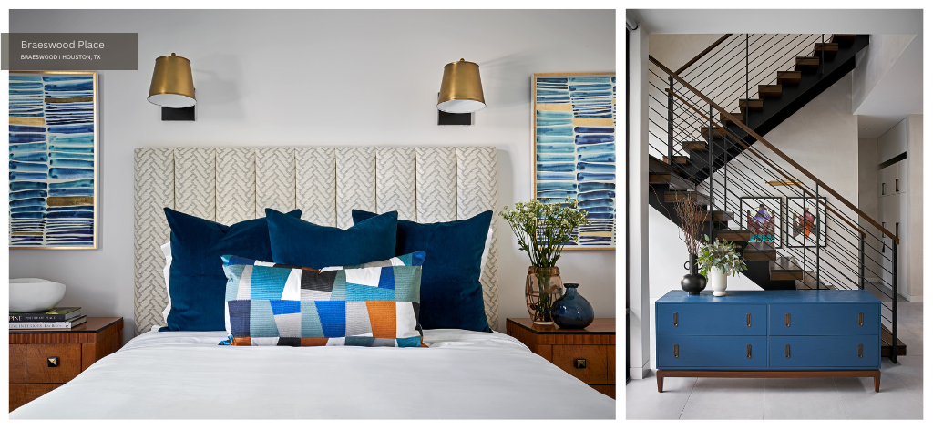
Jewel Tones
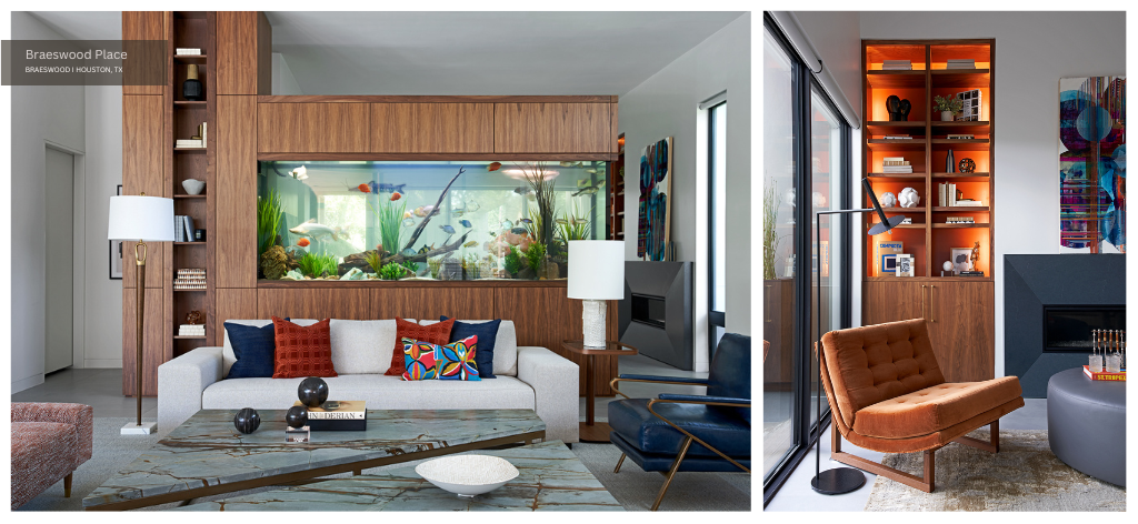
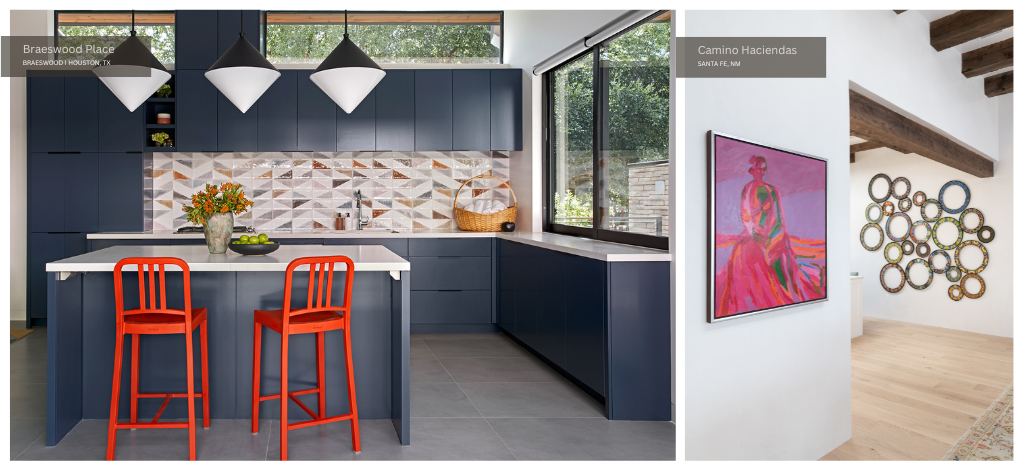
Another noteworthy trend is the use of bold and saturated colors—but in a more controlled and strategic way. Instead of overwhelming a space, colors like deep blues, rich greens, and even vibrant yellows are often used as statement colors.
These are typically applied to accent walls, decorative accessories, or key pieces of furniture. Such shades create focal points and inject energy into the room without overpowering it.
Color Palettes Inspired by Vintage Interior Design
A nod to the past is also evident in recent trends, with retro colors making a comeback but in more modern interpretations. For example, muted versions of mustard yellow and teal reminiscent of the 70s are being paired with contemporary furnishings and decor—blending nostalgia with modernity.
Personalization
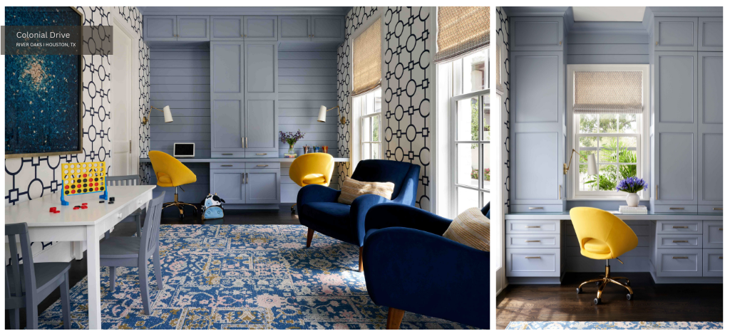
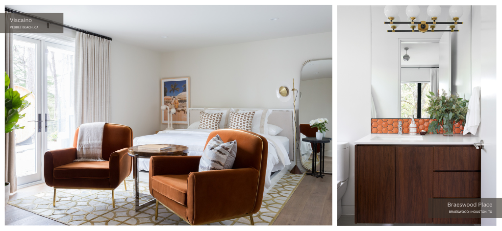
Perhaps the color trend with the most staying power is personalization. The trend towards more personal and meaningful spaces has led to an increase in the customization of color choices. This includes the use of color psychology to create spaces that reflect the occupants’ personalities and emotional needs. For instance, a home office might feature blues and greens for their calming and concentration-enhancing qualities, while a living room might incorporate warmer, sociable tones like terracotta or soft pink.
Overall, current trends in interior design colors reflect a balanced approach—embracing the calming influence of neutrals, the vibrancy of selective bold colors, and the personal touch of customized palettes. These trends underscore the importance of color in creating spaces that are not just visually appealing but also psychologically supportive.
Color Psychology in Interior Design: The Emotional Meaning Behind Current Trends
The current trends in interior design colors are deeply informed by the principles of color psychology—reflecting a growing understanding of how hues can influence mood and behavior. This connection between color choices and psychological effects is key to explaining the popularity of certain colors in contemporary interiors.
Why Neutral Tones and Odes to Nature?
Neutral and earthy tones—such as beige, gray, and soft whites—have gained prominence in recent design trends. These colors are favored for their ability to create a sense of calm and stability. In the context of color psychology, these hues are seen as unobtrusive and soothing—making them ideal for spaces intended for relaxation and unwinding.
The use of these neutral palettes over the last decade reflects a broader societal shift towards minimalism and mindfulness, where environments that promote tranquility, human health, and mental clarity are highly valued. Over the next few years, basic neutrals will give way to bolder, earthier neutrals that add depth and texture to a space. Pale gray might soon be replaced with a dark shade that—while neutral—adds a bit more moodiness to its surroundings.
Why Bold Colors?
On the other hand, the strategic use of bold and saturated colors aligns with the psychological desire for energy and vitality in certain spaces. Colors like deep blue or emerald green are known for their ability to evoke depth, sophistication, and rejuvenation. When used as accent colors, they introduce dynamism and focus to a room without overwhelming the senses. This trend can be linked to a collective inclination towards spaces that balance functionality with personal expression.
Why the Return to Retro?
The resurgence of retro colors like mustard yellow and muted teal reflects a psychological connection to nostalgia and comfort. These colors—reminiscent of past decades—bring a sense of warmth and familiarity to modern spaces. In color psychology, warm hues like yellow are associated with cheerfulness and stimulation—making them suitable for lively areas of the home.
In summary, the popular colors in current interior design trends are selected not just for their aesthetic appeal but for the emotions and atmospheres they create. Neutral and earthy tones provide calm and stability, bold colors introduce energy and focus, while retro hues offer warmth and nostalgia. Understanding the psychological implications behind these color selections is essential for creating interior spaces that are not only visually appealing but also emotionally resonant.
Which Trends Are on Their Way Out, and Why?
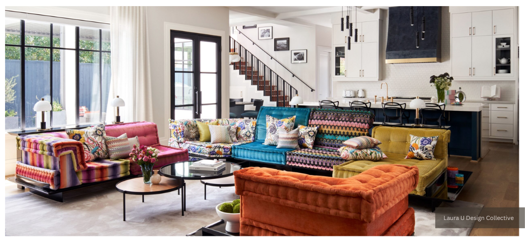
In 2023, interior designers are seeing neutral, cool tones fall away in favor of warm tones and vibrant colors that express the personalities of each home’s inhabitants. Quoted by Sarah Lyon in an article for The Spruce last month, LUDC founder Laura Umansky, notes that “‘[Cool grays] have taken a backseat as warmer tones and bold, vibrant colors dominate the current trends.’” Even warmer neutrals like greige are fading out of fashion.
According to our firm’s founder, “‘Greige definitely had its moment for years, especially with the tonal trend, but it’s time to explore other shades that can be used as neutrals.’” Different shades can definitely function as neutrals, even if they have not been used as such traditionally. Designers expect homeowners and industry professionals to push the boundaries of design and challenge conventional wisdom.
Future of Color Trends in Interior Design
Looking ahead, the future of color trends in interior design appears to be influenced by a combination of technological advancements, environmental concerns, and evolving psychological understanding. Experts in the field anticipate a shift that not only emphasizes aesthetics but also prioritizes well-being and sustainability.
One prediction points towards the increased use of biophilic colors. These are colors that mimic or are inspired by nature—like soft greens, earthy browns, and sky blues. As awareness of the mental and physical health benefits of connecting with nature grows, these colors are likely to become more prevalent in interior spaces. This trend aligns with the broader movement towards sustainability and eco-consciousness in design—reflecting a societal shift towards environmental responsibility.
Another anticipated trend is the use of technology in personalizing color schemes. With advancements in smart home technology and augmented reality, individuals might soon have the ability to dynamically alter the color schemes of their spaces to suit their mood or the time of day. This tech-enabled customization could lead to more experimental and diverse color palettes being used in interior design.
In terms of color psychology, the evolving understanding of how colors affect mood and cognition is likely to have a significant impact on future trends. There’s a growing recognition of the need for spaces that not only look good but also feel good.
As such, colors that promote mental well-being—such as calming blues and rejuvenating greens—may see increased popularity. Additionally, there might be a greater emphasis on the psychological effects of color combinations, with designers paying closer attention to how different hues interact and the overall atmosphere they create.
Ultimately, future color trends in interior design are likely to be characterized by a blend of nature-inspired hues, personalized color experiences enabled by technology, and a deeper integration of color psychology. These trends reflect a holistic approach to design, where the visual, emotional, and functional aspects of color are equally considered in creating spaces that are not just aesthetically pleasing but also conducive to well-being and sustainable living.
Practical Tips for Incorporating Color Psychology in Interior Design
Integrating color psychology into interior design is not just about choosing the right colors. It’s about understanding the function of a space and how color can enhance its purpose. We will leave you with a few practical tips for those hoping to use color psychology effectively in various settings.
Assess the Purpose of the Space
The first step is to identify what the space is used for. Is it a place for relaxation, like a bedroom or living room? Or is it a space for concentration and productivity, like an office or study area? Calming colors like light blue and soft green are ideal for restful areas, while energizing colors like yellows and light oranges can be great for spaces that require activity and alertness.
Use Color to Create Balance
In any space, balance is key. Too much of a vibrant color can be overwhelming, while too much neutrality can feel uninspiring. Consider using neutral colors for walls and floors and adding color through furniture, artwork, or accessories. This approach allows for flexibility and easy changes over time.
Consider Lighting
The way a color looks can significantly change under different lighting conditions. Natural light brings out the truest color, while artificial light can alter the appearance. Testing paint samples at different times of the day is crucial to see how colors behave in varying light conditions in the space.
Warm colors, deeper hues, and pretty much any tone you select for your design scheme might appear differently in the morning than they do at night, for example. If using a space primarily in the evening–like a dining room–be sure that the paint color you select appears as you wish during that time of day.
Experiment with Accent Colors
Accent colors can be a powerful tool in interior design. A bold color on a single wall or a brightly colored piece of furniture can transform a room. Accents are an excellent way to introduce energizing colors without them dominating the space.
Be Mindful of Color Trends
While it’s tempting to follow the latest color trends, it’s important to consider longevity. Trendy colors can quickly become outdated. Select colors that you connect with personally and that will stand the test of time.
Final Thoughts on Color Psychology in Interior Design
color psychology offers invaluable insights into interior design, underscoring the profound impact that color choices have on the atmosphere and functionality of a space. The trends in interior design color reflect a growing appreciation for how hues can evoke specific emotions and behaviors, with current preferences leaning towards a balance of calming neutrals and strategic use of vibrant accents. Looking ahead, the future of interior design colors is poised to be shaped by technological advancements, environmental consciousness, and a deeper understanding of color psychology.
The effective application of color psychology in interior design goes beyond aesthetic appeal. It involves making informed color choices that enhance the emotional and psychological well-being of the occupants, while also meeting the functional demands of the space. This nuanced approach to color selection is key to creating environments that are not only visually striking but also profoundly resonate with those who inhabit them. Working with an interior designer or interior design firm ensures your space achieves the effect you desire. Reach out to our team of interior designers for more insight into your project goals.
