Table of Contents
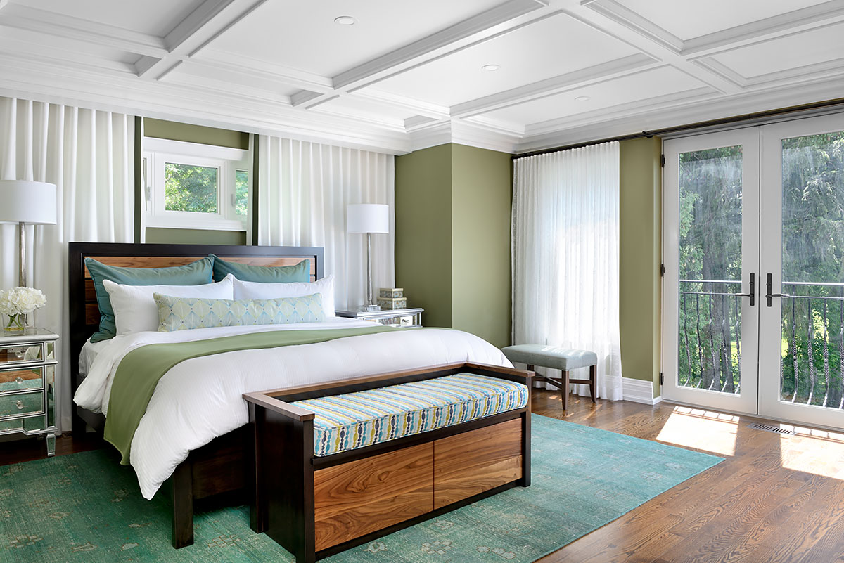
Green plays well with other colours, even other shades of green!
Green is nature’s neutral! From plants to accessories, It’s the easiest colour to mix into any room and the choices are almost unlimited. So, if you want to know, here is my list of the five best green paint colours.
How do you make green?
Green is composed of blue and yellow—two primary colours mixed together. Green never clashes with complementary or analogous colour combos. This means green always stays true when up beside any other colour.

From the lightest tone to the darkest shade, green has a way of blending and enhancing its surroundings.
The Effects of Green
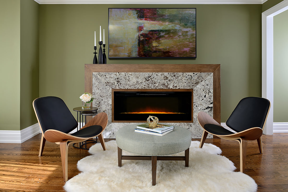
It’s like bringing the outdoors in when you choose the right soothing green.
Green colours are generally cited as the most calming. This is based on the focus of green receptors within the centre of the eye, and its association with nature, it’s perceived as the most “balancing” colour.
Of course, if you dislike a colour for other reasons associated with past experience or events, it is unlikely to evoke a sense of calm!
Green is the colour of “the middle”. It’s neither too warm nor too cool, and green is always happy to oblige should you want to heat it up or cool it down.
For those looking for a true neutral or a trendy lift, look no further than green. It plays well in any room!
Here are the top 5 green paint colours
1. Dusty Miller, Dulux A1914
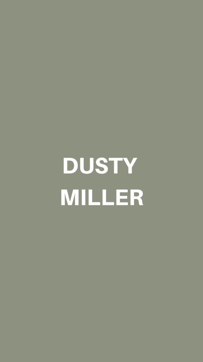
Dusty Miller – Deluxe
This is the ultimate pale grey-green. It is the perfect, cooler backdrop for any space where you don’t want basic grey. Pair this with black or gold hardware for impact, or crisp white trim for a traditional look.
2. Main Street USA, Dulux A1902

Main Street USA Dulux
This name is not indicative of the versatility of this green! It’s neither dark nor light.
It has a touch of grey in it so it won’t be too strong on walls.
It’s an excellent choice for a kitchen or study. When you want the colour to feel “present” within the space, but not take over, this is a lovely choice.
3. Holiday Bough, Dulux A1001

Holiday Bough Deluxe
Looking for a deep olive green you can live with? This is the colour. It’s rich enough that you won’t feel “stuffed” when you use it in your dining room or powder room.
It has just enough body and character to make a statement without looking like it was an overreach!
4. Fresh Cut, Dulux A1044

Fresh Cut Deluxe
Mint can be difficult to select as it can read as “cheap” or feel “clawing”, much like perfume that’s applied too heavily. Fresh Cut is not quite off-white, but it has its place.
It would work exceedingly well in vintage spaces like black and white bathrooms or kitchens with high contrast colours, this green will balance it out.
5. Tavern Green, Dulux, A1939
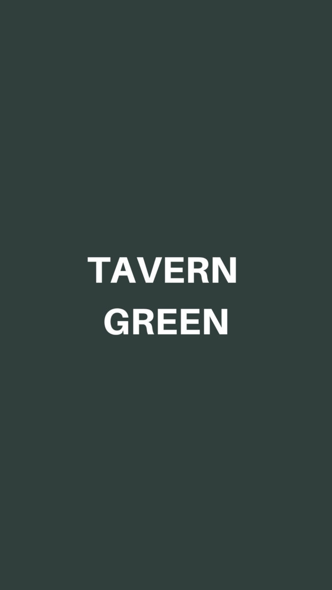
Tavern Green Dulux
This is a perfect “charred” or “blackened” green. It would work well in high contrast rooms when combined with white or ivory. It’s also an excellent front door colour as it maintains history, depth and charm … all in one colour.
Bonus green paint colours!
Pale Clover, Dulux A1055
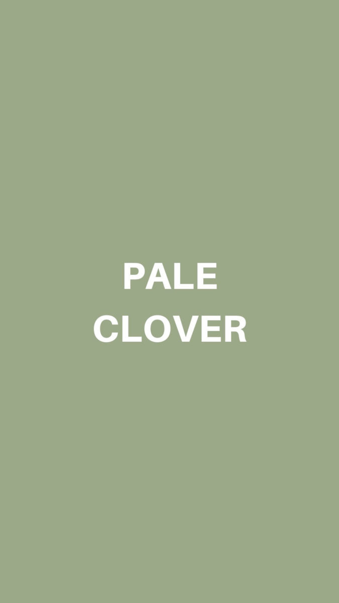
Pale Clover Dulux
This is a stronger green of mid-level brightness. It’s a great green to combine with stained oak cabinets that need to look refreshed. Add this to a den or office to reignite the whole space.
Shakespeare, Dulux, A 0936

Shakespeare Green Deluxe
Yup, it’s chartreuse! A colour I love for its vitality and intensity! It combines the strength of yellow with drops of blue to calm it down. This is a wonderful colour to pair with deep pink and red for a historical combo. It also works with turquoise and navy to embody the colours of the oceanside. Put this on an accent wall in a dark space where you want a reflective colour and brightness.
Are you thinking about painting a room green in your home? Find out how long it takes to paint a room along with some helpful tips at Ownerly.
Love colour? Learn more about which white is right for painting the walls in your home.
