Table of Contents
I am sorry I couldn’t finish the post from Sunday, but as promised, here is the rest.
If you’ve read part 1 please click the link below. Otherwise, if just landing here, please begin from the top of the post.
Part 2 Begins Here
The beginning of the post starts here.
Soooooooooooooooooo…
I am sad to say that I had to go back to the drawing board regarding the staircase guard and handrail design. (This post is from April 2022!)
While I originally learned decades ago that the 4″ maximum opening was code for staircases, I read somewhere recently that it was five inches, so I thought perhaps they (whoever “they” is) had come to their senses.
But no, it is 4 inches for every opening above the hypotenuse of the riser and stair triangle.
In that triangle where the stair riser meets the tread, the rule is a maximum ball of six inches can fit through if there’s a diagonal rail in the staircase design.
Here, let me show you a diagram.
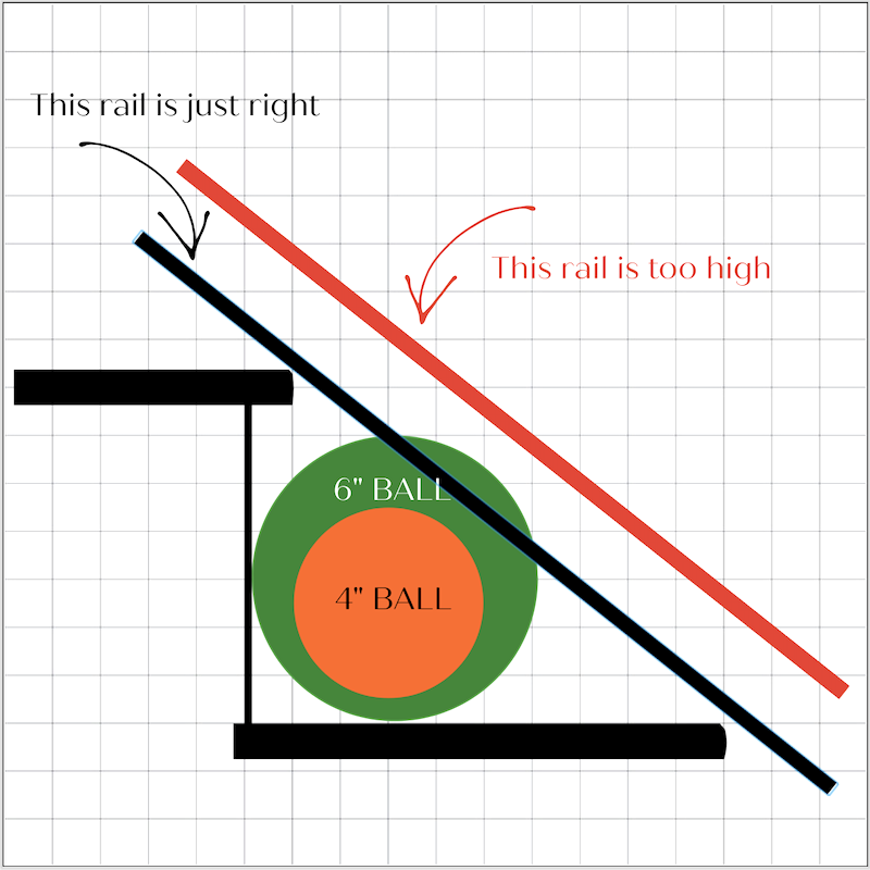
Okay. They are concerned about a young child getting their head caught in an opening.
By the time a baby can crawl, say at 6.5 months, the smallest a baby’s head is over 5.2″ in diameter. I’m a lot more worried about the baby falling down the top of the stairs.
However, a very small dog might be able to fit through that 5.5″ opening at the bottom of the rail where you see the 6″ ball. According to the code, that’s okay, but all other openings must be 4 inches.
Fine.
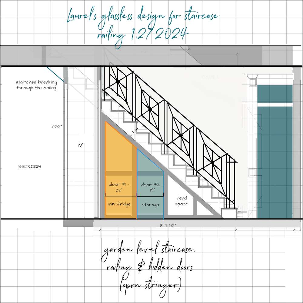
That is why I did the design I love and decided to put in glass which I decided about two weeks ago that I hated.
Above was my solution with the assumption I could go as large as 4.99″ for the openings. Alas, I can’t.
And since I do not wish to add more spokes or squares to my X design, I decided to take another stab at an alternative.
***For those who haven’t read the numerous posts surrounding the stair railing, please know I’ve spent countless hours exploring zillions of other options.
The frustrating part is that many designs look fantastic going down the stairs but are not so great for the guardrail sitting in the back of the living room.
I want a code-compliant chic staircase railing, one with enough interest to not look like a cage, and ideally, it should be a design someone might find in the 19th century.
***Please note that I’m not looking for ideas, and that’s because I found what I was looking for.
I hope!
I don’t know what search term I used or where I saw it, (probably Pinterest), but the first image was quite small and didn’t indicate its source.
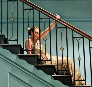
So, I did a reverse image search and quickly discovered it was part of the beloved PBS series Upstairs/Downstairs.
Raise your hand if, between 1971 and 1975, like me, you LIVED for Sunday evenings and the show’s next installment. Well, I did. I was 14 or 15 when the show began. However, I remember the characters so distinctly, I can’t believe it’s been 50 years! The original show spanned the period between 1902-1930.
I didn’t realize that a sequel to the show set a few years later, in the mid-1930s, was made and ran for one year in 2010.
The image I found was from the 2010 sequel.
Let’s take a look at the staircase from the 2010 show. I found a much better image. (below)
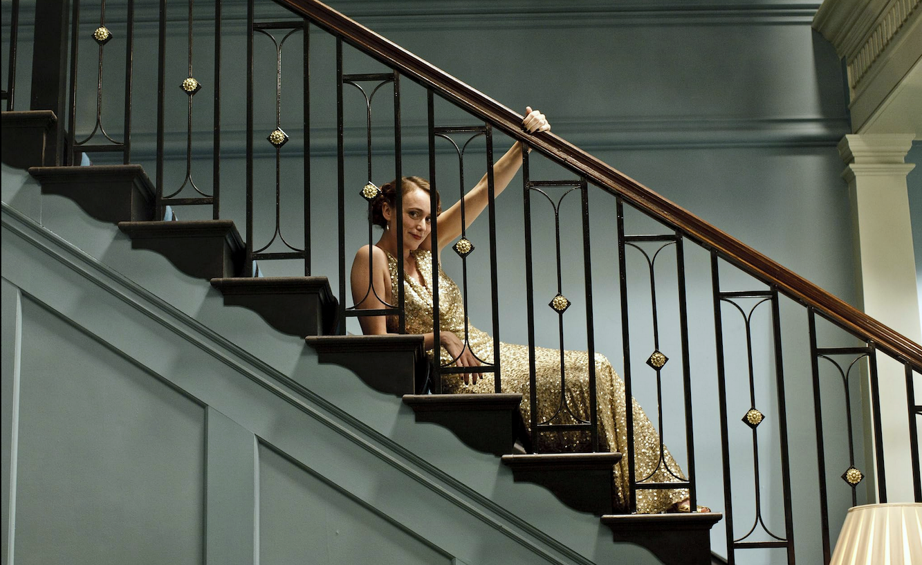
The railing is black iron with antique gold accents and small antique gold rosettes on the balusters. The design is interesting but, not too formal or busy. It’s actually quite simple. Perfect. I’m not looking to make a bold design statement with this element. But I do want a chic staircase railing.
However, it’s from the 2010 show, so maybe it’s just something dreamed up by a set designer.
But, here’s what else I learned that makes me think it might be the real thing.
The show was set at the fictional address of 165 Eaton Place in the posh Belgravia section of London. Eaton Place exists, but there’s no 165. The clever producers did use 65 Eaton Place for the exterior shots of the elegant neo-classical townhouse. They pasted on a one for the shoots to make it 165 Eaton Place.
The interiors were shot in a studio.
But, here’s what’s really cool.
The same staircase railing was in the original series! Yes, here it is!!!
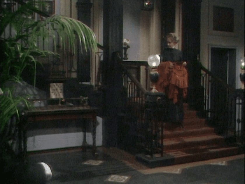
So, it’s at least from 1971!
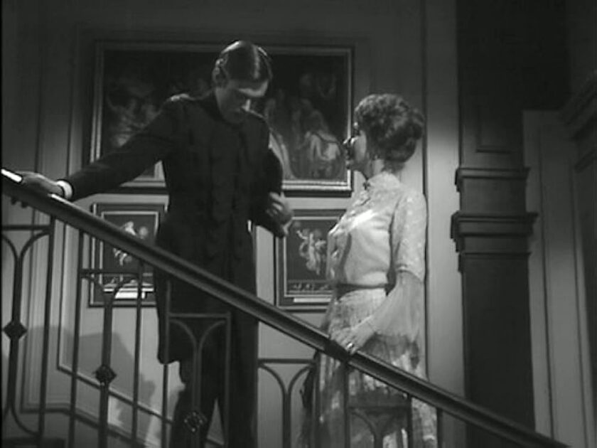
Still, is it authentic to the 19th century?
I can’t say for certain. However, I looked up 65 Eaton Place in London and learned on the website exploring-london.com:
“The property at 65 Eaton Place, meanwhile, was apparently part of a development built in 1824 by renowned builder Thomas Cubitt on the orders of the 2nd Marquess of Westminster, Richard Grosvenor.”
Of course, that still doesn’t let us know if the show’s set designer used an authentic period of the home railing.
I will put my money on what it is, and even if it’s not, it’s beautiful and could easily be adapted to suit my staircase.
So, I got to work.
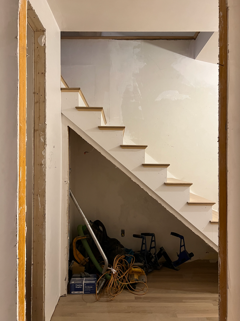
I began by uploading a side view of my staircase to picmonkey.
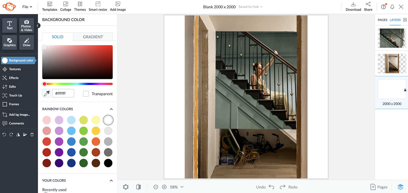
And then I added the cropped image on top of my image. You can temporarily make the top image translucent to see where to place it. And by golly, I didn’t have to work very hard. I only had to squeeze the image a little.
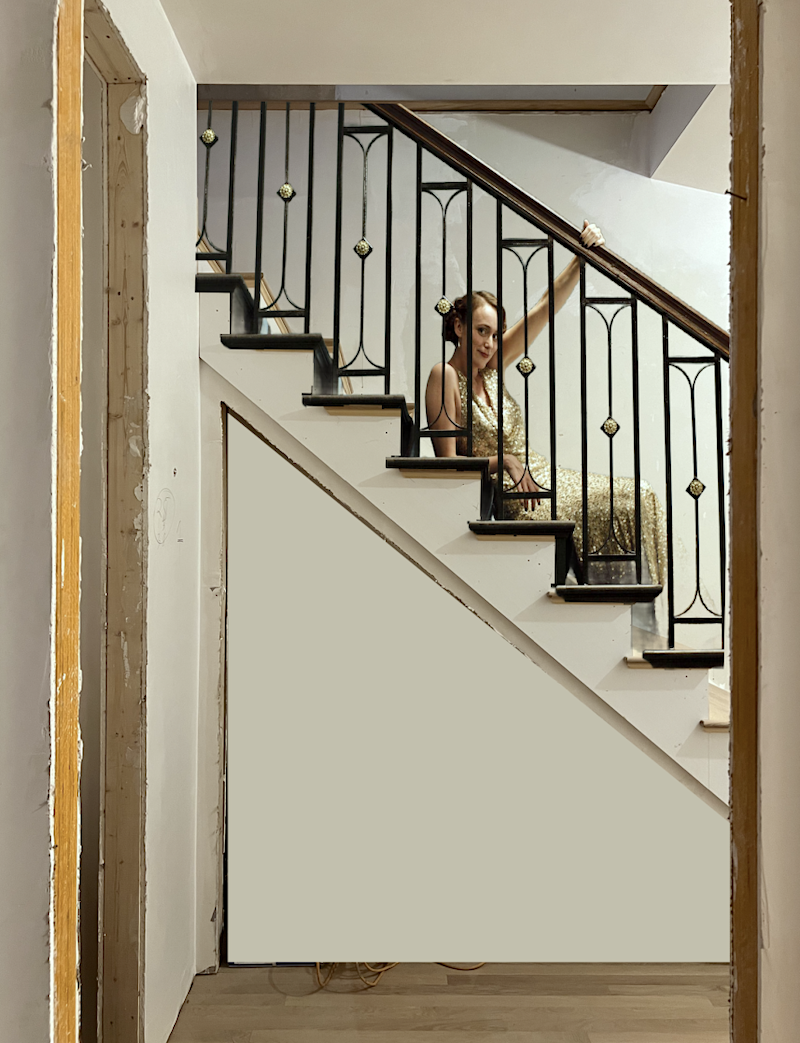
Next, I removed the background from the top image and covered the under-stairs mess.
Hmmm… I love the chic staircase railing, but the white walls aren’t doing it for me.
But, before working more on this one, I better deal with the upstairs.
And, here is where I hit an even bigger snag.
Like the TV show, the heavy drama usually happened upstairs.
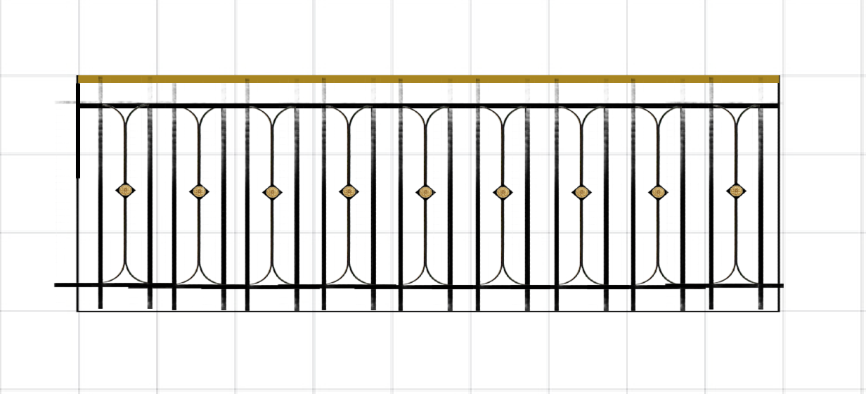
Um, no. That repetition is making me a little cuckoo.
And I tried numerous variations.
But, finally, I hit on the one that makes me love this design for the guardrail, too.
Alas, that’s all the time we have today…
Laurel, WHAT???????? You can’t leave us hanging like that!
Oh, I’m terribly sorry! ;] But, please don’t stress yourselves too much.
***I did work it all out. I just don’t want to stay up until 4:00 AM writing about my solution for a code-compliant chic staircase railing. However, I can’t wait for you to see it. As much as I loved the X design, I love this new design just as much, if not more.
Please stay tuned for Monday evening; we’ll see the FINISHED design upstairs [and] downstairs. Haha.
*********************************************************
Part 2 Begins Here
Let’s back up a sec. I think I need to put back the teal walls.
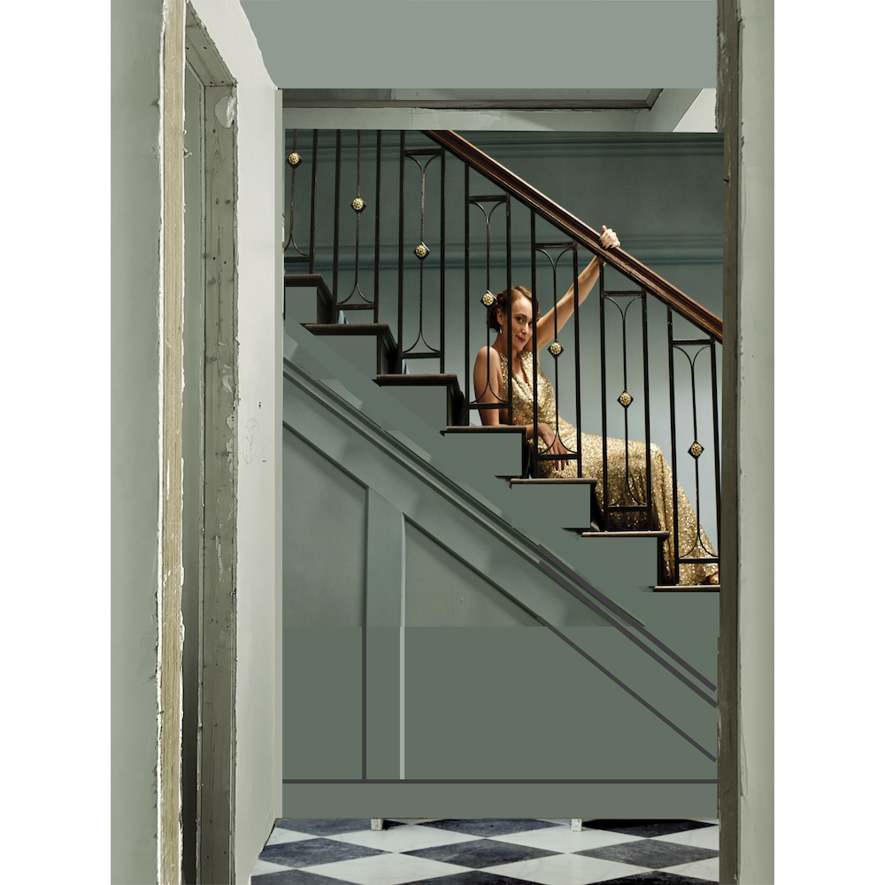
I added my black and white floor.
LOVE! Except it looks like an AI photo with the railing just ending in mid-air. lol. Of course, I could’ve just cropped it.
But, first, I need to work on the upstairs guardrail.
And, here is where I hit a snag. (which is in part 1)

Ummm… no.

The motif goes side-by-side with 3.75″ of space between each panel. However, the repetition was making me a little cuckoo. It’s not terrible, but it wasn’t giving me the same joy as the staircase railing.
I searched and searched for the balcony.
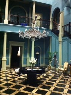
There is one, but the best I could find is this very blurry small file. I could not find a larger version of it. I’m sure if I rented the series, it would pop up. It does look like the panels are a little further than four inches apart.
I tried many iterations with one, two, or three plain or decorative spindles in between the rectangular panel motif. None of them looked right.
It needed something. Let’s try a border.
Well, there’s only one border I would ever want to do. It’s the one I’m always afraid of doing too much of, but there isn’t one anyway in sight.
So, I added a Greek Key border and then added one plain spindle between the panels to give them some breathing room.
Oh, wow! What a difference!
Uhhhh, Laurel, can we see it?
Yes, of course. However, I need to preface it with I prefer the Greek Key havelock-style meander pattern (on top) to the more common Greek Key meander. (on the bottom). That is, in this case.


However, I looked for hours and hours and could not find the havelock meander in cast iron, steel, or any metal. And, there don’t even seem to be a lot of sources for the regular Greek Key meander.
How can that be? It’s a popular and classic design element. Of course, my steel guy, Jerry, will have sources I can’t find online. (I hope.)
So, let’s take a look at what I created to begin with.
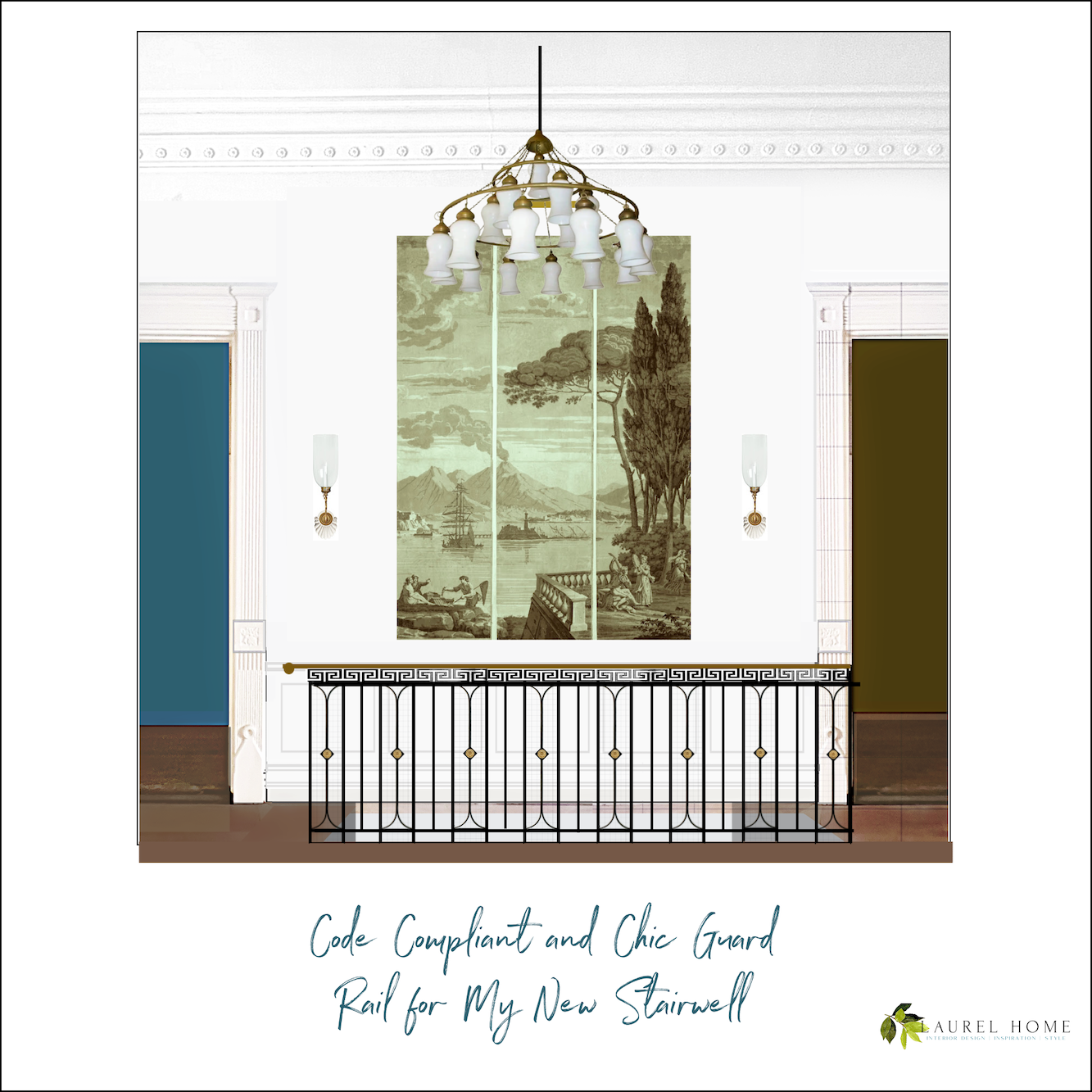
I love the way the plain balusters line up with the pattern.
What do you think?
I also created a version with the typical meander border.
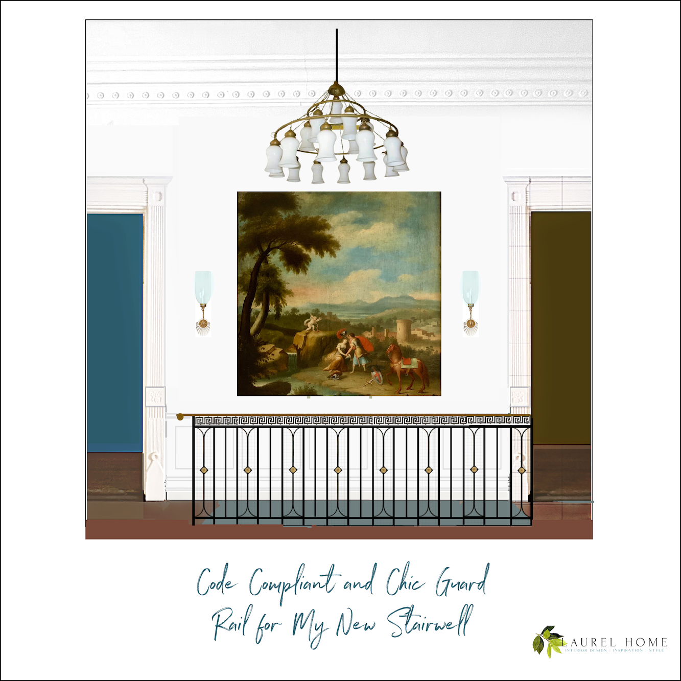
I could live with this. I also made the first baluster a little heavier.
Wait, there are more changes.
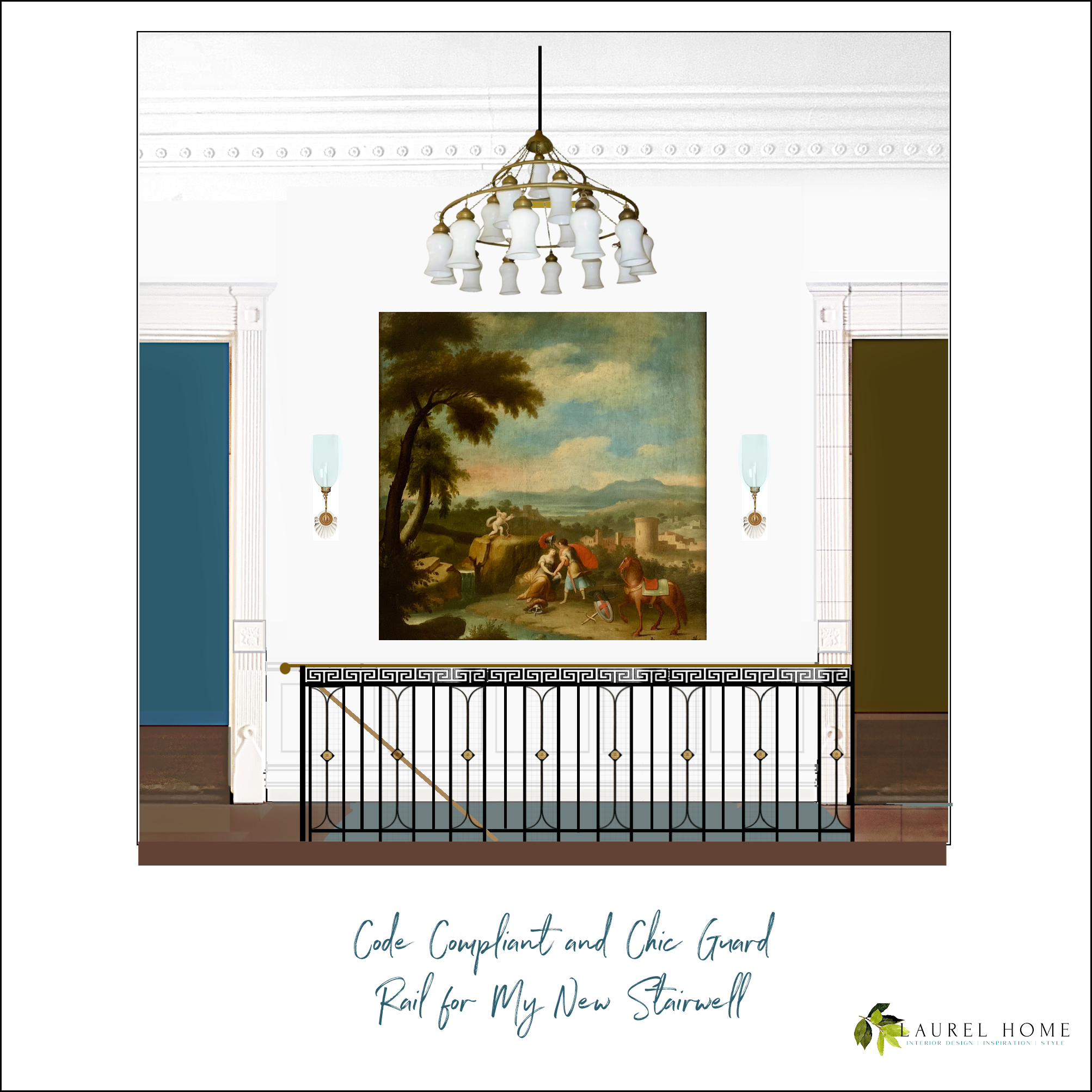
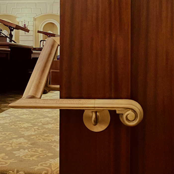
I made a separate small newel post and added a handrail with a volute. (ala the Mass State House, below) I don’t mind it going on the open side of the staircase all the way down.
Mervin asked in the comments if the handrail could be a straight shot, and the answer was yes>
.
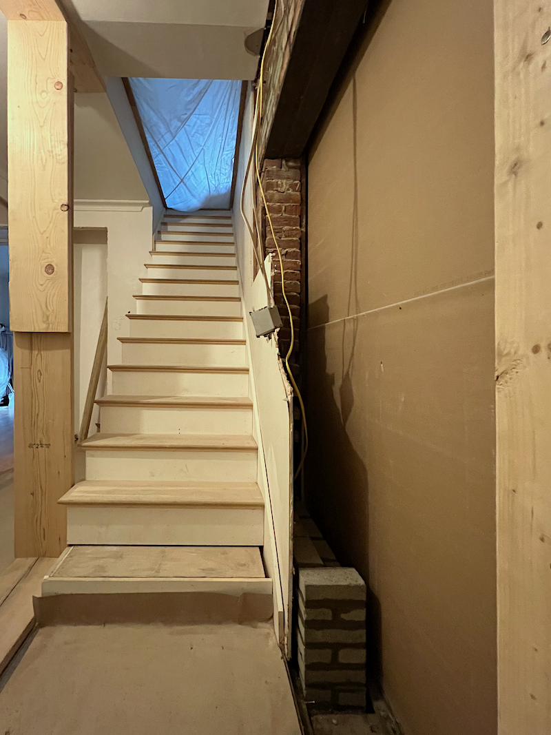
There is no jogging out. The 36″ measurement is for the stairs and stairwell. I believe the handrails can stick out about 2.5 inches on either side. I’d have to double-check that. But do I feel like it? haha
The image is a little distorted because of the wide-angle lens. The cell phone makes the space look deeper than it is.
But, looky, looky! The new doorway is COMPLETE! The guys couldn’t come today because they had to do some other work ahead of the snowstorm coming our way. You can see where the mason began to brick up the old opening. Everything to the right of that is the new doorway. But, the finished opening is only 26 inches. They did an amazing job!
Of course, they’re not finished. They have to finish bricking up the old doorway. Then remove the old door and put it in the new doorway. And finally, brick up the old egress doorway and all the rest. It will look like it was always this way.
Laurel, don’t tell me you have to pay for the bricking up of the old doorway you didn’t know about.
Okay, I won’t tell you I have to pay for that. ;] It’s the least of my problems.
But what about the staircase railing? Don’t you need to change that now?
That’s a terrific question, so let’s look at that.
First, because the tread is 9″ from nosing to nosing, there isn’t room for the panel with one spindle.
And yes, we could add the Greek Key border, which will add to the expense, but I don’t think is necessary.
My feeling is because of the restrictions, and that the configurations are inherently different, they don’t have to be the same. Of course, they need to coordinate. Therefore, I’m fine with coordinating the two designs, but with some differences. They’re like siblings but not identical twins.
Laurel, what about the wooden handrail? Would you do that?
Yes, I love it, and it’s stunning. However, I think it might feel a little too austere in my place. I would be happy to have a cast metal handrail with a spiral end over the rounded step.
![]()
It is like this but without the ball final.
So, guys. This is why I couldn’t finish the post Saturday evening. I had to go back and clean up and edit the stair image considerably. It took hours.
However, here it is, sage walls and all.
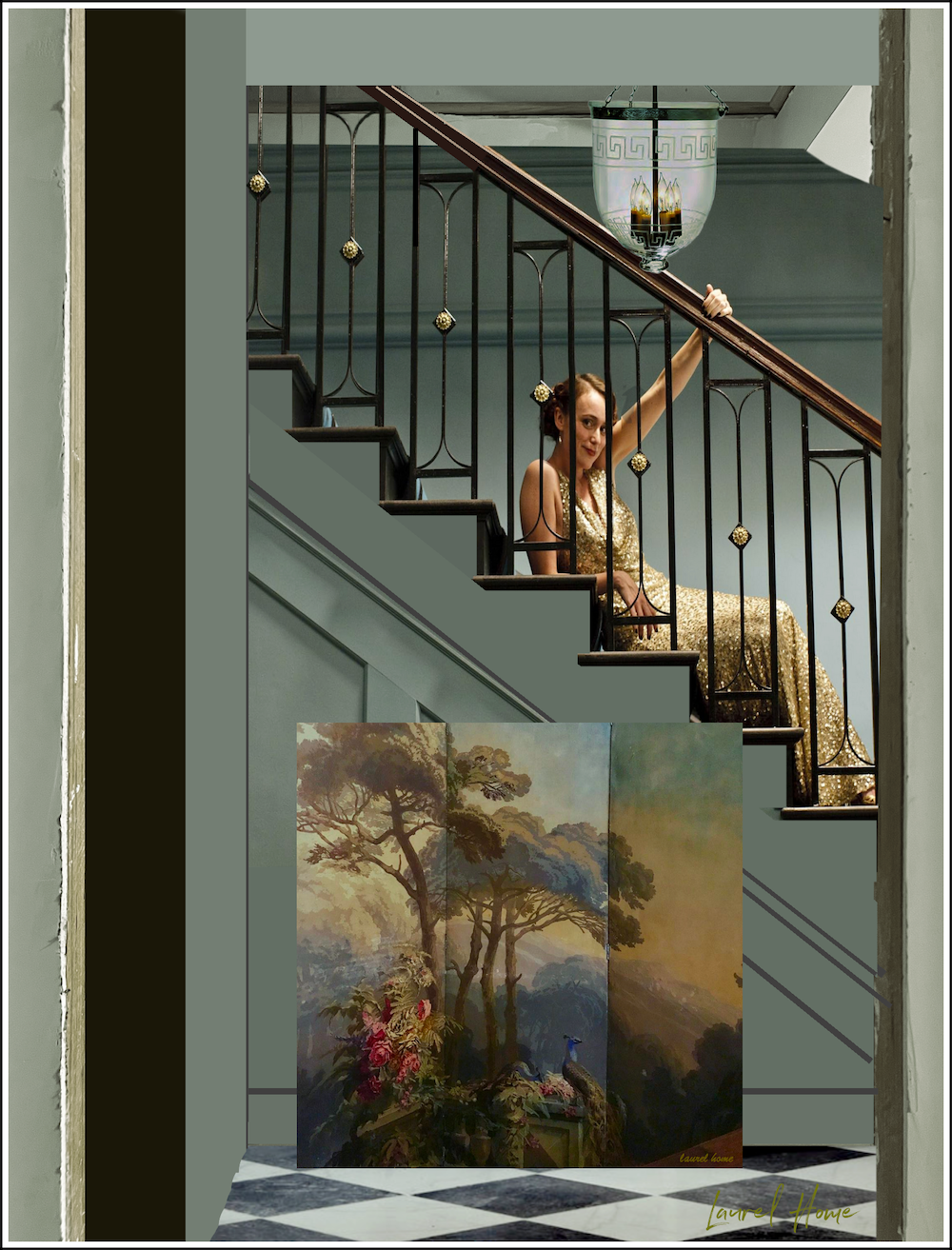
I did keep in a little unfinished wood, nails sticking out and all. Sorry, I had to squeeze beautiful Keeley. My stair treads are less deep than the grand staircase in the show.
So, what else is going on here?
Sadly, I don’t think we can do wallpaper because the electrical panel door sticks out too much. Therefore, I might put the screen (it’s larger than this) on the opposite wall downstairs instead of upstairs. It’s only sitting here so we can see the colors which I love!
Also, my lanterns do not have the Greek Key border because I went with some vintage bell jar lanterns I found on Chairish.
Gosh, I love this! In fact, I think I love it more than the X pattern.
Still, something’s missing.
Hang on a sec, please…
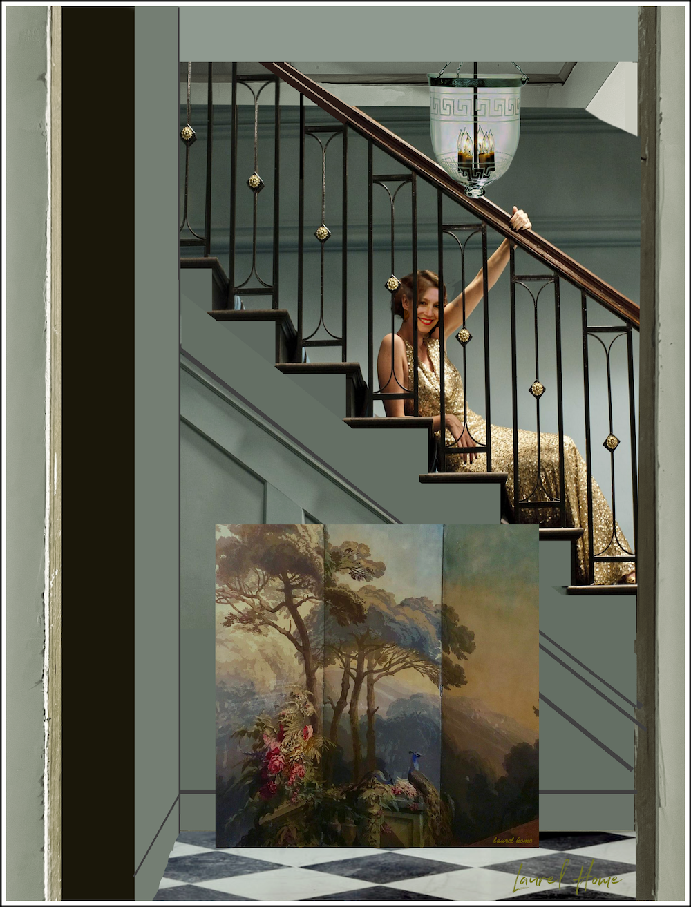
There, that’s better. ;]
Oh, man! You guys kept me hopping yesterday. (Sunday) Three or four of you mentioned how sad you were that I didn’t put my face on top of beautiful Keeley Hawes’s face. Well, duhhhhhhh, ;] of course I did!!! I just couldn’t post it because it needed to come at the end of the post. The face transplant alone takes a ridiculous amount of time.
Anyway, I love my new code-compliant chic staircase railing, and I love the sage-y teal-green.
Okay, that’s all for this evening.
Please stay tuned for a big renovation update.
Snow Day here in Boston. Please stay safe, everyone!
xo,

***Please check out the recently updated HOT SALES!
There is now an Amazon link on my home page and below. Thank you for the suggestion!
Please note that I have decided not to create a membership site. However, this website is very expensive to run. To provide this content, I rely on you, the kind readers of my blog, to use my affiliate links whenever possible for items you need and want. There is no extra charge to you. The vendor you’re purchasing from pays me a small commission.
To facilitate this, some readers have asked me to put
A link to Amazon.com is on my home page.
Please click the link before items go into your shopping cart. Some people save their purchases in their “save for later folder.” Then, if you remember, please come back and click my Amazon link, and then you’re free to place your orders. While most vendor links have a cookie that lasts a while, Amazon’s cookies only last up to 24 hours.
Thank you so much!
I very much appreciate your help and support!

